Hornby

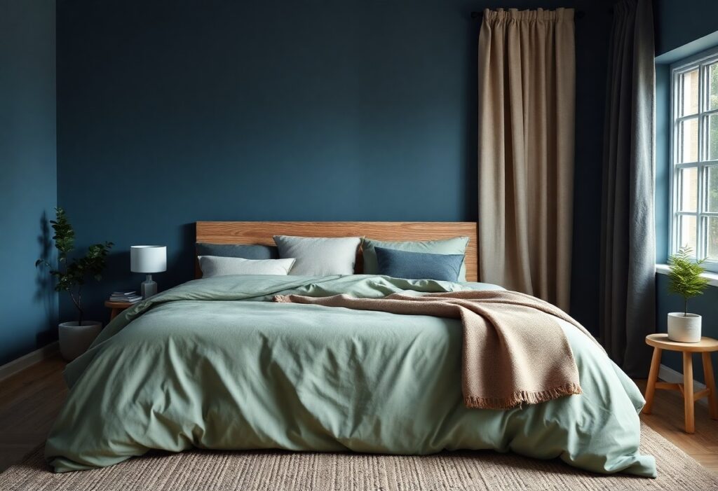
How Can I Make My Bedroom Feel More Relaxing?

Many people overlook how much their bedroom environment affects sleep and stress levels. I’ve found that small, intentional changes can make your space feel calmer and more restful. From lighting to fabric choices, I’ll show you simple ways to create a peaceful retreat that supports deep relaxation every night. Key Takeaways: Choose a calming color […]

How Can I Make My Bedroom Feel More Relaxing? Read More »

What Color Helps You Wake Up Feeling Energized?

Many people overlook how color impacts morning energy, but I’ve found that exposure to bright yellow or soft blue light upon waking can significantly boost alertness. I use these hues in your bedroom lighting or decor to help regulate your circadian rhythm. You’ll feel more awake and focused when your environment supports natural energy flow.

What Color Helps You Wake Up Feeling Energized? Read More »

How Can I Brighten a Dark Room Without Remodeling?

There’s no need to tear down walls to make your space feel brighter. I’ve tested simple, effective methods that instantly improve light in any room. Using light-colored paint, strategic mirrors, and layered lighting, you can transform your dark space. These changes are affordable, renter-friendly, and deliver immediate results. Key Takeaways: Use light-colored paint and reflective

How Can I Brighten a Dark Room Without Remodeling? Read More »

Which Colors Make You Feel Happy at Home?

You’ve likely noticed how certain colors instantly lift your mood when you walk into a room. I’ve studied color psychology for years, and I can tell you that soft yellows and warm terracottas consistently boost feelings of comfort and joy. Your walls do more than decorate-they shape your daily emotional experience. Choosing the right hue

Which Colors Make You Feel Happy at Home? Read More »

Which Colors Help You Focus While Working from Home?

Just by adjusting the colors around your workspace, I can help you improve focus and reduce mental fatigue. I’ve found that blue enhances concentration and yellow boosts energy, while red can overstimulate and harm productivity. Your environment shapes your attention-choose wisely. Key Takeaways: Blue tones, especially soft shades like sky blue or light cerulean, are

Which Colors Help You Focus While Working from Home? Read More »

How Do I Mix Bold Colors Without Making a Room Feel Busy?

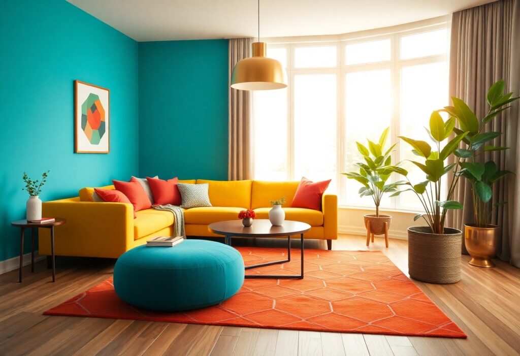
Most people fear bold colors will overwhelm their space, but I’ve found that strategic balance transforms energy into harmony. I use one dominant hue, support it with complementary accents, and anchor everything with neutral tones. You don’t need to shy away from vibrancy-your confidence in color defines the room’s mood, not the number of shades

How Do I Mix Bold Colors Without Making a Room Feel Busy? Read More »

What Artwork Works Best in a Minimalist Home?

Artwork in a minimalist home should enhance, not overwhelm. I believe simple lines, neutral tones, and intentional negative space make the strongest impact. You don’t need clutter to create depth-your walls should reflect calm and clarity. I’ve found that one bold, well-placed piece often speaks louder than many small ones. Choose quality over quantity to

What Artwork Works Best in a Minimalist Home? Read More »

What Color Should I Choose for a Reading Corner?

Over years of designing calming interior spaces, I’ve found that your reading corner’s color directly impacts focus and relaxation. I recommend soft neutrals or muted blues because they reduce eye strain and create a peaceful atmosphere. Bright or overly warm tones can be dangerously overstimulating, making long reading sessions uncomfortable. I always advise you to

What Color Should I Choose for a Reading Corner? Read More »

How Can I Add More Personality to My Home with Art?

Personality in a space comes from choices that reflect who you are, and I use art to make that statement clearly. I choose pieces that speak to your emotions, not just your décor-bold colors, unexpected subjects, and personal meaning transform blank walls into storytelling spaces. You don’t need expensive galleries; you need authenticity. Key Takeaways:

How Can I Add More Personality to My Home with Art? Read More »

How Do Colors Influence Family Rooms and Shared Spaces?

There’s a powerful psychological impact behind the colors you choose for your family room. I’ve seen how warm tones like red and orange can energize a space, while cool blues and greens bring calm and relaxation. The wrong shade can create tension, but the right palette strengthens connection and comfort in your shared environment. Key

How Do Colors Influence Family Rooms and Shared Spaces? Read More »