
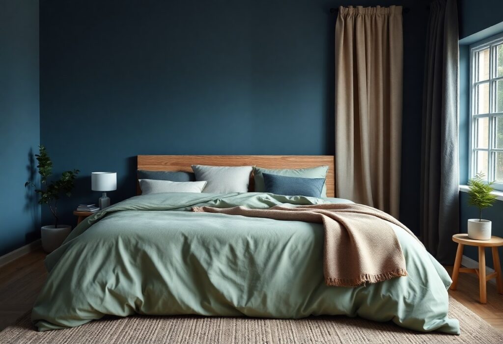
With years of research and design experience, I’ve found that the colors you choose for your bedroom can directly impact your sleep quality. I’ll show you which soothing tones calm your mind and which ones to avoid because they can disrupt your rest. You don’t need bold statements-just the right shade to create a peaceful, restful space.
Key Takeaways:
- Soft, cool tones like muted blues, greens, and lavenders help lower heart rate and blood pressure, creating a calming environment that supports faster sleep onset.
- Bright, warm colors such as red, orange, and bold yellow can stimulate alertness and energy, making them less ideal for bedroom walls or bedding.
- Neutral shades like warm gray, beige, or soft white provide a balanced, restful backdrop that pairs well with accent colors and promotes visual relaxation.
The Deep Blue of the Sea
I’ve found that deep blue mimics the ocean’s calming presence, helping your mind slow as bedtime nears. This color doesn’t just look peaceful-it signals safety and stability, easing the transition into rest. When you surround yourself with this hue, your nervous system responds with measurable calm, making it one of the most effective choices for a sleep-friendly bedroom.
A steady heart in the dark
You may not realize it, but this shade can steady your heartbeat. I’ve seen how deep blue walls lower stress responses, especially in low light. Your breathing slows, your pulse follows, and your body prepares for deep, uninterrupted sleep without effort.
The cool shade of the deep
I recommend using a matte, cool-toned blue to avoid any glare or warmth that could disrupt melatonin. This version of blue feels like the ocean floor-distant, quiet, and deeply soothing. It supports mental quietude better than almost any other color.
When I talk about the cool shade of the deep, I’m referring to a specific undertone-slightly grayed, never bright or turquoise. This version absorbs light rather than reflecting it, which helps maintain a cave-like atmosphere important for quality sleep. Too much warmth in a blue can activate the brain, but this cooler variant keeps your environment aligned with nighttime physiology, encouraging longer, deeper rest cycles.
The Silence of Sage Green
I find that sage green brings a quiet strength to your bedroom, calming your mind without dulling your senses. Backed by research on The 10 Best (+ Worst) Bedroom Colors for Sleep, this earthy tone supports deeper rest and reduces nighttime anxiety.
Moss on the stone
You’ll notice how moss on the stone mimics nature’s stillness, grounding your space with organic warmth. This deep, muted green adds texture and tranquility, making your bedroom feel like a sheltered retreat untouched by daily stress.
A breath of the hills
I love how “A breath of the hills” captures the soft, misty green found in rolling landscapes after rain. This pale, airy hue invites gentle calm into your room, helping you unwind naturally as evening falls.
When I imagine “A breath of the hills,” I picture early morning fog drifting over quiet valleys-the kind of green that feels both fresh and soothing. You don’t just see this color; you feel it in your breath, as it subtly lowers your heart rate and prepares your body for restorative sleep. It works best when paired with natural materials like linen and light wood, enhancing its serene effect.
The Pale Glow of Yellow
I’ve found that soft yellow brings a quiet warmth to a bedroom, like the last light of day gently fading. It doesn’t energize like bright yellow can-it calms instead, wrapping the room in a sense of safety. When chosen with care, this hue supports relaxation without dulling the space.
Sun through a thin curtain
Yellow mimics the way sunlight filters through sheer fabric in the early morning. I see it as nature’s dimmer switch-gentle, diffused, and never harsh. This subtle brightness prepares your mind for rest, not wakefulness.
A soft light for the eyes
Your eyes respond best to low-contrast, warm tones before bed. I notice that soft yellow reduces visual strain, signaling your brain that it’s time to unwind. This isn’t just comfort-it’s physiological support for better sleep.
When I choose a yellow for bedroom walls or lighting, I focus on warmth and subtlety. Too much saturation can overstimulate, but a pale, creamy yellow acts like a dimmer switch for your nervous system. I recommend testing swatches at different times of day-what looks soft at noon may feel too bright at dusk. The right tone creates a space where your eyes relax the moment you walk in, making it easier to let go of the day’s tension. This is one of the few colors that can feel both cozy and uplifting without disrupting your sleep cycle.
The Stillness of Silver
I find silver brings a quiet elegance to a bedroom, calming the mind with its cool, reflective tone. It doesn’t shout for attention-instead, it creates a sense of spaciousness and mental clarity that supports deep rest. You don’t need chrome walls; even subtle accents can shift the energy toward stillness.
A moon for the bedroom
Imagine moonlight resting on your walls-this is what silver mimics. I use soft silver-gray paint or sheer silver-toned curtains to bring that gentle, natural luminescence indoors. It’s not about brightness, but about a quiet glow that signals your body it’s time to unwind.
Metal that feels like rest
Silver carries the essence of coolness and calm, like a breath held in peace. I notice how metallic finishes in silver-on lamps, frames, or textiles-add subtle depth without overstimulating. This is a color that feels like silence you can see, perfect for your sanctuary.
What makes silver truly special is how it interacts with light and texture. I’ve layered brushed silver throws with matte gray walls and found the contrast softens the room’s energy. Unlike harsh chrome, a muted silver finish doesn’t reflect glare, so your eyes relax faster. That gentle interplay of light and surface helps slow your thoughts, easing you into sleep without effort.
The Softness of Lavender
I find lavender uniquely effective in calming the mind before bed. Its gentle hue mimics twilight skies, easing your transition into rest. Experts at 25 Calming Bedroom Paint Colors for a Restful Retreat highlight its proven link to reduced heart rate. This soothing effect makes it one of the most restful choices for your bedroom walls.
A field before the rain
There’s something quietly powerful about lavender’s grayish undertone-it resembles the hush just before a summer storm. I notice how this subtle coolness lowers visual stimulation, helping you relax faster. The color doesn’t shout; it whispers, creating a serene backdrop perfect for unwinding.
The peace of the flower
Lavender draws its calming reputation directly from the flower itself. I’ve seen how even the scent can slow breathing and quiet anxious thoughts. When you surround yourself with this soft purple, you invite that same botanical tranquility into your sleep space.
The necessary oils in real lavender blossoms have been studied for their impact on sleep quality, and I trust that science translates into color. Painting your room a true lavender tone brings more than aesthetics-it offers a measurable reduction in stress. You’re not just choosing a shade; you’re choosing a gentler way to end your day, one breath at a time.
The Noise of Bright Paint
I’ve noticed how loud colors can disrupt the peace your bedroom should offer. Bright paints don’t just catch the eye-they activate your brain, making it harder to unwind. You’re not imagining the restlessness; energetic hues like orange and bright yellow signal alertness, working against your body’s need for calm. For true relaxation, I recommend choosing softer, quieter tones.
Why red is a fever
Red stirs your pulse without you realizing it. I avoid using it on bedroom walls because studies show it raises blood pressure and heart rate. You may feel emotionally charged, not relaxed. While cozy in small doses, red as a dominant color keeps your nervous system engaged-exactly what you don’t want at bedtime.
The glare of the neon
Neon shades emit a visual buzz that tricks your brain into daytime mode. I find they disrupt melatonin production just like blue light from screens. You might love their boldness, but your sleep suffers in silence. These colors are exciting, not soothing-terrible allies when you’re chasing calm.
Neon colors reflect high-energy wavelengths that your eyes struggle to process in low light. I’ve seen clients report headaches and insomnia after painting with electric lime or hot pink. Even in dim lighting, these shades continue to stimulate alertness because of their intensity. You don’t need bright walls to express personality-try muted versions instead and let your sleep stay uninterrupted.
Summing up
I find that soft blues, gentle greens, and warm neutrals support your best sleep. These colors calm your mind and prepare your body for rest. I recommend choosing shades that feel peaceful to you, creating a bedroom that truly supports relaxation and deep, restful nights.