
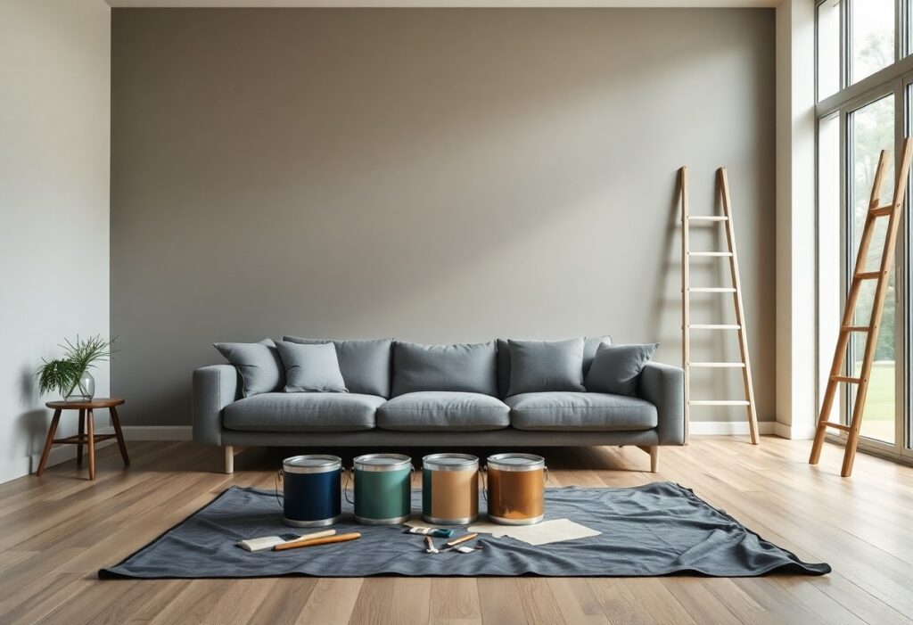
Key Takeaways:
- Neutral bases like warm grays, soft whites, and muted beiges create a calm backdrop that lets modern furniture and architectural details stand out.
- Accent walls in bold tones-such as deep navy, terracotta, or forest green-add depth and personality without overwhelming open-concept spaces.
- Natural light changes how paint colors appear; always test large swatches on different walls and observe them at various times of day before deciding.
The Sin of the Neutral
I’ve watched so many modern interiors fall flat because of an overreliance on neutral tones. While they seem safe, they often drain energy from a space. You risk creating an environment that feels impersonal and emotionally cold, even when the design is otherwise thoughtful. Neutrals shouldn’t dominate-they should support.
The sterile white
White walls promise cleanliness, but I’ve seen them turn rooms into clinical shells. You may think you’re creating space, but without warmth or texture, the result feels empty and uninviting. I prefer white as an accent, not a default.
The charcoal safety
Charcoal is often chosen as a “bold” alternative, yet I find it’s just another escape from color. You might believe you’re taking a risk, but in reality, it’s become its own kind of conformity. It can cast a heavy, oppressive mood if not balanced.
When I use charcoal, I do so with intention-not as a default wall color but as a grounding element in a layered scheme. You can pull it off if you pair it with warm materials or a pop of true color, but left alone, it risks making your space feel closed off and emotionally distant. I always test it at different times of day, watching how light transforms its depth.
The Personality of Pigment
Color speaks before words in any room, and I’ve learned that your choice sets the tone for how people feel the moment they walk in. I always recommend exploring Bedroom Paint Colors | Expert Picks for inspiration that balances beauty and psychology-some shades calm, others energize, all with a distinct personality.
Evoking emotion
Every hue carries emotional weight, and I’ve seen soft blues bring instant calm to restless spaces. You might not realize it, but the color you choose can quiet a busy mind or spark joy with just a glance. I pay close attention to how you respond to certain tones-your reaction often reveals the right emotional fit.
Defining the spirit
Spirit isn’t just about light or layout-it’s embedded in the color you choose. I find that warm terracottas or deep charcoals can define a room’s character more than furniture or art. Your walls should reflect who you are, not just what’s trendy.
When I talk about defining the spirit, I mean aligning paint with the soul of your home. A sunlit room with creamy beige feels welcoming, while a moody emerald in a quiet study can feel deeply personal. I encourage you to think beyond aesthetics-ask yourself how you want to feel in the space. The right pigment doesn’t just cover a wall; it transforms your experience of the room every single day.
The Deception of Daylight
I’ve learned that natural light can dramatically shift how paint colors appear throughout the day. What looks warm and inviting at noon may feel cold by dusk. You need to observe your space at different times to truly understand its light behavior. Ignoring this can lead to disappointing results-a color that feels alive in daylight might vanish under evening lamps.
Morning illusions
Early light often enhances cool undertones, making grays appear bluer and whites seem stark. I’ve seen beige walls look pinkish just after sunrise due to shifting angles. This temporary effect can mislead your final choice if you only view samples in the morning.
Evening depth
As daylight fades, colors gain richness and saturation under artificial lighting. I notice how warm lamps bring out hidden warmth in neutral tones. What seemed flat during the day can become deeply inviting-a transformation many overlook when selecting paint.
Evening depth reveals a room’s true personality. I always test paint swatches lit by your actual evening bulbs, not just sunlight. The way a color holds its tone-or transforms-after dark is one of the most telling signs of its suitability. You’ll avoid regret by seeing how it feels when you’re really living in the space.
The Virtue of the Accent
I’ve found that a single bold hue can transform a neutral space without overwhelming it. Accent colors work best when applied intentionally-on a feature wall, in textiles, or through art. The right pop of color draws the eye exactly where you want it, adding depth and character with minimal effort.
Strategic vibrancy
You don’t need bright tones everywhere to make a statement. I place vibrant shades where they’ll have the most impact-near natural light or at eye level. A splash of cobalt or terracotta in the right spot energizes the entire room, creating focal points that feel intentional, not chaotic.
Balancing intensity
I always pair high-impact colors with neutral backdrops to prevent visual fatigue. Saturation works best when it’s not competing. Too much intensity without relief overwhelms the senses, but balanced correctly, it brings energy and sophistication in equal measure.
When I work with bold hues, I consider how they interact with light and surrounding materials. A deep emerald looks rich at dusk but may feel heavy in a dim room. I use matte finishes to soften strong tones and pair them with warm woods or soft textiles to ground the intensity. This contrast keeps the space feeling dynamic yet livable, ensuring the color enhances your experience rather than dominates it.
The Texture of Sophistication
I’ve learned that paint finish shapes a room’s personality just as much as color does. Your walls don’t just reflect light-they interact with it, creating depth and mood. For a refined look, I always recommend studying The 13 “Do’s” And “Dont’s” Of Choosing Paint For Your … to avoid costly mistakes. The right finish can amplify elegance, while the wrong one can dull even the most thoughtful palette.
The velvet matte
Matte finishes absorb light, giving walls a soft, velvety appearance that hides imperfections beautifully. I use this in living rooms and bedrooms where a calm, cozy atmosphere matters most. You’ll love how it reduces glare, but keep in mind it’s less washable-so avoid high-moisture areas.
The mirror gloss
Gloss finishes reflect light dramatically, making spaces feel larger and more dynamic. I often choose this for trim, kitchens, or accent walls where I want a bold, polished effect. It’s durable and easy to clean, which makes it ideal for busy areas in your home.
When I work with gloss, I pay close attention to lighting and wall condition-because its high reflectivity highlights every bump and shadow. Natural light enhances its luster, but artificial lighting can create unexpected hotspots. I always test a large sample first. Used wisely, the mirror gloss adds a sophisticated sheen that transforms ordinary walls into statement features, giving your modern interior a sharp, intentional finish.
To wrap up
So I’ve shown you how to choose painting colors that align with your space, lighting, and personal style. I know the right hue can transform a room, and you’ll feel more confident selecting shades that reflect your taste. Your modern interior doesn’t need trends-it needs balance, clarity, and a palette that feels like home.