
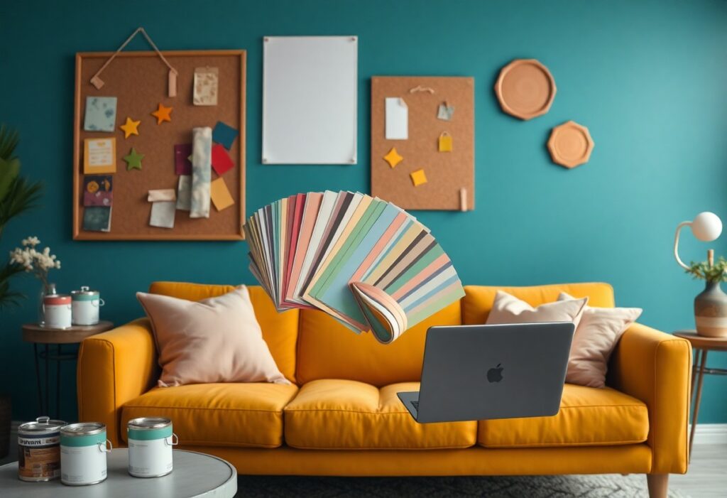
It’s my job to shape how you feel in a space, and I do it largely through color. I use bold reds to energize, calming blues to reduce stress, and warm neutrals to make your environment feel safe. The wrong shade can create anxiety or discomfort, while the right combination supports mood, focus, and well-being-every choice I make is intentional and emotionally powerful.
Key Takeaways:
- Interior designers choose colors based on how they influence mood-cool tones like blue and green often bring calm, while warm shades like red and orange can energize a space.
- Color combinations are used to guide attention and create balance, helping certain areas feel more inviting or dynamic depending on the room’s purpose.
- Cultural and personal associations with color play a big role; designers consider these to make spaces feel personal and emotionally resonant for the people using them.
The Palette of the Soul
I believe every hue speaks directly to the subconscious, shaping how you feel in a space without a single word. Color isn’t just decoration-it’s emotional architecture. I use it to reflect your inner world, turning walls into mirrors of mood, memory, and desire.
Crimson Passions
Crimson stirs energy and intimacy, making it ideal for spaces meant to inspire connection. I use it sparingly in dining rooms or bedrooms because its intensity can overwhelm. You feel it before you see it-a pulse in the air that demands attention and emotion.
Azure Tranquility
Azure wraps a room in calm, lowering your heart rate the moment you enter. I reach for it in bathrooms and bedrooms where peace is non-negotiable. Its cool clarity helps you breathe deeper, think clearer-a quiet reset built into the walls.
When I design with azure, I’m not just choosing a color-I’m prescribing stillness. This soft blue mimics the sky at dawn or water untouched by wind, triggering an almost instinctive relaxation. You don’t just see azure; you surrender to it. I often pair it with natural textures to deepen its effect, letting light play across linen or stone to enhance its soothing authenticity. Used wisely, it becomes an emotional anchor in your home.
The Alchemy of Light and Hue
I’ve learned that light transforms color into emotion-what feels warm at dawn shifts into something mysterious by dusk. By pairing intentional hues with natural and artificial lighting, I guide how you experience your space throughout the day. To truly Unleash the Emotional Power of Your Space, consider how light bends color into mood.
Morning Gold
Golden morning light breathes energy into soft yellows and warm neutrals, making spaces feel inviting and alive. I often recommend these tones for kitchens or breakfast nooks because they awaken your senses gently and set a positive tone for the day.
Twilight Shadows
Deep blues and muted grays come alive as daylight fades, creating a sense of calm and introspection. I use these shades in living rooms or bedrooms where you need to unwind and feel protected from the world’s noise.
As evening settles, the absence of direct light allows cooler tones to dominate, wrapping a room in quiet elegance. I rely on twilight shadows to add depth and intimacy, knowing that the right hue in low light can transform a space into a sanctuary. It’s not just about color-it’s about how it behaves when the sun goes down.
Textures of the Spectrum
I feel color most deeply when it’s paired with texture-rough plaster, soft fabric, polished stone. These combinations shape how you experience a space emotionally. The The Power of Interior Colour Design to Influence Well-being becomes even more profound when touch joins sight, grounding mood in physical sensation.
Velvet Verdant
You sink into a velvet emerald armchair and instantly feel calmer. This deep green, rich with organic warmth, wraps around you like a forest canopy. The plush texture enhances its soothing effect, making the space feel sheltered and intimate.
Silk Citrine
I love how silk citrine catches the light-its shimmer adds a quiet energy to a room. The smooth, reflective surface amplifies the hue’s natural brightness, giving spaces a gentle lift without overwhelming the senses.
Silk citrine works best in spaces where clarity and calm coexist-think reading nooks or morning lounges. The subtle sheen of silk interacts with daylight, creating a soft glow that changes throughout the day. You’ll notice your mood subtly lifts as the fabric catches the sun, making it a quiet but powerful tool in emotional design.
The Architecture of Mood
I shape emotion through color long before a single piece of furniture arrives. Every hue I select builds an invisible framework that guides how you feel in a space-calm, energized, sheltered, or free. Color isn’t decoration; it’s structural, forming the emotional foundation of your environment.
Expansive Whites
White opens a room like light pouring through a window. I use it to give you breathing room, clarity, and a sense of quiet order. It doesn’t erase personality-it frames yours, making your life the focal point.
Intimate Obsidian
Black wraps around you like a quiet embrace. I choose obsidian tones to create spaces where stillness feels luxurious, not empty. This depth doesn’t shrink a room-it pulls it inward, making it feel like a private sanctuary.
When I work with Intimate Obsidian, I’m not just applying color-I’m crafting moments of retreat. You don’t live in black spaces to be dramatic; you live in them to feel protected, grounded, and deeply seen. Used on walls, ceilings, or cabinetry, obsidian absorbs light in a way that softens edges and heightens texture, turning a simple room into a cocoon of intention. It’s not for every wall, but when you need a space that holds you, not just shelters you, this is the color that answers.
Conclusion
Conclusively, I use color to shape how you feel in a space. I choose each hue to influence your mood, guide your attention, and reflect your personality. With intentional palettes, I transform rooms into emotional experiences that resonate deeply with your daily life.