
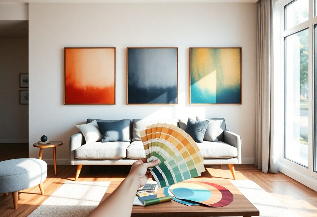
Artwork can transform a room, but choosing the right colors isn’t just about trends-it’s about expressing your true self. I help you align your personality with your space by selecting hues that feel authentic and emotionally resonant. You’ll learn how to avoid clashing tones and instead create harmony between your walls and who you really are.
Identifying Key Factors of Your Personal Color Psychology
- Your emotional connection to certain colors shapes how you experience a space
- Childhood memories often influence your instinctive color preferences
- Cultural background can affect how you perceive color meanings
- Current life phase may shift your attraction to calming or energizing hues
Knowing your emotional and psychological ties to color helps you choose artwork that truly resonates with who you are.
Connecting Emotional Responses to Specific Hues
I notice how blue brings me calm, while red sparks energy in your space. Each hue carries an emotional weight-soft greens soothe, bright yellows uplift. You don’t just see color; you feel it. Knowing which emotions you want to invite guides your choices more than trends ever could.
Assessing Your Aesthetic Temperament: Bold vs. Subdued
Some people lean toward vibrant tones that command attention, while others find peace in muted, gentle palettes. I can tell by how you dress or decorate whether you prefer drama or quiet elegance. Knowing your aesthetic temperament shapes artwork decisions that feel authentic.
When I look at your wardrobe or the way you arrange a room, I often see a clear pattern-either a love for high-contrast, saturated colors or a pull toward neutral, harmonious tones. Bold choices reflect confidence and a desire for visual impact, while subdued palettes suggest a need for balance and calm. Your temperament isn’t about what’s “in style”-it’s about what makes you feel grounded or inspired. Knowing this distinction keeps your artwork from feeling like decoration and turns it into an expression of self.
Analyzing Your Interior Design Style and Architecture
I assess the bones of your space first-your home’s architecture and existing design language guide every color decision. Whether your walls lean toward modern minimalism, rustic charm, or eclectic layering, your artwork must feel like it belongs. I look at moldings, ceiling heights, and room flow to determine what visual weight works best. This
Matching Art Styles to Modern, Traditional, and Transitional Homes
I align art with your home’s personality-bold geometry and monochrome palettes enhance modern spaces, while gilded frames and classic subjects suit traditional interiors. Transitional homes blend both, welcoming textured neutrals and organic forms. I choose pieces that echo your design rhythm without overpowering it. This
- Modern homes thrive with high-contrast, abstract art
- Traditional homes favor detailed, warm-toned paintings
- Transitional spaces balance clean lines with soft color gradients
- Art scale should match room proportions
- Frame finish must complement existing wood tones
Evaluating Fixed Factors: Flooring, Wood Tones, and Natural Light
I examine what you can’t easily change-your flooring material, cabinet finishes, and daily light patterns. Warm hardwoods call for art with amber or terracotta undertones, while cool gray floors pair well with blues and greens. North-facing rooms need lighter artwork to avoid dullness. This
I pay close attention to how light shifts throughout your rooms. South-facing spaces flood with bright light, making saturated colors pop, while east or west exposure creates dynamic shadows that affect how pigments read. I note your floor’s undertone-many mistake warm oak for neutral, skewing color choices. White walls aren’t always white; some lean blue, some yellow, and that changes everything. I test art under your actual lighting conditions. This
- Natural light alters color perception at different times of day
- Flooring undertones influence which hues feel harmonious
- Wood finishes in doors and trim should echo in frame choices
- Window size and direction determine artwork contrast needs
- Wall color temperature interacts with art pigments
How to Use Color Theory to Create Visual Harmony
I rely on color theory to guide how I select artwork that feels right in my space. By understanding how hues interact, you can create a sense of balance and flow. How to Choose Art for Your Home: A Step-by-Step Guide helped me see how intentional choices lead to stronger visual cohesion and emotional resonance in a room.
Applying the 60-30-10 Rule for Balanced Integration
I apply the 60-30-10 rule to maintain proportion in my decor. Your walls and large furniture take up 60%, mid-tones like curtains or rugs fill 30%, and artwork or accents make up the final 10%. This structure ensures your art enhances the space without overwhelming it, creating a calm, well-layered effect that feels naturally balanced.
Choosing Between Complementary and Analogous Color Schemes
I choose complementary colors when I want my artwork to stand out with energy and contrast. These opposite hues on the color wheel create dynamic tension that draws the eye. For a softer, more peaceful look, I go with analogous schemes-colors next to each other-because they blend smoothly and support a serene, unified atmosphere in your room.
When I compare complementary and analogous color schemes, I focus on the mood I want to create. Complementary pairs, like blue and orange, deliver bold contrast that can make a piece feel alive and modern, but they require careful balancing to avoid visual fatigue. Analogous combinations, such as green, teal, and blue, feel more natural and relaxing, making them ideal for spaces meant to soothe. I always test small swatches first-what looks good in theory can feel overpowering or dull in real lighting. Your personal comfort matters most.
Strategic Tips for Coordinating Art with Existing Decor
I align artwork with your space by pulling color cues from key elements you already love. Matching art to your existing decor creates harmony without repetition. I recommend focusing on texture, tone, and balance to avoid visual clutter. Any decision rooted in your current palette will feel intentional. For deeper insight, I suggest reading The complete guide to style wall art in your home.
- Use pillows or rugs as color references
- Match art frames to hardware or furniture finishes
- Repeat a secondary color from your sofa in bold artwork
- Keep scale proportional to your furniture
- Balance busy patterns with simpler art
Drawing Color Inspiration from Textiles and Upholstery
I often pull accent colors directly from your throw pillows, area rugs, or curtains. These textiles offer a safe palette to mirror in artwork since they already belong in the room. You’ll create cohesion when your art reflects hues already in motion. Any fabric with subtle tones can inspire a striking piece.
Using Contrast to Establish a Sophisticated Focal Point
I rely on contrast to make artwork stand out without clashing. Choosing a piece with a bold hue against a neutral wall draws the eye naturally. You gain depth and interest when light and dark tones interact. Any well-placed contrast elevates the entire space.
Contrast isn’t just about color-it includes value, texture, and lighting. I once hung a dark abstract piece on a soft gray wall, and the shift in mood was immediate. The room felt more defined, more intentional. You don’t need loud colors to create impact; sometimes a matte finish against a glossy wall does the trick. Any thoughtful contrast invites closer looks and longer stays.
How to Select Artwork Based on Room Function
I match artwork colors to a room’s purpose because energy and mood shift from space to space. Your living room invites conversation, while your bedroom should support rest-each needs a different visual tone. Choosing with intention ensures your art enhances how you use the room every day.
Selecting Calming Palettes for Private Sanctuary Spaces
I lean into soft blues, muted greens, and warm neutrals when styling bedrooms or reading nooks. These tones create a peaceful retreat that supports relaxation and emotional balance. You’ll find that gentle hues in your private spaces help quiet the mind and deepen your sense of comfort at home.
Incorporating High-Energy Vibrancy in Social Areas
I reach for bold reds, sunny yellows, or electric teals when decorating spaces meant for gathering. These colors spark lively conversation and elevate the mood, making your living room or dining area feel dynamic and welcoming. You’ll notice guests respond positively to the warmth and energy these palettes bring.
When I design social zones, I intentionally place artwork with vibrant, warm tones to amplify connection and joy. A splash of coral or a striking abstract in golden ochre doesn’t just catch the eye-it invites engagement and lifts the spirit. You can balance intensity with neutral furnishings so the art remains the joyful focal point without overwhelming your space.
Expert Tips for Testing Art Before You Buy
I always recommend testing artwork in your actual space before finalizing a purchase.
- Use digital mockups to visualize how a piece fits your wall
- Hold color swatches next to the art to assess harmony
- Observe how lighting conditions shift the tones throughout the day
Any decision made after real-world testing feels more confident and aligned with your vision.
Utilizing Digital Mockups and Swatches in Your Space
I upload photos of my wall into apps that let me place artwork virtually. Seeing a digital mockup helps me judge scale and style without guesswork. You can adjust the background to match your paint, then compare how each color swatch interacts. Any uncertainty fades when you preview art as it would truly appear.
Observing Color Shifts Under Different Lighting Conditions
I notice how natural light changes a painting’s mood from morning to evening. What looks warm at noon may appear cool under lamplight. You’ll see true color behavior only after watching it in your space across hours. Any final choice should account for these shifts to avoid surprises.
Light doesn’t just illuminate art-it transforms it. I’ve seen a blue that looked serene in daylight turn almost gray at dusk. Incandescent bulbs add warmth, while LED lighting can make cool tones feel sharper. That’s why I always study a piece at multiple times of day. Your eyes will catch what cameras miss, and that awareness protects you from regret. Any artwork you love in every light is likely the right one.
To wrap up
Conclusively, I choose artwork colors by aligning them with your personality and home style. I look at your space’s existing tones and your emotional connection to certain hues. You feel more at ease when the art reflects who you are. I trust your instincts-they guide the best choices.