
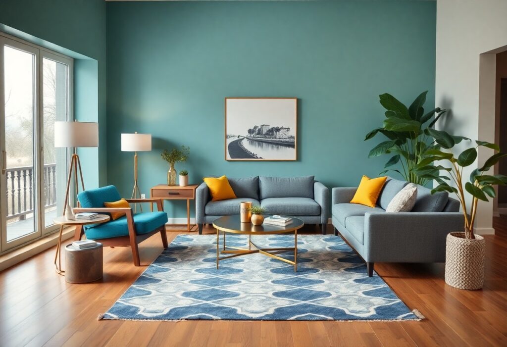
With decades of experience shaping spaces, I’ve seen how color directly influences mood and perception in ways most people overlook. I’ll show you how your choice of hue can make a room feel larger, warmer, or surprisingly tense. You don’t need a redesign-just one strategic color shift to transform your entire environment.
Key Takeaways:
- Color choices in interior design directly influence mood and perception, with warm tones like red and orange creating energy and intimacy, while cool shades such as blue and green promote calm and relaxation.
- Neutral colors like beige, gray, and white serve as flexible backdrops that enhance other hues and help make spaces feel larger and more balanced.
- Personal connection to color matters-selecting shades that resonate emotionally with the occupants can make a room feel more authentic and comfortable.
The Psychology of the Palette
Color shapes how you feel in a space long before you notice it. I’ve watched clients relax instantly in cool blue living rooms or grow animated in sunlit yellow kitchens. Your eyes register hue in seconds, triggering emotional responses rooted in memory and biology. Even subtle shifts in tone can alter mood, focus, and perception of space.
Emotional resonance of hues
Every shade carries emotional weight. I’ve seen soft lavender ease anxiety in bedrooms, while bold red in a dining area sparks conversation-and sometimes arguments. You don’t just see these colors; you feel them. Cool tones often calm, while warm ones energize-sometimes too much.
The temperament of a room
Walls don’t speak, but color gives them a voice. I once transformed a lifeless study with deep forest green, and suddenly it felt focused and grounded. Your room’s temperament isn’t just about furniture or light-it’s coded in the palette. A single hue can make a space feel inviting, tense, serene, or restless.
Choosing the right color means understanding the energy you want in a room. I’ve learned that a bedroom painted in warm greige can feel comforting, while that same tone in a home office may dull alertness. It’s not just personal preference-your brain interprets each shade as a signal. Get it right, and the room supports your intentions; get it wrong, and you’ll feel subtly off-balance without knowing why. I always test swatches at different times of day because natural light shifts the emotional impact. A blue that feels peaceful at noon might turn cold and isolating by evening. Your space should evolve with you, not fight against your rhythm.
The Tyranny of the Neutral
I’ve watched clients hesitate at the edge of color, clinging to beige like a security blanket. Your walls fade into the background, and your space loses its voice. The danger isn’t in calm-it’s in surrender. Living in endless neutrals can dull your senses and drain your energy, making home feel less like a sanctuary and more like a waiting room.
Escaping the beige prison
Color doesn’t have to shout to be heard. I once repainted a dim hallway in deep sage, and suddenly the space felt grounded and intentional. You don’t need a rainbow-just one bold choice to break the monotony. Even a single wall can shift your mood and redefine a room’s purpose.
Courage in pigmentation
Choosing a saturated hue feels risky, I admit. But I’ve seen how a cobalt kitchen or a rust-colored study can transform not just walls, but confidence. Color becomes an act of self-trust. When you commit, you tell yourself you’re allowed to take up space-visually and emotionally.
That deep emerald I used in a client’s bedroom wasn’t just paint-it was permission. At first, she called it “too much,” but within days, she said she slept better, felt calmer. Strong color absorbs attention and blocks mental noise, creating a cocoon that neutral tones often fail to achieve. I now see pigmentation not as decoration, but as psychological support-quiet, bold, and deeply personal.
Light as a Painter
I see light not just as illumination, but as a brush that reshapes color and mood in your space. The way sunlight shifts across a wall can transform a calm blue into something electric by noon. Interior Design Blog || Color Psychology … shows how intentional lighting choices influence emotional responses. What feels serene at dawn may pulse with energy at 3 PM-and that’s the power you can harness.
Shadows and illumination
Shadows add depth your eyes can’t ignore, creating contrast that defines texture and form. I’ve watched how a simple shelf cast in afternoon light becomes a sculptural element. These dark accents balance brightness and prevent spaces from feeling flat, turning empty walls into dynamic canvases shaped by time and angle.
The dance of the sun
Sunlight moves through your rooms like a silent performer, changing hues as it travels. I notice how east-facing spaces glow warmly at breakfast, then cool by midday. This natural rhythm affects how you experience color emotionally and physically, making timing part of the design itself.
As the sun arcs across the sky, its angle alters the intensity and direction of color saturation in your walls and furnishings. I’ve adjusted paint selections based on this daily journey, choosing cooler tones where harsh noon light amplifies warmth. By aligning your palette with the sun’s path, you create harmony instead of visual fatigue. It’s not just about how a color looks in a showroom-it’s how it lives and shifts in your real, sunlit world.
Textures and Tints
I’ve learned that color doesn’t stand alone-its true impact emerges when paired with texture. A soft blush on velvet feels intimate, while the same tint on a matte wall reads calm and collected. The interplay between surface and shade shapes how you experience a room. For deeper insight, I recommend this piece from The Secret Power of Color | Branders Magazine.
Velvet vs. Matte
Velvet absorbs light, giving rich hues a warm, inviting depth that matte finishes can’t match. You’ll notice how a deep emerald velvet chair feels luxurious and enveloping, while the same color in matte paint reads more restrained. This contrast shapes mood and perception, making material choice just as powerful as the palette.
Layering for depth
Layering tints of the same color family adds dimension without chaos. I often use a spectrum from soft dove gray to charcoal on walls, textiles, and accents to create subtle contrast. You feel the depth before you even notice it, making spaces more engaging and emotionally resonant.
When I layer tints, I start with a base tone on the walls, then introduce slightly darker or lighter versions through cushions, rugs, and artwork. This method avoids flatness and invites the eye to explore. The most successful interiors don’t shout-they whisper with nuance, guiding your emotions through quiet shifts in shade and texture that feel intentional and personal.
The Social Life of Pigments
I’ve watched how pigments move through homes like uninvited guests who end up shaping the mood. Color doesn’t just decorate-it communicates, silently influencing how you feel in a space. From ancient dyes to modern paints, every hue carries history, culture, and psychological weight you absorb without realizing.
Dining in crimson
Crimson sparks conversation and increases appetite by up to 20%, making it a favorite for dining rooms. I’ve seen even the shyest guests lean in and laugh louder under its warm glow. You don’t just eat in crimson-you engage, connect, and savor.
Sleeping in azure
Azure calms your nervous system the moment you enter the room. I recommend it for bedrooms because it lowers heart rate and supports deeper sleep. You’ll notice fewer restless nights when your walls breathe quiet, cool serenity.
When I first painted my bedroom azure, I didn’t expect the shift in my sleep quality. The color mimics a twilight sky, signaling your brain that it’s time to rest. Unlike harsh blues, azure lacks the stimulating undertones that disrupt melatonin. You’re not just choosing a shade-you’re setting a nightly rhythm. Over time, your body begins to associate the space with stillness, making it easier to unwind without screens or rituals. It’s one of the simplest, most effective design choices I’ve made for well-being.
Summing up
Conclusively, I see how color shapes your experience in a space. I know that the hues you choose do more than decorate-they influence mood, perception, and behavior. From calming blues to energizing yellows, I guide you to use color with intention, turning your rooms into environments that reflect and support your daily life.