Hornby

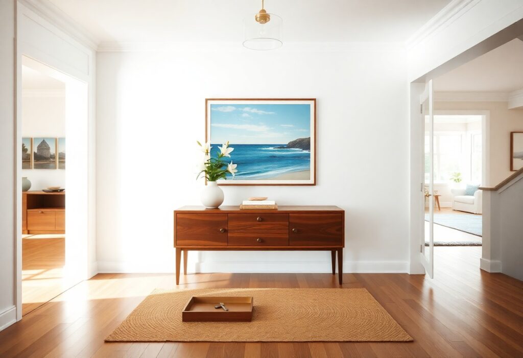
Which Artwork Creates the Best First Impression in a Vacation Rental?

Most guests form an opinion about your vacation rental within seconds of stepping inside, and I’ve found that the right artwork can make the difference between a forgettable stay and a memorable, shareable experience. You don’t need a gallery wall to impress-just one bold, intentional piece that speaks to place, personality, and comfort. What you […]

Which Artwork Creates the Best First Impression in a Vacation Rental? Read More »
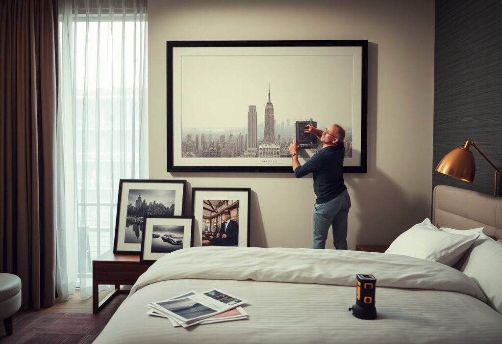
How to Choose Artwork for Hotel Rooms That Guests Will Remember

Just one piece of art can transform a hotel room from forgettable to unforgettable. I’ve seen how the right artwork creates an emotional connection, turning a simple stay into a lasting impression. You don’t need a museum budget-just a clear vision and attention to detail. The wrong choice can clash with your brand or even

How to Choose Artwork for Hotel Rooms That Guests Will Remember Read More »

What Colors Encourage Guests to Stay Longer and Feel More Comfortable?

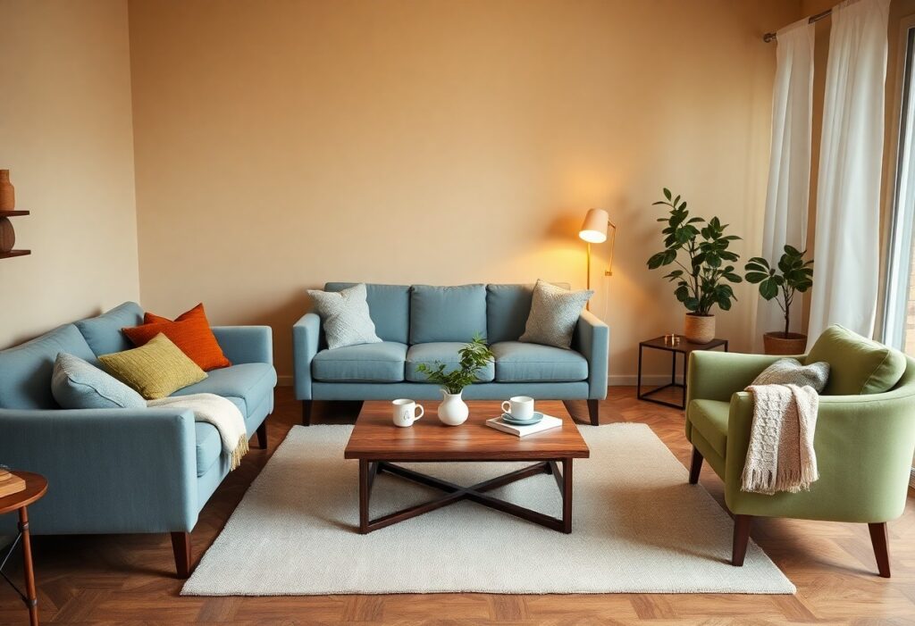
Just one shade shift on the wall can mean the difference between a guest glancing at their watch and sinking deeper into the sofa. I’ve noticed that when you balance warmth, depth, and subtlety in your color choices, you create spaces where people naturally relax. Earthy neutrals and soft blues don’t just look calming-they signal

What Colors Encourage Guests to Stay Longer and Feel More Comfortable? Read More »

Which Colors Help Restaurants Feel More Warm, Welcoming, and Comfortable?

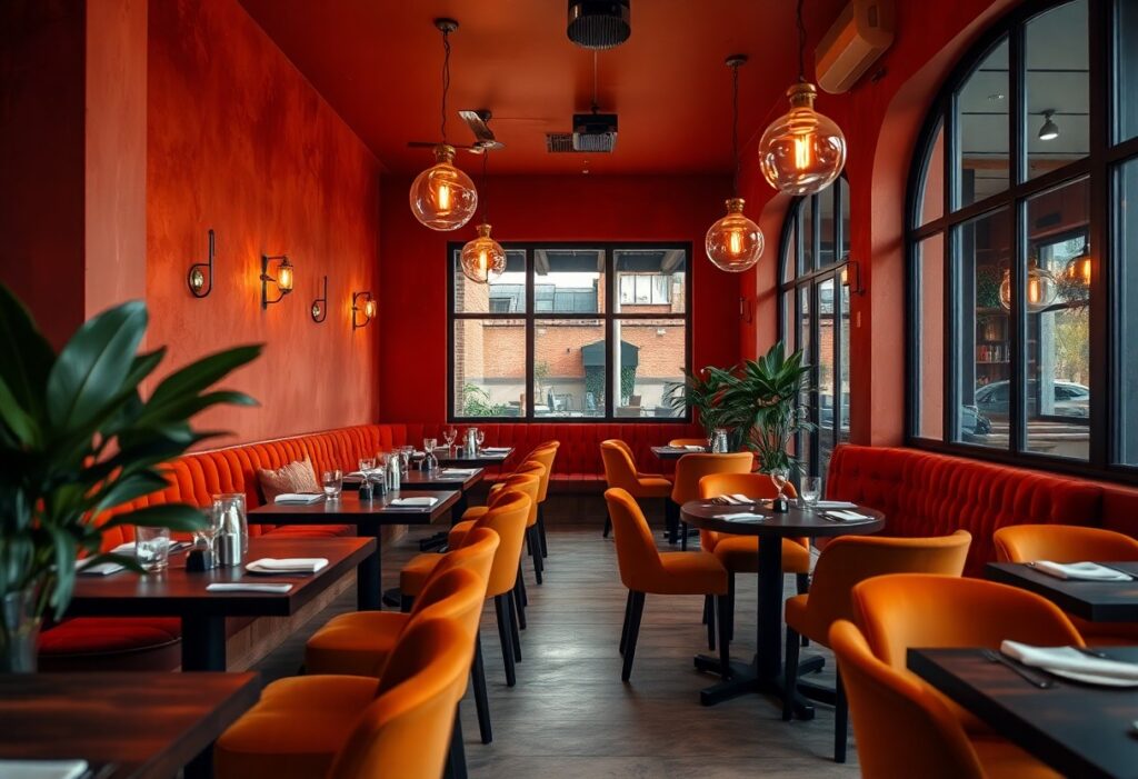
Colors shape how you experience a restaurant, often before you’ve even tasted a bite. I’ve watched guests relax the moment they step into a space bathed in warm terracotta or soft amber, while cooler tones can leave the same menu feeling less inviting. Red stimulates appetite, earth tones build trust, and poor color choices can

Which Colors Help Restaurants Feel More Warm, Welcoming, and Comfortable? Read More »

How to Choose Artwork That Makes Customers Feel Comfortable in Your Business

Artwork shapes how people experience your space before they even speak to a team member. I’ve seen a café lose regulars after switching to abstract, high-contrast pieces that made patrons feel restless. You don’t just want decoration-you want pieces that align with your brand and make your customers feel at ease. The wrong artwork can

How to Choose Artwork That Makes Customers Feel Comfortable in Your Business Read More »

Which Colors Work Best for Yoga Studios and Wellness Spaces?

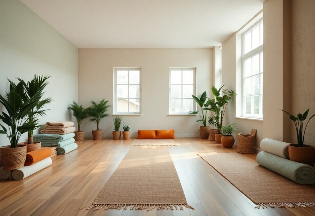
Most people don’t realize how deeply color influences mood and breath, yet I’ve seen how a single shade can shift the energy of a room from restless to profoundly calming. When you step into a wellness space, your nervous system responds before your mind does, making your color choices more than aesthetic-they’re physiological. I’ve watched

Which Colors Work Best for Yoga Studios and Wellness Spaces? Read More »

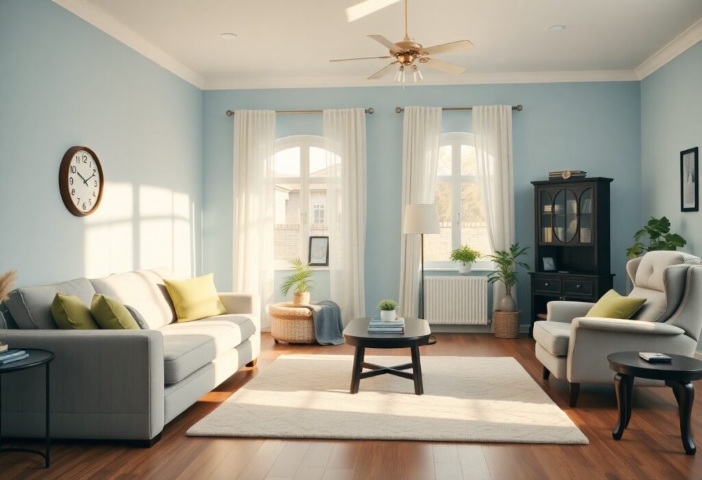
What Colors Help Seniors Feel More Comfortable and Relaxed at Home?

It’s remarkable how much color influences mood and perception, especially as we age. I’ve observed that subtle shifts in wall tones can significantly affect your sense of calm, with certain hues reducing visual strain and promoting emotional ease. For seniors, comfort isn’t just about furniture or lighting-color choice plays a direct role in daily well-being.

What Colors Help Seniors Feel More Comfortable and Relaxed at Home? Read More »

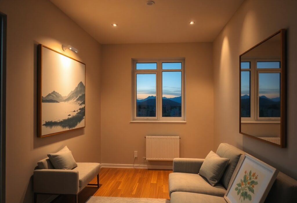
How to Choose Artwork for Homes With Limited Natural Light

There’s a common misconception that dim rooms can’t support bold or vibrant artwork, but I’ve found the opposite is true when you understand how light interacts with color and texture. You don’t need floor-to-ceiling windows to display compelling pieces-instead, your choices in medium, frame, and placement become the deciding factors in visual impact. I’ll show

How to Choose Artwork for Homes With Limited Natural Light Read More »

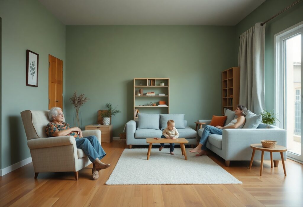
How to Use Color to Create a Calm Environment for Multigenerational Families

This approach begins with understanding how a single color can affect different family members in distinct ways, especially when three or more generations share one home. I’ve found that cool neutrals like soft greys and warm beiges often bridge generational gaps most effectively, creating a sense of balance without sacrificing comfort. You don’t need bold

How to Use Color to Create a Calm Environment for Multigenerational Families Read More »

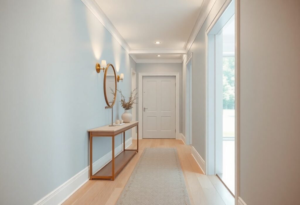
Which Colors Make Dark Hallways Feel Brighter and More Inviting?

You’ve likely walked down a narrow hallway that feels more like a tunnel, dim and unwelcoming no matter how often you flip the light switch. I’ve seen how the right paint color can transform these forgotten spaces, turning them from oppressive to open and luminous in a single stroke. You don’t need major renovations-just strategic

Which Colors Make Dark Hallways Feel Brighter and More Inviting? Read More »