
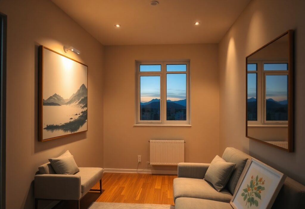
There’s a common misconception that dim rooms can’t support bold or vibrant artwork, but I’ve found the opposite is true when you understand how light interacts with color and texture. You don’t need floor-to-ceiling windows to display compelling pieces-instead, your choices in medium, frame, and placement become the deciding factors in visual impact. I’ll show you how to make every piece work harder in low-light environments.
Key Takeaways:
- Matte finishes on artwork reduce glare and diffuse ambient light more effectively than glossy surfaces, making them a better choice for spaces where natural illumination is sparse.
- Lighter color palettes and high-contrast compositions can create visual depth and draw the eye, helping a piece stand out even in dimly lit corners or hallways.
- Positioning artwork perpendicular to artificial light sources, such as floor or wall sconces, increases visibility and emphasizes texture, especially in oil or impasto pieces.
Assessing Environmental Factors in Low-Light Spaces
Understanding the room’s natural and artificial light patterns helps determine suitable artwork. I consider window direction, nearby obstructions, and overhead sources. Surface reflectivity and wall color influence perceived brightness. This ensures your art remains visible and impactful throughout the day.
Identifying ambient light limitations
North-facing rooms or spaces with small windows often receive minimal daylight. I observe how light shifts from morning to evening, noting dim corners. Overhanging trees or adjacent buildings can further reduce ambient brightness. This affects how colors and details in artwork are perceived over time.
Evaluating wall color and texture interactions
Dark or heavily textured walls absorb light, diminishing an artwork’s presence. I recommend pairing matte finishes with glossy frames to create contrast. Light-colored walls enhance reflectivity, helping diffuse available light. This improves visibility and depth in low-lit environments.
When evaluating wall color and texture interactions, I pay close attention to how surface finishes interact with nearby light sources. A smooth, pale wall can amplify the effect of a backlit canvas, while a rough, dark surface tends to swallow light and flatten visual depth. In one project, switching from charcoal plaster to a soft gray paint increased perceived illumination around a gallery wall by drawing more attention to the artwork’s highlights. This demonstrates how subtle changes in wall treatment directly influence the viewer’s experience of the piece.
How to Select the Ideal Art Medium
I recommend exploring reflective and metallic surfaces when selecting artwork for dim interiors, as they actively interact with ambient light. A mid-sized SaaS firm redesigned its lobby with mirrored acrylic pieces, resulting in a visibly brighter space. For a detailed walkthrough on aligning art with interior conditions, see How to Choose Art for Your Home: A Step-by-Step Guide ….
Prioritizing reflective and metallic surfaces
Metal prints with polished finishes return available light into the room, making them ideal for corners with minimal daylight. I’ve observed that even low-wattage overhead bulbs can create soft glints across aluminum surfaces, enhancing perceived brightness. These subtle highlights prevent the space from feeling flat or visually stagnant.
Avoiding matte finishes that absorb light
Matte surfaces tend to soak up light rather than reflect it, which can deepen the sense of dimness in a room. I’ve seen interiors where large matte canvases made walls appear to recede, creating a cave-like effect. This is especially problematic in north-facing rooms with limited daylight exposure.
When I evaluate finishes for low-light areas, I consistently rule out uncoated canvas or chalk-based prints because they lack luminance response. Instead, I opt for sealed or semi-gloss alternatives that maintain some reflectivity without glare. A matte finish might look sophisticated in a sunlit gallery, but in a dim hallway, it risks disappearing entirely after dusk.
Color Theory Tips for Darker Rooms
Choosing the right colors in artwork can transform a dim room. I prioritize high-contrast palettes and warm tones to counteract flat lighting. Lighter backgrounds with bold accents draw the eye and create depth. For practical advice, see this discussion on What are tips for choosing wall art that brings back warmth. This approach ensures visual engagement without relying on natural light.
Utilizing high-contrast palettes for visibility
Strong tonal differences between elements in a piece improve legibility in low light. I look for artwork where light and dark areas clearly oppose each other, such as charcoal sketches on cream paper or graphic prints with deep blacks and bright whites. This contrast creates definition even under artificial lighting.
Selecting warm tones to create artificial glow
Warm hues like ochre, terracotta, and golden amber simulate the effect of sunlight. I find these shades make a space feel more inviting and visually brighter. This emotional warmth compensates for the lack of daylight.
When I select pieces with warm undertones, I focus on pigments that reflect available light rather than absorb it. A painting with a sunset gradient or gilded accents can subtly bounce illumination across a wall. Even in a north-facing room with minimal windows, such artwork introduces a sense of radiance. This effect is especially effective behind seating areas or along hallways where ambient brightness is lowest.
Strategic Placement Factors for Maximum Impact
Positioning artwork where ambient light naturally pools increases visibility and draws the eye. I prioritize walls near lamps, hallways, or reflective surfaces that amplify available brightness. Strategic placement ensures each piece contributes to spatial depth. Aligning art with secondary light sources, using mirrors to bounce light onto canvases, and avoiding shadow-heavy corners are key. Recognizing light behavior in your space transforms how art is experienced.
Aligning art with secondary light sources
I place paintings near table lamps, floor lights, or overhead fixtures that emit soft, indirect illumination. Secondary light sources can highlight a canvas without causing glare. You’ll notice richer color depth when light hits the surface at an angle. This method works especially well for textured pieces. Recognizing where artificial light lands during evening hours improves your display significantly.
Using mirrors to bounce light onto canvases
I’ve found that positioning a mirror opposite a window or lamp can redirect light onto a nearby artwork. The reflected glow enhances visibility without altering the room’s layout. Mirrors act as passive amplifiers in dim areas. You can test angles by moving a handheld mirror until the canvas catches the light. Recognizing the optimal reflection point makes a visible difference.
A large mirror placed beside a north-facing wall in a mid-sized SaaS firm’s office redirected daylight toward a series of monochromatic prints, making them appear more dynamic throughout the morning. The effect was subtle but consistent, reducing the need for additional fixtures. I recommend testing mirror placement during different times of day, as shifts in sunlight alter the reflection path. Using mirrors to bounce light onto canvases works best when the frame and glass are glare-resistant.
How to Enhance Visibility with Dedicated Lighting
I rely on targeted lighting to bring life to artwork in dim interiors. Without sufficient illumination, even the boldest pieces can fade into the background. I always install dedicated light sources near or above art to ensure visibility and depth. Proper lighting doesn’t just reveal details-it transforms how a piece interacts with its surroundings, making it feel present and intentional within the space.
Implementing adjustable LED picture lights
I use adjustable LED picture lights because they let you direct illumination exactly where needed. These fixtures mount easily above or beside frames and can be angled to reduce glare on glass or canvas. I prefer models with dimmer compatibility so I can fine-tune brightness based on time of day or room use, ensuring the artwork remains the focal point without washing out.
Choosing the correct color rendering index (CRI)
I never overlook the CRI when selecting bulbs for art lighting. A high CRI-ideally above 90-means colors appear more true to life under artificial light. Low-CRI lighting distorts hues, making reds look dull or blues appear flat, which defeats the purpose of carefully chosen artwork. I always check packaging for CRI values before purchasing.
When I evaluate lighting for art, I treat CRI as non-negotiable. Standard bulbs often render colors inaccurately, especially in warm-toned pieces where subtle shifts in pigment matter. I once lit a landscape painting with a low-CRI bulb and the golden sunset turned muddy overnight. Switching to a 95 CRI LED restored warmth and depth instantly. Accurate color representation preserves the artist’s intent and maintains visual harmony in low-light rooms.
Expert Tips for Framing and Glazing
Proper framing and glazing can dramatically improve how artwork reads in dim environments. I recommend using anti-reflective museum glass to eliminate glare and enhance color clarity. Choose frame finishes that contrast with your wall color to draw the eye. Any thoughtful detail elevates the piece, such as those highlighted in this guide on how to choose art for your home: curate a collection of art.
- Use anti-reflective glass to reduce glare from artificial lighting
- Select frame colors that contrast with both the artwork and wall
- Avoid thick, dark frames that can absorb light and diminish visibility
- Consider lightweight materials to prevent visual heaviness in small spaces
Incorporating anti-reflective museum glass
I always specify anti-reflective museum glass for homes with limited natural light because it allows more visible light to pass through while minimizing distracting reflections from lamps or overhead fixtures. This glazing option preserves the artwork’s true tones and increases legibility, especially in rooms lit primarily after sunset.
Selecting frame finishes that provide contrast
A light-colored frame on a dark wall-or vice versa-creates a visual anchor that helps the artwork stand out. I find that metallic finishes like brushed nickel or pale gold add subtle brightness without overwhelming the composition.
When identifying frame finishes, I focus on how they interact with both the artwork and the surrounding wall color. A mid-sized SaaS firm’s office renovation, for example, used warm brass frames against deep charcoal walls, which not only highlighted the prints but also reflected ambient light effectively. Strong contrast prevents the piece from visually receding, ensuring it remains a focal point even in low illumination.
Final Words
I’ve found that choosing artwork for homes with limited natural light comes down to thoughtful material choices and intentional placement. You don’t need bright sunlight to showcase pieces effectively-your selection of matte finishes, reflective surfaces, or backlit frames can make a noticeable difference. I always recommend testing how a piece interacts with artificial light at different times of day. A painting that feels flat under overhead lighting might come alive with a well-placed picture light. Your space, no matter how dim, can still highlight art with depth and character.