
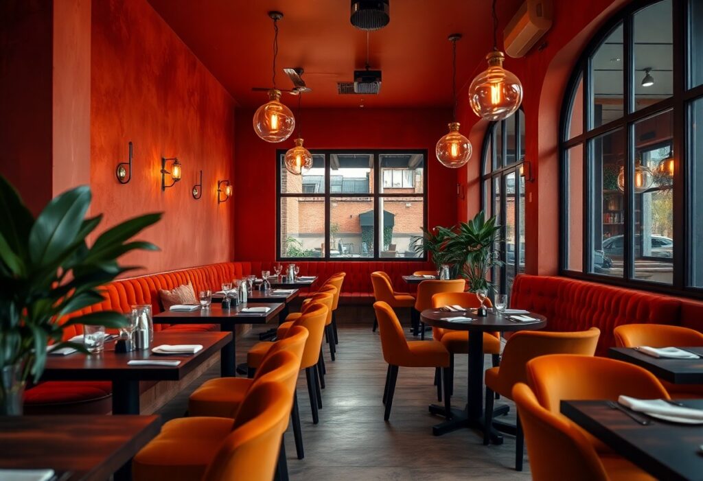
Colors shape how you experience a restaurant, often before you’ve even tasted a bite. I’ve watched guests relax the moment they step into a space bathed in warm terracotta or soft amber, while cooler tones can leave the same menu feeling less inviting. Red stimulates appetite, earth tones build trust, and poor color choices can quietly drive customers away. Your space’s palette is silent but powerful.
Key Takeaways:
- Warm reds and oranges stimulate appetite and conversation, making them ideal for dining areas where energy and engagement are desired, such as in fast-casual chains like McDonald’s, which uses red and yellow to encourage quick turnover and visibility.
- Earthy tones like terracotta, olive green, and warm browns create a grounded, inviting atmosphere, often seen in farm-to-table restaurants that emphasize natural ingredients and rustic authenticity.
- Soft, warm lighting paired with beige, cream, or sand-colored walls enhances coziness without overwhelming the senses, allowing food to remain the focal point while contributing to a relaxed, unhurried guest experience.
The Primal Hunger of Crimson
I’ve watched diners linger longer in booths bathed in deep reds, their hands reaching instinctively for bread before the menu arrives. Crimson doesn’t whisper-it commands attention, accelerating heart rates and stimulating appetite through primal association with ripe fruit and cooked meat. A well-placed scarlet wall behind the bar or in upholstery can increase perceived warmth by several degrees, making even a new restaurant feel lived-in. I once advised a neighborhood bistro to repaint their dining room from cool gray to terracotta-red, and within weeks, repeat customers remarked it felt “like home, but better.”
Earthy Hues and Honest Grit
I find that terracotta, raw sienna, and deep olive bring a grounded warmth to dining spaces, mimicking the natural materials found in stone, wood, and clay. These colors don’t shout; they settle, creating an atmosphere where guests linger longer and feel more at ease. In a neighborhood bistro I consulted for, swapping cool gray walls for a warm, earth-toned plaster finish led to immediate positive feedback-patrons described the room as “cozy” and “inviting” without knowing any changes had been made. Earth tones work best when paired with textured finishes, like troweled paint or reclaimed wood, reinforcing a sense of authenticity that modern finishes often lack.
The Golden Glow of Comfort
I’ve noticed how a warm golden hue can transform a dining space, making it feel instantly cozier and more inviting. This isn’t just aesthetic preference-research into the Psychology of Color in Restaurant Interior Design shows that gold and soft amber tones stimulate appetite while evoking feelings of luxury and comfort. Unlike harsher warm tones, gold adds richness without overwhelming, making it ideal for upscale casual environments where relaxation and indulgence go hand in hand.
Neutrals with a Soul
I’ve found that warm beiges, soft taupes, and greiges with subtle undertones of peach or clay invite calm without dulling the energy of a dining space. These tones act as a quiet foundation, allowing wood accents, textured walls, or handmade tableware to speak with authenticity. When dicking out a neutral, I always test it at different times of day-natural light can reveal hidden coolness in a shade that looks warm in the store. For inspiration on how to pair these tones effectively, see the curated examples at Best Restaurant Wall Colors to Attract More Customers. A well-chosen neutral doesn’t recede-it grounds the entire experience in comfort.
The Appetite-Killing Chill of Blue
I avoid blue in dining spaces because it suppresses appetite-our brains don’t link it to edible foods in nature. While a splash of blue might add visual contrast, large swaths dull hunger cues and make meals feel less inviting. I’ve seen diners linger longer in warm-toned rooms, but in cooler ones, even well-prepared dishes seem less appealing. That’s why I rarely recommend blue as a dominant hue.
Lighting the Scene
I’ve watched diners linger longer under soft, warm-toned lighting, their faces relaxed, the space feeling more intimate. Bright, cool LEDs can wash out a room, making even the coziest palette feel sterile. I always recommend dimmable fixtures paired with bulbs in the 2700K-3000K range, because they enhance warm wall colors without distorting them. A well-lit table, gently illuminated, makes food look richer and guests feel seen, not exposed.
To wrap up
I’ve found that warm, welcoming restaurant spaces often rely on colors that mirror natural, nourishing environments-deep reds, burnt oranges, and warm browns invite conversation and appetite, while harsh or cool tones like blue can subconsciously suppress hunger. In my experience, the most comfortable dining atmospheres pair these hues with soft, layered lighting and organic textures, creating a space where you naturally want to linger over a meal. A mid-sized SaaS firm might prioritize efficiency, but in hospitality, it’s the subtle emotional cues that shape your experience.