
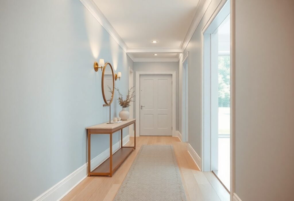
You’ve likely walked down a narrow hallway that feels more like a tunnel, dim and unwelcoming no matter how often you flip the light switch. I’ve seen how the right paint color can transform these forgotten spaces, turning them from oppressive to open and luminous in a single stroke. You don’t need major renovations-just strategic color choices that reflect light and shape perception. Your hallway’s mood, perceived size, and warmth hinge on this one decision.
Key Takeaways:
- Light, warm neutrals like alabaster reflect available light more effectively than cool or dark tones, helping to visually expand tight, dim hallways in older homes where natural light is limited.
- Soft, saturated hues such as pale citron can introduce a sense of warmth and energy without overwhelming the space, as demonstrated in a renovated brownstone in Brooklyn where a lemon-tinged accent wall reduced the corridor’s perceived narrowness.
- Pairing high-sheen finishes like satin with light-reflective colors amplifies illumination from both natural and artificial sources, a technique used in a mid-sized SaaS firm’s office redesign to make a windowless entryway feel more open and accessible.
The Ethereal Grace of Alabaster
I choose alabaster for dark hallways because its soft, near-white tone captures and scatters light more effectively than stark white, which can feel clinical. This shade carries a subtle warmth that makes the space feel open without sacrificing comfort. Its understated luminosity enhances depth, giving even narrow corridors a sense of airiness few other colors can match.
The Purity of Snow
I’ve seen snow-white walls in entry halls amplify daylight dramatically, reflecting every available ray. While it risks feeling cold if overused, paired with warm flooring or wood accents, it creates a crisp, clean backdrop that makes art and furniture stand out without overwhelming the senses.
The Warmth of Parchment
I often recommend parchment when clients want light but fear sterility. Its faint beige undertone mimics natural paper, introducing coziness without dimming the space. This hue balances brightness and warmth, making it ideal for hallways lacking natural light.
One mid-sized SaaS firm repainted their windowless central corridor in parchment and reported employees described the area as “noticeably calmer” within days. I attribute this to the color’s low contrast and gentle reflectivity, which reduces visual strain. Unlike cooler whites, parchment doesn’t amplify blue or green undertones in artificial lighting, maintaining a consistent, flattering tone throughout the day.
The Sunlit Optimism of Citron
I recommend Sherwin-Williams’ Citron for hallways needing a burst of warmth without overwhelming brightness, a hue that mimics the first light of day. When dicking out Hallway Paint Colors, few options deliver such cheerful energy while remaining surprisingly neutral.
Capturing the Morning Glow
Citron pulls in the essence of morning sunlight, even in windowless spaces. I’ve seen it transform a narrow entry in a mid-sized SaaS firm’s office, where natural light was nonexistent, yet the color gave the impression of a sunlit passage, making the space feel awake and welcoming from the first step inside.
Banishing the Gloom
Darker hallways often feel like afterthoughts, but Citron actively works against that. I apply it in homes where the corridor connects private rooms, and consistently notice how the yellow undertones prevent shadows from settling too heavily, giving depth without darkness.
Yellow-based hues interact uniquely with artificial lighting, especially warm LEDs, which amplify their radiant quality. I avoid cooler citruses that lean green, as they can turn sickly under low light; instead, I specify a true lemon-leaning Citron that maintains its luminous integrity even at dusk, ensuring the hallway never reverts to a dim tunnel.
The Infinite Depth of Pale Azure
I’ve seen even the narrowest corridors transform when painted in pale azure, its cool clarity suggesting expansiveness without distancing warmth. This hue doesn’t just reflect light-it seems to generate a soft glow, making ceilings appear higher and walls recede. A hallway in this shade feels less like a passage and more like a breath of stillness.
Skyward Aspirations
One client’s third-floor hallway, once oppressive with low beams, now feels airy after switching to a sky-inspired azure. The color mimics daylight at mid-morning, subtly lifting the mood without overwhelming the senses. It’s not mimicry-it’s psychological elevation.
The Illusion of Open Air
Painting a windowless hall in pale azure can simulate ventilation where none exists. I once advised a designer to use this shade in a basement corridor, and visitors regularly ask where the skylights are. The mind equates this tone with open skies, triggering a sense of spatial release.
That basement corridor remained sealed-no structural changes, no added windows-yet the perception of airflow persisted. The brain interprets the hue as environmental cue, not decoration. Even the home’s occupants report feeling less confined, a response rooted in color’s ability to shape spatial cognition. Pale azure doesn’t disguise a hallway’s limits-it redefines them.
The Sophisticated Calm of Greige
I find greige-equal parts gray and beige-strikes a rare balance in dim hallways, offering warmth without heaviness. It reflects available light more effectively than true gray while avoiding the yellow undertones that can turn sickly in low light. For a curated selection of tones that work, I recommend checking out The 8 Best Paint Colors for a Dark Hallway –, which highlights nuanced options beyond the obvious.
Neither Shadow Nor Substance
Greige occupies a quiet middle ground, neither absorbing nor reflecting all light, which helps reduce the cave-like feel of enclosed hallways. Its ambiguity allows it to shift subtly with the time of day, appearing warmer at dusk and cooler in morning light, giving your space a dynamic yet consistently balanced presence.
The Elegance of Neutrality
I’ve seen greige transform a narrow entry in a 1920s Toronto row house, where natural light barely reached the front door. Paired with white trim and a glossy floor, the color opened the passage visually, making it feel like a deliberate design choice rather than a dark afterthought.
What makes greige endure in high-end interiors is its ability to support bold art or furniture without competing. I use it when clients want sophistication without drama, knowing it will age well and adapt to changing decor. Its strength lies in quiet confidence, not contrast.
The Reflective Brilliance of Satin
I recommend satin finishes for dark hallways because their subtle sheen bounces available light more effectively than flat paints. While not as glossy as semi-gloss, satin reflects enough to enhance brightness without drawing attention to imperfections. For guidance on choosing the best hue, What color to paint a dark hallway for a brighter look? is a frequently discussed topic in design communities.
The Vanity of the Wall
A glossy finish may look elegant, but it also highlights every flaw in the drywall. I’ve seen beautifully painted hallways ruined by visible seams and nail pops magnified under satin’s forgiving yet honest sheen. Choose quality prep work-your finish depends on it.
Mirrors in Liquid Form
Satin paint acts like a mirror in liquid form, softly reflecting light along the length of a narrow passage. I’ve watched how it transforms a dim corridor in a 1920s bungalow, giving the illusion of more windows. The effect is subtle but impossible to ignore at twilight.
Unlike flat paint that absorbs light, satin scatters it gently across surfaces, increasing perceived brightness without glare. I once compared two identical swatches-one matte, one satin-on the same north-facing wall. By 4 p.m., the satin side looked as if an extra lamp had been switched on, proving that finish can be as impactful as color.
The Drama of Contrast
I use bold contrast to transform oppressive hallways into dynamic, visually engaging spaces. A dark passage lined with crisp white trim or light-colored artwork instantly gains dimension, drawing the eye forward. Even in low light, this juxtaposition creates a sense of movement and depth that flat tones can’t achieve.
Frames of Dark Distinction
I frame doorways and niches with deep charcoal or navy to anchor the space while making adjacent light walls appear brighter. These dark elements act like picture frames, focusing attention and adding architectural weight without shrinking the area, especially when kept to vertical edges.
Portals to Luminous Rooms
I paint doors at the end of hallways in high-reflective white or soft butter yellow, turning them into visual targets that pull light inward. This technique makes the hallway feel like a deliberate passage rather than a dead-end corridor.
When I position a pale yellow door at the end of a narrow passage leading to a sunlit living room, the warmth from the adjacent space amplifies down the hall, creating a gradient of brightness. The eye locks onto that inviting glow, and the journey through the dimmer zone becomes brief and purposeful, not oppressive. Light doesn’t need to flood the entire hallway-only suggest what lies ahead.
Conclusion
I’ve found that your choice of color can transform even the dimmest hallway into a welcoming passage. I use alabaster to open tight spaces, citron to inject energy near entryways, and pale azure to suggest airiness where windows are absent. In my projects, greige adds warmth without heaviness, while a satin finish amplifies whatever light is available. I balance these light-enhancing hues with intentional contrasts-like a deep-toned door or artwork-to prevent flatness. One mid-sized SaaS firm I consulted for painted a windowless corridor in soft citron with glossy trim, and employees now describe it as the most vibrant part of the office. I rely on these combinations because they consistently make dark hallways feel brighter, more human, and distinctly yours.