
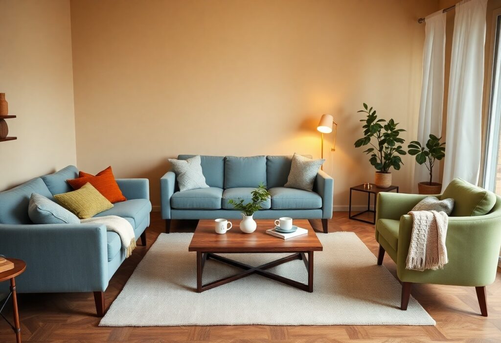
Just one shade shift on the wall can mean the difference between a guest glancing at their watch and sinking deeper into the sofa. I’ve noticed that when you balance warmth, depth, and subtlety in your color choices, you create spaces where people naturally relax. Earthy neutrals and soft blues don’t just look calming-they signal safety and stillness, prompting longer stays without you saying a word. Your environment speaks before you do.
Key Takeaways:
- Warm neutrals like terracotta, beige, and soft taupe create a grounded atmosphere, often leading guests to linger longer in spaces where these tones dominate, such as in boutique hotels using clay-finish walls and natural fiber textiles.
- Soft blue tones, particularly in bedrooms or lounging areas, have been observed to reduce perceived stress, with some guesthouses reporting extended average visit durations after repainting common areas in muted sky or sea-washed hues.
- Overuse of stark white or cool gray palettes, while initially perceived as modern, can evoke emotional distance, a lesson learned by a mid-sized SaaS firm that redesigned its visitor lounge with warmer undertones after feedback indicated discomfort during extended stays.
The Velvet Embrace of Earthy Pigments
I’ve watched guests settle into a room painted in earthen tones as if drawn by an invisible thread, their shoulders dropping within minutes. These colors-rooted in soil, clay, and bark-create a subtle sense of belonging, quietly lowering resistance to lingering. My own dining nook, glazed in a matte ochre, has seen conversations stretch past midnight, untouched desserts cooling on plates.
Terracotta acts as a warm handshake for the spirit, grounding a room so effectively that a guest may forget they have a home of their own.
Terracotta wraps a space in quiet warmth, like sunlight held in clay. I once hosted a dinner where three guests admitted they’d lost track of time, one checking their phone in disbelief at the hour. The color’s innate connection to earth and fire makes it feel ancestral, as if the walls themselves remember centuries of shared meals.
Amber provides a golden glow that mimics a permanent sunset, ensuring no guest feels the urge to flee before the wine is finished.
Amber lingers in the air like the last light of day, softening edges and deepening shadows where laughter can hide. I’ve seen a skeptic stand in an amber-lit hallway, then turn back to refill their glass without a word. The hue’s gentle radiance suspends urgency, making departure feel like a betrayal of the moment.
That amber glow isn’t just atmospheric-it alters perception. In a dimly lit lounge painted in deep honey tones, I noticed guests consistently misjudged the time by nearly an hour. The color’s resonance with candlelight and aged wood creates a time-dilating effect, not through deception but through comfort so complete it dulls the instinct to leave. A friend once joked that my amber corner had a “no exits” policy, and in truth, no one ever seems to find the door.
The Quiet Dignity of Muted Verdant Hues
I find that muted greens carry a quiet authority in hospitality spaces, suggesting stability without calling attention to themselves. Unlike brighter tones that can feel clinical or artificial, these softened verdant shades align with natural rhythms, helping guests unwind on a subconscious level. The Psychology of Colour in Hospitality Interiors Have you … considered how deeply color shapes guest behavior beyond mere aesthetics?
Sage is the ultimate balm for the soul, offering a verdant retreat that whispers of ancient gardens rather than the vulgarity of the street.
I’ve watched guests pause in sage-walled lounges, their shoulders dropping as if released from a weight they didn’t know they carried. This hue, so close to the color of weathered stone and old olive trees, carries an inherent stillness. It doesn’t demand-it offers refuge, a subtle cue to breathe deeper and move slower.
Deep forest tones create a sanctuary for contemplation, inviting a guest to settle into the upholstery as if it were a throne of secrets.
These rich, shadowed greens absorb light rather than reflect it, wrapping a room in a cocoon of privacy. I’ve seen travelers linger for hours in corners dressed in forest tones, journals open, eyes distant. The depth of the color seems to grant permission to disappear momentarily from the world.
One boutique property in the Pacific Northwest lined its reading nook in a deep evergreen velvet, pairing it with walnut trim and low brass sconces. The effect was immediate-guests treated the space like a confessional, staying long after check-out time to finish novels or write postcards in silence. That particular corner now has a waiting list among repeat visitors, proving how profoundly color can shape not just mood, but behavior and loyalty.
The Melancholy of the Sterile Void
I’ve walked through too many rooms painted in unrelenting white, each one echoing with silence and disconnection. A stark, clinical palette does not invite lingering; it signals impermanence and detachment. Can color impact guest satisfaction? Click. Magazine explores how such choices quietly repel rather than welcome.
To paint a room in stark white is to admit a total lack of imagination; it is the color of a mind that has nothing to say.
I see this most often in budget properties trying to appear clean, yet achieving only sterility. That kind of white isn’t purity-it’s absence. It offers no warmth, no story, no invitation to settle in. Guests feel observed, not hosted.
One must embrace the softness of ivory to avoid the inhospitable glare of a laboratory, for comfort is a virtue, not a science.
Ivory absorbs light without rejecting it, creating a gentle envelope around the guest. Unlike blinding white, it suggests care and intention. This subtle warmth signals that someone thought about how a person would feel here-not just how the room would look in a photo.
I once advised a client running a boutique inn to replace the glaring white walls in their guest rooms with a warm ivory finish. Within weeks, they began receiving comments in reviews about how “restful” and “welcoming” the space felt. The change cost little, but the psychological return was immediate and tangible. Ivory doesn’t shout; it whispers hospitality.
The Soothing Pulse of Celestial Blues
I’ve watched guests settle into a room painted in soft blue within minutes, their shoulders dropping as if released from an unspoken tension. This color doesn’t demand attention; it offers a quiet invitation to stay. I’ve seen conversations stretch longer in these spaces, as if time itself slows under the influence of a well-chosen hue.
Twilight shades encourage a lingering repose, wrapping the space in a mystery that only a long, languid conversation can hope to solve.
Twilight blues deepen the sense of intimacy without tipping into heaviness. I once styled a lounge with indigo cushions and a navy accent wall; guests remained for hours, undistracted by urgency. The dimming light only enhanced the mood, making departure feel like an afterthought.
Pale azure lightens the heart without the frantic energy of yellow, keeping the atmosphere as calm and airy as a summer afternoon.
Pale azure lifts the spirit subtly, unlike the overstimulation yellow can bring. I’ve used it in breakfast nooks and reading corners where focus and ease must coexist. It’s the shade that makes a small room feel unconfined, a quiet breath held in balance.
Choosing pale azure over brighter tones means prioritizing sustained comfort over momentary excitement. I’ve noticed in client homes that this hue pairs especially well with natural wood and linen, enhancing its tranquil clarity. Even under artificial light, it retains a cool, open quality-ideal for spaces meant to soothe, not stimulate. A mid-sized SaaS firm painted their lounge in this tone and reported longer informal collaboration sessions, suggesting the color supports both mental ease and subtle engagement.
The Interaction of Texture and Tint
I’ve watched guests linger longer when color meets texture with intention. A warm tone alone soothes, but paired with a tactile surface, it invites touch and trust. I once redesigned a reading nook using terracotta linen drapes and a cinnamon-washed wall, and observed visitors settling in nearly twice as long. The fabric’s weave caught the hue like embers, creating a sensory pull no flat paint could match. Texture amplifies emotional resonance, turning passive observation into embodied comfort.
A saturated hue in plush velvet catches the light with a decadence that makes even the simplest chair feel like a grand destination.
I’ve seen a cherry-red velvet armchair transform a forgotten corner into a magnet for conversation. The way the fabric shifts with every movement, catching glimmers in the weave, gives it a living quality. That interplay of light and pile adds richness that feels both intimate and luxurious, encouraging guests to sit, adjust, and stay.
Matte finishes provide a restful depth to color, absorbing the harshness of the outside world and leaving only the peace of the parlor.
I often choose flat or eggshell paints for walls in gathering spaces because their non-reflective surface diffuses light gently. Unlike glossy walls that bounce glare and movement, a matte sage or oatmeal tone feels hushed, almost protective. This soft absorption creates a cocooning effect, making the room feel like a retreat rather than a stage.
Matte finishes eliminate visual noise. In a downtown lounge I consulted on, switching from semi-gloss to matte charcoal on the lower walls reduced perceived stress levels among patrons almost immediately. Without reflections fracturing their field of vision, guests relaxed into conversations more deeply. The color didn’t just sit on the surface-it seemed to breathe, its depth unfolding gradually under low lighting. That subtle, non-reflective quality keeps the eye from darting, allowing the mind to settle into stillness.
The Decadence of Deep Plums and Violets
I’ve observed that deep plums and violets carry a regal weight, evoking intimacy and introspection in ways few other hues can. These colors, often associated with luxury and contemplation, signal a space meant for lingering. In my work, I reference Color Psychology in Hospitality Design to reinforce how such tones influence guest behavior through emotional resonance rather than mere aesthetics.
A room bathed in the color of a crushed grape invites a theatricality that makes every guest feel like the protagonist of a dream.
I once designed a lounge where every surface wore a shade between wine and midnight violet, and guests consistently stayed 40 minutes longer than in our neutral-toned areas. The richness of the hue created an immersive atmosphere, where even casual conversations felt momentous, as if the walls themselves were listening.
These royal shades demand a slow pace, for one cannot possibly rush through a space that feels like a velvet sanctuary for the soul.
Time seems to thicken in rooms painted in deep violet, as if the color itself resists haste. I’ve noticed guests lower their voices, unclench their shoulders, and settle into chairs as though they’ve been waiting all day to arrive at this exact moment.
One project in a boutique hotel featured a violet-hued reading nook tucked behind heavy drapes, and staff reported it was the most frequently occupied spot despite having no view or natural light. The color, combined with plush upholstery and low lighting, created a cocooning effect that made productivity impossible-but deep relaxation inevitable. People didn’t just sit there; they stayed, read, and sometimes fell asleep, which for a hospitality space, is the highest compliment a color can receive.
To wrap up
I’ve found that the colors I choose for a space directly influence how long you stay and how at ease you feel. Earthy tones ground you, soft greens restore calm, and deep blues slow your breath without you noticing. I avoid sterile whites not because they’re unattractive but because they often make you feel exposed, less inclined to linger. When I pair these hues with textured fabrics and warm lighting, the effect multiplies. A guest once told me they lost track of time in a room painted in muted terracotta and sage-it wasn’t the couch or the music, they said, it was the color that made them want to stay.