
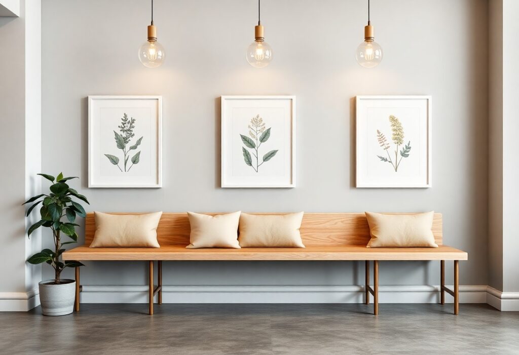
Artwork shapes how people experience your space before they even speak to a team member. I’ve seen a café lose regulars after switching to abstract, high-contrast pieces that made patrons feel restless. You don’t just want decoration-you want pieces that align with your brand and make your customers feel at ease. The wrong artwork can disrupt mood and shorten visits, while the right selection builds connection and encourages lingering.
Key Takeaways:
- A business’s artwork should reflect both its brand identity and the expectations of its primary customers, such as a boutique law firm selecting framed historical legal documents to convey tradition and trust.
- Visual comfort is influenced by color temperature and subject matter, with soft blues and natural landscapes often promoting calmness in high-traffic areas like waiting rooms or lobbies.
- Proper scale and placement ensure artwork enhances rather than overwhelms a space, as seen in a mid-sized SaaS firm that installed a series of small, abstract panels at eye level along narrow hallways to guide movement without crowding.
Identifying Your Brand Identity and Customer Demographics
Defining the emotional goals of your business environment
I shape the atmosphere of my space to reflect the feelings I want customers to experience. A calming hue or a familiar scene can ease tension in a waiting area, while bold colors might energize a creative studio. I focus on emotional resonance, ensuring every piece supports the mood I intend-whether it’s trust, inspiration, or relaxation-so visitors feel aligned with my brand the moment they walk in.
Analyzing the aesthetic preferences of your target audience
I consider the visual language my customers respond to, whether it’s minimalist line art or vibrant local photography. A younger urban crowd may connect with street-inspired pieces, while a luxury clientele might prefer classic oil paintings. Recognizing these patterns helps me select artwork that feels personally relevant and welcoming to those I serve.
One mid-sized boutique I advised shifted from abstract expressionism to regional landscapes after observing that their most loyal clients consistently mentioned local pride in feedback surveys. The change didn’t just improve aesthetic alignment-it led to longer dwell times and more frequent return visits. I now routinely review customer interactions and social media engagement to detect visual themes that resonate, using real behavior instead of assumptions to guide selections. This direct feedback loop reveals unspoken preferences that demographics alone can’t capture.
Evaluating Key Factors for Visual Comfort
Comfortable visual environments rely on balanced color palettes, non-threatening subject matter, and appropriate scale relative to the space. I prioritize pieces that avoid sharp contrasts or chaotic compositions, which can subconsciously elevate stress. Lighting glare on frames is another detail I always check during installation walks. How to Gain Corporate Clients and Get Your Art Seen offers practical insights on aligning artistic choices with client expectations. Recognizing
Utilizing color psychology to influence customer mood
Soft blues and warm earth tones often create calm, making them ideal for reception areas where patience and relaxation matter. I avoid overly saturated reds in high-traffic zones, as they can increase perceived urgency. Neutral backgrounds with subtle accent colors let guests focus without distraction. Your choice of hue directly shapes how long people stay and how they feel while there.
Selecting subject matter that reduces stress and anxiety
Natural scenes like forests, gentle water, or open fields tend to lower heart rates and ease mental fatigue. I steer clear of abstract or emotionally intense works in waiting or service areas. Familiar, non-confrontational imagery supports a sense of safety. Your customers should feel at ease, not questioned or challenged by what they see.
When I assess subject matter for a healthcare provider’s office, I chose a series of framed botanical illustrations-detailed yet predictable in form, offering visual interest without tension. The absence of human figures removed potential emotional triggers, while the organic lines mirrored the clinic’s focus on wellness. Even the frame colors were muted greens and greys, reinforcing continuity. This kind of deliberate selection ensures the art supports, rather than disrupts, the intended emotional tone.
How to Choose Art Based on Room Functionality
I match each space’s purpose with artwork that supports its emotional and practical demands. A consultation room needs calm, while a hallway invites movement. The function guides the feeling, and the feeling should shape the selection. Choosing with intention prevents dissonance between environment and experience.
Curating soothing pieces for reception and waiting areas
I prioritize soft tones and familiar imagery in reception spaces where guests arrive with uncertainty. A landscape of gentle hills or a quiet still life can ease tension. Overly complex or dramatic work risks heightening anxiety, so I select pieces that breathe quietly, offering a sense of arrival and safety without demanding attention.
Picking engaging artwork for high-traffic transition zones
I use transition areas to spark subtle interest without overwhelming. A narrow hallway benefits from a series of small, thematic prints spaced at eye level. Art here should catch the glance, not halt the step. I avoid clutter and ensure frames are securely mounted to withstand frequent movement.
In my experience, a retail corridor or office connector works best with narrative fragments-like a sequence of abstract shapes suggesting motion or progression. These zones aren’t for deep contemplation, so I choose pieces with light visual rhythm, such as a trio of minimalist cityscapes in muted blues. A well-placed image can turn a forgotten passageway into a moment of quiet recognition, reinforcing brand tone without slowing foot traffic.
Tips for Proper Sizing and Spatial Arrangement
Selecting the right artwork size and arranging it thoughtfully enhances visual flow and supports your space’s comfort. I recommend leaving at least 2 to 3 inches between frames and aligning pieces at eye level, typically 57 to 60 inches from the floor to the center of the piece. Groupings should mirror the shape of the wall or furniture below to create balance. Proportional harmony prevents pieces from overwhelming or disappearing in a room. This How to Select the Best Artwork For Your Restaurant guide offers practical examples for matching art scale to interior dimensions. This ensures your selections contribute to, rather than disrupt, the customer experience.
Calculating appropriate dimensions for wall scale
I assess empty wall space by measuring its width and height, then aim for artwork that covers 50 to 75 percent of the available area above furniture. A narrow piece on a broad wall feels lost, while an oversized frame in a small nook creates pressure. This proportion maintains visual weight without dominating the room.
Avoiding sensory overload through intentional placement
I limit high-impact pieces to one per zone, focusing on focal points like entryways or seating areas. Clustering bold works or filling every wall distracts the eye and raises ambient tension. This restraint supports calm engagement.
When I design gallery walls or select statement pieces, I prioritize negative space as part of the composition. Placing art too close together compresses the visual field, making a space feel cluttered even if it isn’t. I often step back-literally-to view arrangements from a customer’s path, adjusting until each piece has room to breathe. Overcrowding, especially with colorful or detailed art, can trigger subconscious stress, particularly in waiting or dining areas where relaxation is key. This deliberate spacing ensures clarity and comfort.
Enhancing Atmosphere Through Lighting and Installation
I shape the viewer’s experience not just through the image but through how it’s lit and placed. Poor installation can undermine even the most thoughtful piece, while precise lighting directs attention and influences mood. I treat each artwork as part of the room’s sensory flow, ensuring it integrates naturally with its surroundings.
Positioning artwork at optimal eye-level heights
I hang most pieces so the center sits at 57 to 60 inches from the floor, aligning with average eye level. This height creates a natural viewing experience without forcing guests to strain their necks. In spaces with varied seating, I adjust slightly to accommodate seated sightlines, especially in lounges or waiting areas.
Using professional lighting to prevent glare and shadows
I use adjustable track or picture lights positioned at a 30-degree angle to the artwork to eliminate harsh glare and uneven shadows. LED fixtures with high CRI deliver accurate color representation, preserving the artist’s intent. Avoiding overhead recessed lights alone prevents flat, washed-out appearances.
Directional lighting gives me control over how each piece is perceived throughout the day. I often layer ambient, accent, and task lighting to maintain balance. For glass-covered works, I test lighting at different times to catch reflective hotspots. Dimmable systems let me adjust intensity based on natural light flow, ensuring consistent visibility without visual fatigue. A mid-sized SaaS firm redesigned their lobby with these principles and reported guests lingered 40% longer near curated wall features.
Maintaining a Cohesive and Welcoming Collection
I ensure each piece aligns with the brand’s tone by curating artwork that shares a consistent color palette, theme, or medium, creating visual harmony. A scattered approach risks confusing your message, while a thoughtful selection reinforces your space’s identity. For pro guidance on making intentional choices, I recommend this resource on Choosing Artwork for Your Place of Business: Pro Tips to Make the Right Statement with Your Art.
Integrating local art to foster community connection
Local artwork invites a sense of belonging by reflecting the culture and stories of the surrounding neighborhood. I’ve seen how a single piece from a nearby artist can spark conversation and make guests feel more at ease, knowing they’re in a space that values its community. This connection is one of the most authentic ways to build trust and warmth.
Establishing a schedule for refreshing your visual display
Rotating artwork every three to six months keeps the environment feeling dynamic without overwhelming visitors. I find that even small changes, like swapping two pieces, can renew interest and show attention to detail. A stale display risks making your space feel neglected or outdated.
Seasonal shifts offer a natural rhythm for updates-spring might bring lighter tones and floral motifs, while winter lends itself to deeper hues and textured compositions. I align rotations with business milestones or local events to maintain relevance. A café I advised replaced its summer coastal prints in early September, timing the change with the return of regulars after vacation, which reinforced a sense of continuity and care.
Final Words
I’ve found that the right artwork quietly shapes how your customers experience your space. You don’t need bold statements in every corner-sometimes a simple, well-placed piece that reflects your brand’s tone and your audience’s sensibilities makes all the difference. I always recommend choosing pieces that feel familiar yet thoughtful, like a photograph of a nearby landscape or an abstract work in your brand’s palette. One local café I advised replaced generic prints with framed sketches of neighborhood landmarks and saw immediate positive feedback. Your space should say, “You belong here,” and the right art helps deliver that message without a word. A mid-sized SaaS firm, for instance, might opt for clean, modern line drawings that suggest innovation without overwhelming visitors. It’s not about filling walls-it’s about placing the right pieces where they support comfort, connection, and continuity with your brand’s story.