
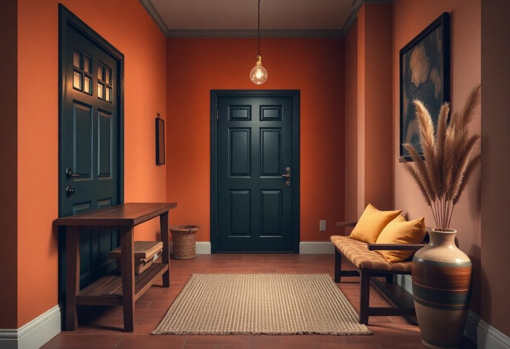
Just inside your front door sets the tone for the entire home, and I’ve seen how the right color can transform a cold, forgettable entry into a space that feels immediately warm and inviting. You don’t need a renovation to achieve this effect-your choice of paint color, finish, and lighting interaction can make a remarkable difference in how guests and family experience your space from the first step inside.
Key Takeaways:
- A warm entryway begins with color temperatures-opt for reds, oranges, and soft yellows that mimic natural warmth, like the glow of morning light on plaster walls in a Mediterranean courtyard.
- Balance is achieved by pairing dominant warm hues with neutral bases such as creamy whites or warm grays, preventing visual overwhelm while maintaining a sense of comfort and cohesion.
- Accent colors drawn from nature-terracotta, olive green, or deep ochre-add depth and personality, especially when applied to trim, front doors, or interior shutters for a layered, intentional look.
Identifying Key Factors for a Welcoming Atmosphere
A warm entryway begins with understanding the elements that shape first impressions. I consider natural light, space dimensions, and architectural character as foundational. Your color choices must respond to these conditions, not override them. Perceiving the space as a holistic experience-where light, proportion, and style intersect-guides more intentional decisions.
- Natural light affects how colors appear throughout the day
- Room size influences color intensity and perception of warmth
- Architectural style determines which hues feel authentic and harmonious
Assessing natural light availability
Light changes how your chosen colors present themselves, so I always observe the entryway at different times. North-facing entries receive cooler light, making warm tones like terracotta or creamy beige feel richer. South-facing areas with strong sunlight can handle deeper, saturated hues without feeling oppressive. Perceiving how light moves through your space ensures your palette stays balanced.
Evaluating the size and layout of the space
Small entryways benefit from lighter, warm tones that open up the area without sacrificing coziness. I avoid dark shades in tight spaces unless they’re used on a single accent wall to create depth. The flow between rooms also affects color continuity. Perceiving the entry as a transitional zone helps maintain visual harmony with adjacent areas.
When evaluating the size and layout of the space, I take note of ceiling height, door placements, and foot traffic patterns. A narrow hallway with limited wall space calls for a monochromatic scheme to elongate the perception of distance. In open foyers, I might introduce a warm mid-tone on lower walls and transition to a lighter shade above to enhance volume. Built-in storage or alcoves offer opportunities to use slightly bolder colors without overwhelming the area. These spatial cues directly inform how color can guide movement and mood.
Matching color to the home’s architectural style
A Victorian home with ornate woodwork suits deep garnet or olive green, while a mid-century modern entry calls for warm greige or mustard accents. I align color with architectural cues to preserve authenticity. Perceiving the home’s era and design language prevents clashing tones and supports a cohesive narrative.
Matching color to the home’s architectural style means respecting its original character rather than imposing trends. For example, a craftsman bungalow often features natural materials like stone and dark wood, so I choose earthy ochres or warm taupe to complement, not compete with, those elements. In a minimalist contemporary home, I lean toward soft warm grays that enhance clean lines without adding visual weight. Even in renovated spaces, maintaining a nod to the home’s roots through color creates a sense of continuity. Perceiving style as a framework-not a restriction-allows for warmth that feels both intentional and timeless.
How to Choose the Perfect Warm Color Palette
When I select a warm color palette for an entryway, I focus on hues that create an immediate sense of comfort. Soft beiges, warm grays, and gentle taupes often serve as ideal bases. I always test swatches at different times of day to see how natural and artificial light affect the tone. For deeper insight, I’ve shared real-life examples in a post on how to make entryway warm and welcoming?, where lighting and paint interact in surprising ways.
Selecting inviting undertones in neutrals
I prioritize neutrals with red, yellow, or green undertones because they feel inherently warmer than those with blue or gray bases. A beige with a peachy undertone, for instance, adds subtle radiance without overwhelming the space. Cool undertones can make even light-colored walls feel distant, so I always check the undertone under multiple lighting conditions before deciding.
Incorporating soft terracottas and muted yellows
I often recommend soft terracottas and muted yellows to introduce gentle warmth without intensity. These colors echo natural clay and morning light, creating a welcoming glow. They work especially well in homes with wood floors or natural fiber rugs, enhancing the organic feel of the entryway.
Soft terracotta, when paired with creamy white trim, adds depth while maintaining brightness. I’ve seen a mid-sized SaaS founder transform a narrow foyer by painting one accent wall in a dusty saffron, which made the space feel both grounded and uplifting. These hues perform best when balanced with matte finishes to diffuse light evenly.
Utilizing deep, saturated hues for a grounded feel
I sometimes use deep rust, burnt umber, or warm charcoal on walls to anchor a larger entryway. These saturated tones add richness and sophistication, especially when paired with brass or wood accents. The key is ensuring ample lighting to prevent the space from feeling closed in.
A client with a two-story entryway chose a deep ochre that absorbed midday sun beautifully, creating a cocooning effect in the evenings. I advised using a satin finish to enhance depth while resisting scuffs from daily use. When layered with a lighter ceiling and natural linen textiles, the color remained inviting rather than oppressive.
Expert Tips for Balancing Color and Light
I rely on a few tested methods to harmonize color and light in entryways, ensuring warmth without sacrificing brightness. Layered lighting, warm-toned finishes, and reflective surfaces all contribute to a balanced effect. Creating a Warm and Welcoming Entryway offers practical inspiration. Recognizing
- the impact of light temperature on paint appearance
- how mirror placement affects perceived depth
- the need to match wall tones with flooring undertones
Enhancing warmth through artificial lighting temperatures
I use bulbs between 2700K and 3000K to maintain a cozy glow that complements warm wall colors. Cooler lights wash out terracotta and cream tones, making them feel flat. The right color temperature enhances richness and depth, especially in dimmer spaces. Recognizing
Using mirrors to amplify color depth and brightness
Mirrors strategically placed opposite light sources reflect both natural and artificial light, intensifying the perception of warmth. They also enhance the saturation of surrounding wall colors by increasing luminance. Recognizing
I’ve found that positioning a large mirror beside a front window doubles the daylight’s reach, making a pale peach wall appear more vibrant by midday. The reflection creates an illusion of space while reinforcing the color’s warmth without additional paint. This technique works especially well in narrow hallways.
Coordinating wall color with flooring and woodwork
Matching wall hues to existing flooring and trim prevents visual dissonance, especially in open-plan entries. A beige carpet with yellow undertones, for instance, pairs best with warm greiges, not cool grays. Recognizing
I once corrected a jarring entry by switching from a blue-gray paint to a warm greige that echoed the oak floor’s amber notes. The change unified the space, making the woodwork appear intentional rather than outdated. Even small shifts in undertone can dramatically affect cohesion.
| Element | Recommended Coordination Approach |
|---|---|
| Warm wood floors | Pair with creamy whites, soft taupes, or earthy terracottas |
| Cool-toned tiles | Balance with warm accent walls or rich wood furniture |
| White trim | Use warm white or greige walls to avoid stark contrast |
How to Use Accent Colors for Visual Interest
I recommend introducing accent colors to break visual monotony and guide attention toward architectural highlights. A bold hue on a console table or vibrant artwork can transform a flat entryway into a dynamic space. For inspiration on balancing warmth with personality, see How can I add warmth to an entryway? 8 inviting looks… that demonstrate real-world applications.
Creating a focal point with a painted interior front door
A painted interior front door in a rich terracotta or deep navy instantly draws the eye and sets a welcoming tone. I’ve seen this simple change redefine entire entryways, especially when paired with neutral walls. The contrast creates depth and signals a thoughtfully designed transition from outside to in.
Adding pops of color through furniture and textiles
A vibrant bench cushion or a patterned rug introduces color without overwhelming the space. I often choose one or two accent shades that echo the front door or artwork to maintain cohesion. These small touches bring energy and warmth, making the entry feel lived-in and intentional.
Textiles like throw pillows or an upholstered stool offer flexibility-you can switch them seasonally to refresh the look. A mid-sized SaaS firm’s office entry, for example, uses a rust-colored runner and teal umbrella stand to reflect its brand while keeping the space inviting. The key is restraint: too many colors compete, but one or two well-placed accents create rhythm and charm.
Integrating complementary patterns and textures
Pairing a geometric rug with a woven basket or a smooth ceramic vase adds dimension without clutter. I balance bold patterns with solid accents to prevent visual overload. Texture enhances warmth, especially in entries with limited natural light.
Layering materials-like a jute runner over hardwood, a velvet ottoman, and a metal wall sconce-creates tactile interest that evolves as you move through the space. I once styled an entry with a herringbone tile floor, a linen-covered bulletin board, and a matte black mirror frame, which together added depth and quiet luxury. These elements work best when they share a cohesive color story, allowing texture to shine without chaos.
Essential Factors in Paint Finishes and Durability
- Selecting the right paint finish impacts both aesthetics and longevity
- Durability matters most in entryways exposed to daily wear
- Sheen level influences how light interacts with color
- Washable, scuff-resistant finishes simplify long-term upkeep
Knowing how finish type affects appearance and resilience helps you make informed choices that last.
Choosing the right sheen for high-traffic areas
I recommend a satin or semi-gloss sheen for entryways where doors swing, bags drop, and shoes kick the wall. These finishes resist marks better than flat paint and handle wiping without damage. I’ve seen a mid-sized SaaS firm repaint their lobby every six months until switching to semi-gloss-now it holds up for years.
Understanding how finish affects color perception
I notice flat finishes absorb light, muting warm tones slightly, while satin or eggshell reflects more, enhancing richness. A warm terra cotta in flat paint can look subdued, but the same hue in satin gains subtle depth. I once advised a client to test swatches under evening light, and they were surprised how much the sheen altered the warmth they wanted.
Finish doesn’t just change shine-it shifts how color behaves in real conditions. Matte finishes hide imperfections but can appear chalky, dulling the intended warmth. Higher sheens amplify ambient light, making entryways feel brighter, especially in north-facing spaces. I always test a full quart on the wall, not just a swatch, because light exposure over hours reveals true color behavior.
Prioritizing scuff-resistant and washable materials
I insist on washable paint because entryways collect fingerprints, smudges, and weather marks. A scuff-resistant formula means cleaning with a damp cloth won’t strip the finish. I once saw a family with two dogs and three kids maintain a cream-colored entryway for 18 months without touch-ups using a high-quality acrylic washable paint.
Daily use demands resilience. I favor acrylic-based paints with built-in stain resistance-they repel dirt and moisture without sacrificing finish quality. In a coastal home I worked on, humidity warped lower walls with standard paint, but switching to a washable, mold-resistant formula solved the issue. These materials prevent long-term damage, not just surface flaws.
Step-by-Step Tips for a Professional Finish
- Always begin with clean, sanded surfaces to ensure optimal color adhesion
- Use high-quality brushes and rollers designed for your chosen paint finish
- Apply a primer if you’re covering dark hues or new drywall for even coverage
- Test paint samples on multiple walls to assess light variation throughout the day
- Cut in carefully at edges before rolling to avoid bleeding and streaks
| Tool Type | Best Use Case |
| Angled sash brush | Cutting in around trim and corners |
| Microfiber roller (3/8″) | Smooth walls with latex paint |
| Paint edger | Preventing bleed near ceilings or adjacent walls |
Recognizing the impact of proper tools and preparation helps avoid costly touch-ups and ensures a polished result.
Preparing surfaces for optimal color adhesion
I clean every surface with a mild detergent to remove dust and grime, then lightly sand with 120-grit paper to create texture for paint grip. I patch any dents or cracks with spackle and let them dry before sanding smooth. Skipping this step risks peeling or uneven sheen, especially in high-traffic entryways exposed to moisture and friction.
Testing paint samples in varying light conditions
I tape 2-foot-square swatches on north, south, and east-facing walls to observe how natural light shifts the perceived warmth of a color. Artificial lighting at night can make the same terracotta hue appear cooler or more saturated. I leave samples up for at least 48 hours to assess changes across morning, midday, and evening.
Light quality varies significantly depending on window size and room orientation. A warm greige that looks inviting at noon may appear dull under dim hallway lighting. I once selected a peach-toned beige for a client’s entryway only to discover it took on a pinkish cast under evening LED bulbs. Testing in context prevents such mismatches and ensures the final color behaves as expected throughout the day.
Applying paint for smooth and even coverage
I start with a high-quality angled brush to cut in along edges, then use a roller with consistent pressure to maintain a wet edge and prevent lap marks. I work in small sections and avoid overloading the roller, which can cause drips and texture buildup. Two thin coats always deliver better results than one thick application.
Roller speed and direction influence the final texture. I roll in a “W” pattern to evenly distribute paint and finish with a single downward stroke to smooth ridges. I let the first coat dry completely-usually 4 to 6 hours-before applying the second. Using a roller cover compatible with the paint type, such as synthetic for latex, preserves the finish’s integrity and enhances long-term durability in high-traffic areas.
Summing up
I’ve found that a warm entryway starts with intentional color choices you can live with and love. I use soft terracottas, creamy beiges, or muted olives in my own home because they welcome light and mood equally. You don’t need bold statements to create impact. A well-painted wall in a finish that resists scuffs and cleans easily makes a lasting difference. I always finish with a coordinated runner and a mirror to reflect both light and personality.