
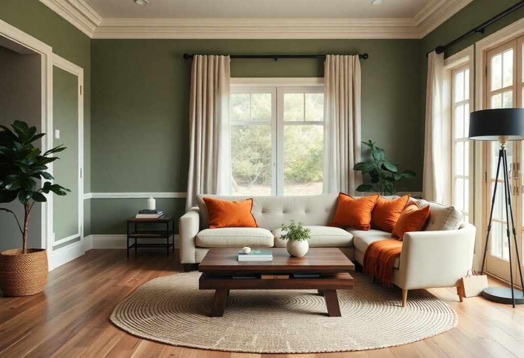
Just one shade can transform a house from a structure into a sanctuary, and I’ve seen how the right color on your walls influences mood, memory, and even how long you linger in a room. I know you want your space to feel personal, lived-in, and comforting, not just stylish. Color isn’t decoration-it’s emotional architecture, and choosing wisely means understanding how each hue shapes the soul of your home.
Key Takeaways:
- Warm neutrals like beige and warm gray create a timeless backdrop that enhances natural light and complements a range of furnishings, making spaces feel both inviting and effortlessly cohesive.
- Earthy tones such as terracotta and olive green connect interiors to the natural world, fostering a sense of grounded calm-evident in homes that use these shades in living areas to encourage relaxation and conversation.
- Soft accent colors like muted pink or pale yellow in bedrooms or entryways can subtly influence mood, introducing warmth and personality without overwhelming the senses, as seen in boutique residential designs favoring understated comfort.
The Radiant Optimism of Yellow
I’ve seen yellow transform cold entryways into welcoming spaces within minutes. A well-chosen shade introduces radiant optimism, lifting moods and amplifying natural light. You don’t need bold tones-subtle warmth often works better. I recommend testing samples at different times of day, since yellow reacts strongly to sunlight.
Butter Cream and Morning Light
Butter cream reflects early sunlight without overwhelming a room. I once helped a client paint their breakfast nook in this hue and the space immediately felt more intimate. The color pairs beautifully with white trim and natural wood, creating a soft, inviting clarity that lasts well beyond sunrise.
The Joy of Golden Hues
Golden hues bring a quiet energy to living rooms and kitchens. I’ve noticed how a hint of gold in a paint finish can mimic candlelight, adding warmth during evening hours. These tones work best when balanced with neutral furnishings to avoid visual fatigue.
One project involved layering a golden-tinted glaze over a warm beige base in a north-facing kitchen. The depth it created was unexpected-the walls appeared to glow even on overcast days. I used a satin finish to enhance light reflection, and the client reported feeling more energized during morning routines. The effect wasn’t just visual; it influenced daily rhythm.
The Deep Repose of Blue
I find that blue, in its deeper tones, brings an immediate sense of stillness to a space, making it ideal for bedrooms and living areas where calm is imperative. According to Best Paint Colors to Sell a House for More Money in 2026, certain shades of blue can increase buyer interest and even contribute to faster sales, especially when paired with natural textures.
Midnight Velvet Comfort
I’ve seen how a midnight blue wall in a cozy reading nook creates a rich, enveloping warmth, almost like being wrapped in a familiar blanket. This depth doesn’t overwhelm when balanced with soft lighting and warm wood tones, making the room feel both intimate and grounded.
Coastal Calm and Quietude
I often recommend soft, gray-tinged blues for bathrooms and sunlit breakfast nooks where a quiet, airy serenity is desired. These hues echo sea mist and overcast skies, bringing an effortless tranquility that pairs beautifully with white trim and natural linen textiles.
One mid-sized SaaS founder I consulted transformed her home office using a pale coastal blue on the lower third of the walls, creating a visual anchor that made the room feel both stable and open. The color’s subtle coolness reduced eye strain during long workdays, and she reported a noticeable improvement in focus and evening relaxation. This kind of strategic hue placement demonstrates how color can influence not just mood, but daily function.
The Living Breath of Green
I see green as the color that quietly animates a home with a sense of balance and renewal. It mirrors the natural world in a way no other hue can, bringing an organic rhythm into interior spaces. I’ve watched families grow more relaxed in living rooms washed in soft greens, as if the walls themselves were breathing in time with the trees outside.
Sage for the Wise
Sage green carries a quiet confidence, often chosen by those who value calm over drama. I’ve noticed it in homes where conversation flows easily and guests linger longer. Its muted tone reduces visual stress without sacrificing character, making it ideal for bedrooms and reading nooks where clarity and peace are necessary.
Emerald Envy and Life
Emerald green makes a bold statement of abundance and vitality. I’ve seen it transform dining rooms into intimate, jewel-toned sanctuaries that feel both luxurious and grounding. The color invites depth and warmth, especially when paired with natural wood or brass accents in a mid-sized SaaS founder’s converted loft.
Emerald works best when balanced with neutral bases, allowing its richness to stand without overwhelming. I once advised a client to use it on a single accent wall behind a reclaimed wood buffet, lit by warm pendant lights. The result was a space that felt both energized and secure, where family meals unfolded with a sense of occasion. Its intensity can stir emotion, so I recommend testing large swatches at different times of day before committing.
The Earthly Charm of Terracotta
I find terracotta brings an immediate sense of grounded warmth, its sun-baked hue echoing centuries of homes built from the land itself. This natural pigment, drawn directly from clay, creates spaces that feel both ancient and inviting. For a deeper understanding of intentional color use, I recommend A Master Class In Using Color In Your Home Without it …, which explores how earth tones shape emotional resonance.
Earthly Delights of Clay
Clay’s raw, unglazed finish adds texture and depth, making walls feel alive. I notice how its subtle variations in tone catch the light differently throughout the day, creating a dynamic backdrop. The organic imperfection of true clay surfaces fosters a quiet authenticity that polished materials often lack.
Rustic Red and Evening Glow
Rustic red, a deeper cousin to terracotta, deepens the atmosphere as daylight fades. I’ve seen it transform west-facing rooms into warm sanctuaries by late afternoon, when sunlight hits at a low angle. The rich, burnt undertones mimic the sky just after sunset, enhancing a feeling of shelter.
That evening glow isn’t accidental-it’s the result of iron oxide in the pigment reacting to natural light. I once watched a client’s kitchen shift from a warm peach at noon to a deep, blood-tinged amber by 6 p.m., all due to the specific clay-based paint on the walls. No artificial lighting could replicate that gradual, organic transition.
The Quiet Dignity of Grey
I find grey’s quiet dignity lies in its ability to ground a space without dominating it, offering a balanced backdrop that lets texture and light take center stage. For a comprehensive approach to harmonizing tones throughout your home, I recommend the Whole House Palette: 2025 Ultimate Guide, which outlines how to layer neutrals with confidence and cohesion.
Sophisticated Silver Shadows
Silver undertones in cool greys add a sleek, modern precision to living areas, reflecting light in a way that makes rooms feel more open. I’ve seen this effect transform narrow hallways, where the metallic hint prevents flatness and introduces a subtle luminosity that warmer neutrals often lack.
Soft Pebble Foundations
A soft pebble grey on large surfaces creates a calming continuity between rooms, especially in open-plan homes. I use this shade often in base trims and walls because it pairs effortlessly with natural wood and stone, reinforcing a grounded, lived-in atmosphere.
When I select a soft pebble foundation, I prioritize undertones that lean neither blue nor beige, aiming for a true mid-grey that remains neutral under changing daylight. This balance ensures cabinetry, flooring, and furnishings maintain their intended warmth or coolness without unintended clashes, a detail that proves necessary in homes with mixed material palettes.
The Tender Blush of Pink
I find that pink, when used with restraint, introduces a quiet warmth that few hues can match. It’s not the fluorescent shock of a highlighter but the soft hue of dawn that makes a space feel held. You don’t need bold statements-just a whisper on the walls can shift the emotional temperature of a room.
Rosy Cheeks of a Room
Painting a single accent wall in a warm blush gives a space subtle dimension. I’ve seen it transform narrow hallways into inviting passages, making them feel less like corridors and more like embraces. The color reflects light gently, softening sharp edges and cold surfaces without overwhelming the senses.
Gentle Sunset Whispers
A pale pink with peach undertones mimics the sky just after dusk, creating a serene atmosphere in bedrooms or reading nooks. I often recommend this shade when you want comfort without heaviness. It pairs beautifully with natural wood and ivory textiles, adding warmth without sacrificing airiness.
That peach-kissed pink works because it taps into a primal sense of shelter, like the glow of firelight on skin. I once advised a client to use it in a north-facing living room that always felt dim. The result wasn’t just warmer-it felt more inhabited, as if the room itself had exhaled. Choosing a version with a matte finish deepened the coziness, turning an underused space into the family’s preferred gathering spot.
To wrap up
I find that the colors which make a house feel most like home aren’t dictated by trends but by personal resonance-you respond to what quietly settles your mind or sparks a sense of comfort. For you, it might be the warmth of terracotta in a sunlit kitchen, the calm of soft green in a bedroom, or the gentle presence of warm grey in a reading nook. I’ve seen a mid-sized SaaS founder transform a sterile loft with nothing more than a single wall in deep sage, and suddenly the space felt lived-in, intentional. Your home reflects your inner world, and the right color doesn’t shout-it whispers.