
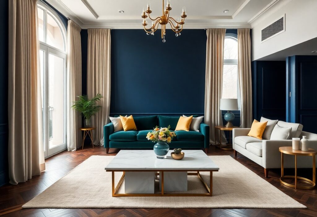
Most people underestimate how much color shapes the perception of luxury in a space, but I’ve seen firsthand how the right hues transform ordinary rooms into striking, high-end environments. I’ll show you which shades add instant sophistication and which ones risk making your home feel cold or outdated. You don’t need expensive furniture-just strategic color choices to create opulence.
Key Takeaways:
- Deep, rich tones like navy blue, emerald green, and charcoal gray create a sense of sophistication and depth, making spaces feel more refined and opulent.
- Neutral palettes with warm undertones-such as beige, taupe, and soft gray-add warmth and elegance, especially when layered with textured materials like velvet or marble.
- Accent colors in gold, brass, or copper can enhance a luxurious feel when used sparingly in lighting, hardware, or decor, adding subtle shimmer without overwhelming the space.
The Sovereignty of Midnight Blue
I’ve watched midnight blue transform ordinary rooms into spaces of quiet opulence. You don’t need gilded accents for impact-this shade commands attention on its own. When applied to walls or cabinetry, it creates depth and intimacy, making ceilings feel higher and spaces more refined. I use it in dining rooms and studies where calm sophistication matters most. You’ll notice how it shifts with light-velvety at dusk, almost navy in daylight-adding a dynamic richness few colors can match.
The Quiet Elegance of Alabaster
I’ve watched alabaster transform ordinary rooms into spaces of refined calm, its soft white glow adding depth without drama. You don’t need bold accents when your walls carry this kind of subtle luminosity. I use alabaster in entryways and living rooms because it makes natural light feel richer and artificial lighting more flattering. It’s not just a neutral-it’s a quiet statement of sophistication that lets your furniture and art take center stage.
Emerald Envy and Botanical Wealth
I’ve always believed emerald green carries a quiet confidence that few colors can match. This deep, jewel-toned hue instantly signals sophistication and abundance, like a private greenhouse in a historic estate. You don’t need gold accents for it to feel opulent-its richness stands on its own. When I use emerald in a space, 7 Colors That Make Any Room Look More Expensive proves I’m not alone. The color wraps a room in luscious depth, making even simple furnishings feel curated and intentional.

Charcoal as a Dramatic Canvas
I use charcoal to ground a space with depth and quiet intensity. This near-black hue wraps walls like tailored velvet, creating a backdrop so rich it makes gold accents glow and textures pop. You don’t need bold patterns when your walls already speak with such confidence. For those chasing understated opulence, explore Paint Colors That Make a Room Feel Expensive | Clare to see how this shade transforms ordinary rooms into gallery-worthy moments.
Terracotta and the Warmth of Antiquity
I find that terracotta brings a grounded richness few colors can match. Its earthy tone echoes ancient villas and sun-baked courtyards, giving your space a sense of history and timeless warmth. You don’t need ornate details-this hue alone adds depth and quiet luxury. I’ve seen it transform minimalist rooms into inviting sanctuaries with just a single accent wall or terracotta-toned furnishings.
To wrap up
Summing up, I find that deep tones like navy, emerald, and charcoal gray give your space a refined, luxurious feel. I’ve seen how these colors add depth and sophistication when paired with quality materials and proper lighting. You don’t need extravagance-just intentional choices that reflect elegance and calm. I trust these shades will enhance your home’s atmosphere with quiet luxury.