
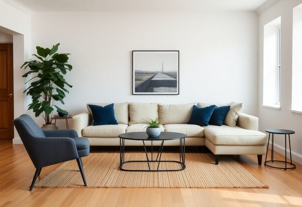
There’s a reason I always recommend certain hues to you when planning a timeless space-colors like white, gray, navy, and beige consistently stand the test of time. I’ve seen your confidence grow when you choose palettes that remain stylish for years. These shades offer dangerous versatility, blending effortlessly with trends while keeping your home feeling calm and enduring.
Key Takeaways:
- Neutral tones like white, beige, and gray consistently remain popular in home design because they create a calm, timeless backdrop that works with changing trends and decor styles.
- Classic blue, especially in deeper shades like navy, adds enduring sophistication and pairs well with both warm and cool color schemes across decades.
- Black and deep charcoal accents bring contrast and elegance without dating a space, especially when used in furniture, fixtures, or trim.

The Immaculate Virtue of White
I see white as more than just a neutral-it’s a transformative force in any room. You feel its presence immediately: clean, open, and charged with light. I use white to amplify space, to let art and texture speak louder. It’s dangerous in its simplicity, because a poorly lit white room can feel sterile. But when balanced with warmth-wood, linen, shadow-it becomes timelessly serene. Your walls breathe easier in white.
The Dramatic Soul of Raven Black
I’ve watched raven black command rooms with quiet intensity, turning walls and accents into bold declarations of confidence. You don’t need much of it to feel its presence-just a single black-framed mirror or a matte black light fixture can anchor your space in timeless depth. I use it to create contrast, to draw the eye, and to add a layer of sophisticated mystery that lighter tones rarely achieve. When balanced well, black doesn’t overwhelm-it grounds.
The Stoic Poise of Slate Grey
I’ve always found slate grey to carry a quiet strength that few colors match. It’s timeless, grounding a room without dominating it, and works just as well in a minimalist loft as it does in a traditional home. You can pair it with warm woods, crisp whites, or bold accents-it adapts without losing its character. If you’re wondering what is a timeless color choice for home interior design?, this is one answer that never steers you wrong.
The Verdant Wisdom of Sage
I find sage green brings a quiet strength to any room, balancing warmth and calm in a way few colors can. You don’t need bold accents when sage creates such a grounded, timeless foundation. It pairs effortlessly with natural wood, crisp white, or even soft black finishes. You can’t go wrong with the classics. Discover 5 timeless … looks that prove this hue always belongs in refined spaces.
The Aristocratic Depth of Navy
I’ve watched navy blue anchor countless interiors with quiet authority. You don’t need to chase trends when you have this shade-it commands respect without shouting. I use it on walls, cabinetry, and upholstery because it adds instant sophistication and pairs effortlessly with metallics, crisp white, or warm wood tones. It’s the color of timeless confidence.
The Gentle Comfort of Sand
I find sand to be one of the most enduringly soothing neutrals in home design. You don’t need to chase trends when your walls wear this soft, sun-bleached tone. It wraps a room in warmth without overwhelming it, making your space feel open and quietly inviting. I’ve seen it harmonize with wood, metal, and bold colors alike-its quiet strength lies in its simplicity.
To wrap up
Conclusively, I’ve found that neutral tones like white, gray, beige, and navy blue never go out of style in home design. I recommend these colors because they offer timeless appeal and adapt easily to changing trends. You can build your palette around them, and your space will always feel balanced and inviting, no matter the season or decade.