
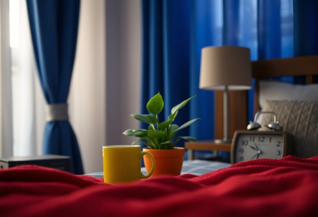
You experience color every day, often without realizing how deeply it influences your emotions. I’ve studied how red can raise your heart rate and boost energy, while blue calms your mind and reduces stress. Even subtle shades in your clothes or room walls shift your mood. Yellow may lift your spirits, but too much can trigger anxiety. I’ll show you how these effects shape your daily life.
Key Takeaways:
- Colors like blue and green often create calm and focus, making them common choices for workspaces and bedrooms.
- Bright colors such as red and yellow can boost energy and alertness but may cause agitation if overused.
- Personal experiences and cultural backgrounds shape how individuals respond to different colors, so emotional effects can vary widely.
The Tyranny of the Morning Palette
I notice how the colors I see first thing shape my entire day. That harsh red alarm clock glow or the cold blue light from my phone doesn’t just wake me-it triggers stress responses before I’ve even stood up. These early visual cues set a tone I don’t always choose, turning my morning into a reaction instead of a rhythm.
Crimson Wakefulness
Red jolts me awake like a spark. I feel my pulse rise when I see it in my kitchen kettle or workout gear. This color boosts energy and alertness, but too much too early can leave me feeling edgy or impatient. I use it sparingly-only where I need a burst of action.
Azure Calm
Blue slows my breath the moment I see it. Whether it’s my bedroom wall or the sky during a morning walk, this shade brings a quiet clarity that red can’t. I rely on it to soften the morning rush and create space before the day takes over.
When I surround myself with soft blue tones in the morning, I notice a measurable drop in my anxiety. Studies confirm that blue light regulates cortisol differently than red-it supports gentler wakefulness without agitation. I’ve replaced my bright bathroom lights with warmer blue-tinged LEDs, and now I start the day feeling centered, not scrambled. This small shift makes a profound difference in how I handle stress later on.
The Social Mask of Hues
I notice how you often choose colors not for how they make you feel, but for how you want others to see you. Wearing bold red to appear confident or soft blue to seem calm-it’s a silent performance. Colors become costumes, shaping first impressions before a word is spoken. For more on this subtle influence, explore Using Color to Affect Mood.
Golden Deceptions
Gold promises success and warmth, but I’ve seen it used to mask insecurity. You might wear it to project achievement, yet it can create distance. This hue often hides vulnerability behind a shimmering front, making you appear untouchable when you’re simply trying to feel worthy.
Emerald Envy
Emerald green draws the eye with its richness, but I know it carries a double meaning. You may wear it for balance and renewal, yet it can stir feelings of jealousy in others-or within yourself. Its beauty is powerful, but not always peaceful.
I’ve come to realize that emerald green does more than decorate-it communicates. While it’s linked to growth and harmony, its intensity can trigger comparison. When you wear it, people may perceive you as composed, but they might also feel you’re ahead of them. This duality makes emerald one of the most emotionally layered colors in your wardrobe, quietly shaping interactions beneath the surface.
Domestic Chromatics
I’ve learned that the colors in your home do more than decorate-they shape how you feel moment to moment. From the calm of soft blues to the energy of warm yellows, every shade in your space sends subtle signals to your brain. The right palette can soothe stress or spark creativity, making color one of the quietest yet most powerful influences in daily life.
Lavender Dreams
Lavender wraps your bedroom in a gentle hush, easing tension the moment you walk in. I notice my breathing slows when surrounded by its muted purple tones, especially at dusk. This hue encourages rest and emotional balance, making it ideal for spaces meant for reflection or sleep.
Terracotta Comfort
Terracotta grounds your living space with warmth that feels both natural and inviting. I find it brings a sense of stability, like the earth after rain. Its soft, reddish-brown tone promotes emotional warmth and connection, making conversations flow more easily and solitude feel cozy.
What makes terracotta truly special is how it bridges the gap between nature and nurture in design. I’ve seen how this earth-derived pigment softens harsh lighting and adds depth without overwhelming. Unlike cooler neutrals, terracotta carries a quiet energy-it warms without exciting, comforts without dulling. Whether on walls or in ceramics, it reminds you of sunbaked soil and open skies, anchoring your mood in something timeless and real.
Professional Pigments
I’ve noticed how certain colors silently shape workplace energy and perception. The hues we wear or surround ourselves with at work don’t just reflect style-they influence confidence, clarity, and how others respond to us. Color is a quiet force in professional settings, often guiding interactions before a word is spoken.
Indigo Authority
You’ve likely worn navy to a meeting and felt instantly more composed. I rely on indigo because it projects calm competence without demanding attention. It signals trust and focus, making it my go-to when I need to lead with quiet confidence.
Slate Indifference
Slate gray often shows up in offices as a neutral backdrop, but I’ve seen how it can dull motivation over time. While it feels safe and professional, its emotional flatness can suppress creativity and make spaces feel emotionally distant.
Spending long hours in slate-dominated environments has taught me something subtle but powerful: neutrality isn’t always calming-it can be draining. I’ve watched colleagues grow less engaged in gray-walled meeting rooms, their energy mirroring the color around them. Without intentional contrast, slate can foster emotional detachment, making collaboration feel mechanical instead of dynamic. That’s why I always introduce a warm accent-just enough to disrupt the monotony and reawaken connection.
The Wardrobe of the Soul
I choose my clothes not just for style, but for how they shape my inner world. Every shade I wear sends subtle signals to my mind, shifting my energy and outlook. From bold reds that ignite confidence to calming blues that steady my thoughts, your wardrobe is more than fabric-it’s a daily mood regulator. Learn more about this silent influence through the Psychology of Color: How Shades Affect Your Mood.
Scarlet Passion
Red pulls me into action. When I wear scarlet, I feel bolder, more assertive-like I take up more space. This color increases heart rate and signals dominance, making it ideal for high-stakes moments. Scarlet doesn’t whisper; it commands attention, and that energy can fuel your confidence when you need it most.
Violet Melancholy
Violet often wraps me in quiet reflection. It carries a spiritual depth, but in excess, it can deepen sadness or isolation. This shade blurs the line between calm and sorrow, making it powerful in small doses. I notice it most when I seek solitude, but must be cautious not to linger too long.
I’ve learned that violet’s complexity lies in its duality. While it can inspire creativity and introspection, it sometimes amplifies feelings of loneliness. When I surround myself with too much violet-especially in dim lighting-I feel a subtle emotional weight. It’s not inherently negative, but its depth demands awareness. I use it now as a tool for mindful pause, not prolonged retreat.
Nature’s Unfiltered Canvas
I see how raw, unfiltered colors from nature shape your daily mood without you even noticing. The sky’s morning blush, the deep green of old trees, the dusty gold of sunlit soil-each hue speaks directly to your senses. These are not manufactured tones but authentic signals your mind interprets as calm, energy, or comfort.
Verdant Vitality
I feel a surge of energy every time I’m surrounded by lush greenery. You don’t need a scientific study to notice how forest tones lower your stress-they quiet your thoughts and sharpen your focus. This green isn’t just background; it actively restores your balance.
Ocher Nostalgia
I associate ocher with warmth that feels familiar, like the walls of a childhood home or sunbaked earth in late summer. You may not name it, but this earthy tone triggers deep comfort, linking you to memories of safety and simplicity.
I’ve come to recognize ocher as more than just a color-it’s a psychological anchor. When you see it in a room, a painting, or a landscape, it subtly signals stability. Unlike fleeting trends, ocher carries the enduring weight of time, connecting you to ancestral spaces and natural cycles that predate modern stress. Its presence grounds you, often without you realizing why.
Final Words
As a reminder, I see how colors shape your mood daily-from calming blues to energizing yellows. I notice how your environment’s hues influence focus, calm, or motivation. You don’t need dramatic changes to feel the effect. I’ve found that even small shifts in color around you can support emotional balance and daily well-being.