
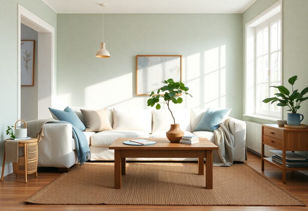
With years of experience in interior design, I’ve seen how the right color choices can transform your space into a calm sanctuary. I’ll show you how specific hues influence mood and where to apply them for maximum effect. You don’t need a renovation-just strategic use of soft tones and natural palettes to create lasting peace in your home.
Key Takeaways:
- Soft, neutral tones like warm whites, gentle grays, and muted beiges create a calm foundation that helps reduce visual stress and makes spaces feel more open and serene.
- Bringing in nature-inspired colors-such as soft greens, sandy taupes, and pale blues-can promote relaxation by connecting your home to the tranquility of the natural world.
- Limiting bold or high-contrast colors to small accents prevents sensory overload and maintains a peaceful atmosphere, allowing calm hues to dominate the space.
The Blue Horizon
I find that soft, airy blues on walls mimic the sky meeting the sea, instantly calming your mind. This hue works best in spaces where you want tension to dissolve-bedrooms, bathrooms, quiet reading nooks. When you choose the right tone, the room feels larger and more open, inviting a sense of stillness you can feel the moment you walk in.
Deep Water Stillness
Deep navy or slate blue on an accent wall grounds your space like the ocean’s depths. I use this shade in rooms where focus and introspection matter most. You’ll notice how it absorbs excess light and noise, creating a cocoon that supports rest and emotional balance without feeling oppressive.
High Mountain Air
Crisp, cool pale blue with a hint of gray mimics the clarity of high-altitude skies. I paint this in hallways or home offices where mental sharpness matters. You’ll feel how it refreshes the air visually, lifting mood and reducing mental fatigue with a whisper of alpine calm.
When I first tried High Mountain Air in my workspace, I was struck by how quickly the room transformed. It isn’t just a color-it’s a mental reset. Unlike warmer tones that can feel heavy over time, this shade keeps your thoughts clear and your breathing deeper. It pairs beautifully with natural wood and white trim, enhancing its clean, invigorating effect without overwhelming your senses. You’ll find yourself pausing more, thinking clearer, and feeling just a little lighter each day.
Green of the Earth
I find that grounding your space with earthy greens brings a quiet strength to a room. This hue mirrors nature’s balance, helping you feel centered and calm. For more ideas on using color to create a peaceful home, join the conversation here.
Shadows in the Pines
Deep forest tones add depth without heaviness when paired with natural wood and soft textures. I use this shade in bedrooms to create a soothing retreat that feels protected and serene, like being wrapped in a quiet woodland.
Grass After Rain
Fresh and softly luminous, this green evokes renewal and clarity. I paint accent walls in this tone when you need a breath of calm, especially in spaces where mental clarity matters most.
What makes Grass After Rain so effective is its subtle brightness-it uplifts without overstimulating. I recommend pairing it with white trim and natural linen fabrics to enhance its gentle, restorative energy. This shade works beautifully in home offices or kitchens where you want a sense of quiet vitality.
The Strength of White
I’ve found that white isn’t just neutral-it’s a powerful tool for calm. When used thoughtfully, it expands space and reflects light, making rooms feel open and uncluttered. Explore 12 Wall Colors That Instantly Make Any Room Feel More … to see how different shades of white set the tone for serenity.
Bleached Bone and Shell
White with a whisper of warmth, bleached bone and shell tones add softness without starkness. I use these hues in bedrooms to create a soothing backdrop that feels clean yet inviting, helping you unwind naturally at day’s end.
Fresh Wool Blankets
Natural wool in fresh, white tones brings texture and tranquility to a space. I drape one over a sofa to introduce a calming tactile element that feels grounded and pure, enhancing the peaceful effect of a white palette.
Wool has a unique ability to regulate temperature and resist dust, making it a healthy choice for your home. I appreciate how its subtle texture catches light differently throughout the day, adding depth without disruption. Choosing undyed, fresh wool supports a cleaner aesthetic and promotes better indoor air quality, aligning beauty with well-being.
Softened Yellows
I find that softened yellows bring a quiet warmth to a space without overwhelming the senses. These tones mimic natural daylight and reflect calm energy, making rooms feel open and gently inviting. You’ll notice how they pair effortlessly with neutrals and wood tones, creating a backdrop that supports relaxation and mental clarity.
First Light of Day
One of my favorite ways to use soft yellow is with a shade that captures the delicate glow just after sunrise. This hue feels refreshing yet soothing, perfect for bedrooms or breakfast nooks where you want a sense of renewal. It brightens your mood without the harshness of pure yellow.
Dried Summer Wheat
Dried Summer Wheat is a muted, earthy yellow with subtle gray undertones that I often recommend for living rooms or reading corners. It feels grounded and serene, echoing the natural fading of sunlit fields. You’ll appreciate how it adds warmth while maintaining a peaceful, understated elegance.
When I choose Dried Summer Wheat for a wall or accent, I notice how it changes gracefully with the light-warmer at dawn, cooler in the afternoon. This shade works especially well when paired with natural linen, warm woods, and soft whites. Its gentle complexity keeps the space from feeling flat, offering depth without visual noise, making it ideal for spaces meant to restore your calm.
The Gray Stone
I find that grounding a space begins with quiet hues like those found in weathered stone. The Gray Stone isn’t just a color-it’s a mood. I use its soft, neutral depth to balance brighter accents and create a steady, calming foundation in your rooms. This understated tone absorbs light gently, helping your home feel more spacious and serene.
River Pebbles
Soft and subtly cool, River Pebbles brings a whisper of the outdoors inside. I often recommend this shade for bathrooms or reading nooks where you want a clean, refreshing calm. Its barely-there blue undertone promotes stillness without feeling cold or distant.
Rain on the Porch
There’s something deeply soothing about the way light reflects off wet concrete after a storm. Rain on the Porch captures that exact moment-damp, reflective, and peaceful. This muted blue-gray helps lower visual noise, making it ideal for bedrooms or spaces where you unwind.
I’ve painted my own bedroom in Rain on the Porch, and the change in atmosphere surprised me. You don’t just see the color-you feel it. It shifts with the daylight, appearing cooler in the morning and deeper at dusk. That natural rhythm helps regulate your sense of time and relaxation, making it easier to slow down and breathe. I suggest pairing it with warm wood tones to keep the space from feeling too detached.
Summing up
The colors I choose for your walls, furniture, and decor directly shape how you feel in your home. I use soft neutrals, gentle blues, and warm earth tones to create spaces that invite calm. You don’t need dramatic changes-small, intentional shifts in color can make your rooms feel more peaceful and truly your own.