
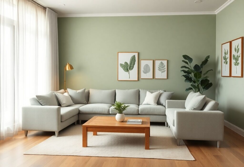
There’s a strong connection between color and mood, and I’ve found that soft, cool tones most effectively create a peaceful atmosphere. I recommend light blue as the best choice for your living room-it’s proven to lower heart rate and reduce stress. You don’t need bold accents; subtle shades work best to keep your space serene and inviting.
Key Takeaways:
- Soft neutrals like warm gray, beige, and greige create a soothing backdrop that promotes relaxation and works well with natural light.
- Cool tones such as muted blues and gentle greens mimic elements of nature, helping to lower stress and support a peaceful atmosphere.
- Personal preference plays a major role-choose a color that feels calming to you, as emotional response to color is subjective and deeply individual.
The Celestial Indifference of Pale Blue
I find that pale blue carries a quiet emotional distance, like the sky that doesn’t care if we’re happy or sad. Its neutrality doesn’t demand feeling, yet somehow soothes the mind. You don’t fight it-you breathe with it. That calm detachment is exactly what makes it perfect for a living room meant to restore balance.
Serenity of the Morning Mist
Soft and barely there, this shade mimics the hush just before sunrise. You feel it more than see it, wrapping the room in a cool, tranquil veil. I’ve watched how it diffuses light, softening edges and quieting noise, both visual and mental. It’s not a statement-it’s a sigh.
The Gentle Art of Sky Gazing
Looking up has always been a form of escape, and I bring that same ease into interiors with sky-inspired tones. You don’t need windows to feel open when walls echo the infinite. This hue invites slow breathing, not distraction. It’s subtle, but the effect is immediate-your shoulders drop without you noticing.
When I paint a room in this airy blue, I’m not just choosing a color-I’m designing a pause. The shade works best when paired with natural textures: linen, unfinished wood, ceramic. It loses its magic in overly bright or cluttered spaces. I recommend dimmable lighting to mirror changing skies. You’ll notice how, in the late afternoon, the walls seem to glow from within, like twilight held in paint. This is where calm isn’t forced-it’s felt.
Sage Green and the Verdant Whisper
I find that sage green carries a quiet strength, like a breath of fresh air woven into your walls. Its earthy balance of green and gray creates a serene backdrop that feels both natural and refined. For those seeking harmony, The Most Calming Colour Palette For Your Home often includes this gentle tone.
Inviting the Garden Indoors
You can bring the tranquility of nature inside without a single potted plant. I’ve seen sage green transform sterile spaces into soft, living environments. This hue mimics morning dew on leaves, offering a subtle connection to the outdoors that calms the mind and warms the soul.
Mossy Hues for Sophisticated Souls
Mossy greens speak to those who value depth without drama. I appreciate how these tones add richness while maintaining a quiet presence. They’re perfect for creating a composed, grounded atmosphere-ideal for living rooms where elegance meets ease.
What makes mossy hues truly stand out is their ability to age beautifully in natural light. I’ve watched them shift from cool undertones at dawn to warm, earthy depths by dusk. Unlike bolder greens, they don’t dominate-they settle, creating a layered, timeless look that feels personal and deeply calming.
The Subtle Elegance of Warm White
I find that warm white brings a quiet sophistication to a living room, offering softness without sterility. Unlike cold whites, it holds gentle undertones that make you feel instantly at ease. For more inspiration, explore 10 Calming Wall Colors for Your Home to see how this hue fits into serene spaces.
Ivory Dreams and Linen Sheets
Ivory wraps your space in a sense of quiet luxury, much like fresh linen sheets catching morning light. It’s warm, inviting, and subtly rich-never harsh. This shade makes your room feel lived-in and peaceful, blending comfort with timeless style.
Escaping the Vulgarity of Starkness
Stark white walls may look clean, but I’ve seen how they can feel cold and unwelcoming. They often amplify light in a way that feels harsh and emotionally draining. Choosing warmth in your white tones helps you avoid that clinical vibe.
What many don’t realize is that stark white can exaggerate every shadow and imperfection, making your living room feel more like a lab than a sanctuary. I prefer warm whites because they diffuse light gently, creating a space where you can truly relax. The right tone removes the severity of pure brightness while maintaining clarity and openness, giving your room soul without sacrificing brightness.
Soft Terracotta and the Earthy Hearth
I find that soft terracotta brings a grounded warmth to a living room, like the quiet glow of a hearth at dusk. This color doesn’t shout; it settles. You feel it before you see it-a subtle presence that makes space feel held, not just decorated.
Sun-Drenched Clay Foundations
You’ll notice how sun-drenched clay tones anchor a room in quiet strength. I use them as a base because they reflect natural light with a gentle warmth. These hues connect your space to the land, creating a foundation that feels both timeless and inviting.
The Comfort of Ancient Dust
I see ancient dust not as decay, but as memory held in pigment. This muted tone carries the softness of time-worn surfaces. It wraps your room in a sense of quiet endurance, like walls that have absorbed generations of calm.
When I paint with colors inspired by ancient dust, I’m not choosing a shade-I’m choosing stillness. It’s the difference between a room that looks peaceful and one that actually feels it. This color absorbs sound, light, and tension, leaving behind a space where breath slows and shoulders drop without you even noticing.
Lavender and the Poetic Twilight
I’ve always believed lavender holds a quiet magic, like the moment daylight softens into dusk. You don’t just see this color-you feel it. Its gentle hue calms the nervous system, inviting stillness without dulling awareness. In my own living room, a lavender accent wall became a sanctuary, especially when lit by candlelight.
Fragrant Shadows on the Wall
Light shifts the mood, and with lavender, it writes poetry. I’ve watched how evening sun casts fragrant shadows-not literal scent, but a visual suggestion of calm-that ripple across the walls. You’ll notice how these soft tones make a space feel intimate, almost hushed, as if the room itself is breathing slowly.
The Melancholy of a Purple Dusk
There’s a subtle sadness in deepening purple light, one I find oddly comforting. I don’t fear this melancholy-it’s not oppressive, but reflective. It invites introspection, not isolation. You may find, as I do, that this gentle sorrow helps release the day’s tension, making space for peace.
That melancholy isn’t a flaw-it’s a feature. I’ve come to see it as emotional honesty in color form. When you sit in a lavender-lit room as night falls, you’re not escaping stress; you’re acknowledging it, then letting it soften. This isn’t escapism-it’s presence, painted in twilight tones that honor both calm and complexity.
The Tactile Symphony of Decor
I feel texture before I even see it. Your living room’s calm isn’t just painted on walls-it’s woven into every fabric, every surface you brush against. Softness under bare feet, the gentle drape of a throw, the cool kiss of linen pillows-these sensations shape your emotional response as much as color does. Touch is silent, but it speaks volumes.
Velvet Pleasures and Silk Secrets
Velvet invites you in with its plush depth, absorbing light and sound alike. I love how it adds warmth without weight, especially in muted tones like sage or dusty blue. Silk, on the other hand, catches the faintest glow, offering a subtle shimmer that feels luxurious but never loud. Together, they create a quiet opulence that soothes the senses.
Marrying Texture with Tone
Color sets the mood, but texture gives it dimension. I’ve found that pairing a soft gray wall with nubby wool throws and smooth ceramic vases creates balance. When your tones are calm, rich textures add interest without chaos. This harmony keeps the room feeling layered, not overwhelming.
When I match texture with tone, I think in layers, not rules. A pale blue linen sofa feels airier than the same shade in glossy leather. Rough-hewn wood tables ground a pastel palette, preventing it from floating away into sterility. You don’t need bold colors to create depth-just thoughtful contrasts. The right fabric against the right hue can turn stillness into sanctuary. I always test swatches together under your room’s natural light; what looks balanced in daylight may feel cold at dusk. Trust your hand as much as your eye.
Final Words
From above, I see that soft blue is the best color for a calm living room. I know it lowers heart rate and helps you relax. You don’t need bold tones to feel comfort-your space should support peace. I recommend choosing a shade with gray undertones to avoid coldness. Your calm begins with this quiet, steady hue.