
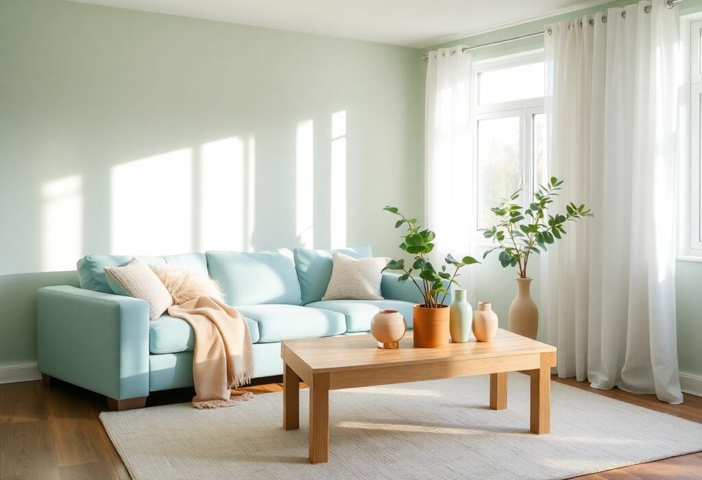
It’s no secret that the colors in your home directly impact your mood. I’ve studied how specific hues influence emotional well-being, and cool tones like soft blues and gentle greens consistently reduce stress. You don’t need bold accents-subtle, natural shades create the most calming environments. I’ll show you exactly which colors support relaxation in your space.
Key Takeaways:
- Soft blues and greens are linked to lower stress levels because they mimic natural environments and promote a sense of calm and relaxation.
- Neutral tones like warm grays, beige, and soft whites create a soothing backdrop that reduces visual clutter and supports mental clarity.
- Bright or saturated colors such as red and orange can increase alertness but may heighten anxiety when used excessively in living spaces.
The Serenity of Azure
I’ve found that painting a bedroom in soft azure can dramatically lower your heart rate within minutes of entering the space. You don’t need bold accents-this shade works best when it wraps the room in quiet calm. I once helped a client repaint their chaotic home office in this hue, and they reported feeling more focused and less reactive to stressful emails. Even small touches, like an azure throw or curtain, can shift your mood. The color mimics a clear sky, offering instant psychological relief without overwhelming your senses.
Verdant Wisdom
The Calming Effect of Green
I’ve found that green, especially in soft sage or deep forest tones, brings a natural balance to any room. You don’t need a garden view to feel grounded-painting a wall or adding houseplants can make a measurable difference in your mood. Your space begins to breathe, and so do you, as this color gently lowers heart rate and supports mental clarity.
The Warmth of Dawn
I find that soft peach and warm coral hues bring a gentle energy to your space, mimicking the first light of morning. These colors invite calm without dulling your mood, offering a balance between comfort and quiet vitality. According to research, surrounding yourself with these tones can reduce anxiety and promote emotional warmth. Color Your World to Relieve Stress explores how dawn-inspired palettes support mental well-being in everyday environments.
Granite Stillness
I find that granite stillness brings a grounded calm to any room, mimicking the quiet strength of natural stone. You’ll notice how this soft, cool gray anchors your space without dulling the light. For those seeking balance, I recommend exploring The 10 Best Light & Calming Paint Colors for Stress & … to see how subtle tones like this support emotional clarity and peace in your home.
Floral Tranquility
I find that soft pinks and muted greens, like those in morning garden blooms, bring a quiet calm to your space. These colors mirror nature’s gentle rhythms, helping lower your heart rate and quiet a busy mind. You don’t need fresh flowers-paint, textiles, or art in these tones can create the same soothing effect. I use them in bedrooms and reading nooks where peace matters most.
Grounded Terracotta
I find that terracotta brings a quiet strength to a room, its earthy warmth making spaces feel sheltered and calm. You don’t need bold accents-this color works best in soft, natural textures like clay tiles or linen upholstery. Its connection to the earth helps lower anxiety, grounding your mood the moment you walk in. I’ve seen how just a terracotta throw or wall can soften harsh lighting and create a sense of quiet stability.
Conclusion
With this in mind, I find that soft blues and gentle greens in your home can quietly lower your stress levels. These colors mimic natural environments, helping you feel calmer and more grounded. I’ve seen how thoughtful color choices in your space can support daily peace without overwhelming your senses.