
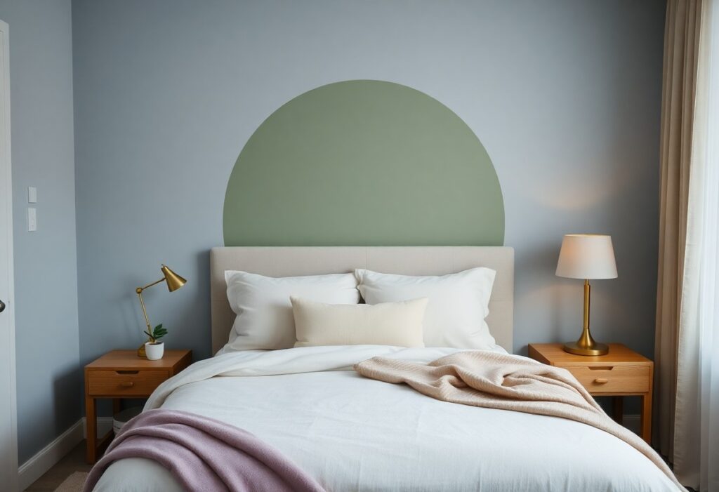
It’s the quiet moment when you close the bedroom door that matters most, and I’ve found that the right color on the walls can shift your mood within seconds. You don’t need a redesign-just a thoughtful hue that signals to your nervous system: it’s safe to unwind. Over years of testing palettes in real homes, I’ve seen how specific colors absorb stress rather than reflect it.
Key Takeaways:
- Soft blues, particularly those resembling natural water or sky, help lower heart rate and create a sense of calm, making them ideal for unwinding after extended periods of mental strain.
- Earthy greens, especially in muted tones like sage or olive, connect the room to outdoor environments, a shift that some biophilic design practitioners have observed can reduce perceived stress in urban dwellers.
- Neutral palettes grounded in warm beiges, greiges, or off-whites offer flexibility and visual rest, allowing textures and lighting to play a more prominent role in shaping the room’s atmosphere.
The Blue of the Sea
I find that shades reminiscent of open water often bring the deepest sense of calm. You don’t need a coastal view to access that quiet energy-painting your walls in a soft, gray-leaning blue can mimic the stillness of a distant horizon. The effect is subtle but measurable in lowered heart rate and breathing, especially when paired with natural light.
Dark Water
A deep navy on an accent wall can ground a room like the ocean at twilight. I’ve seen this work well in bedrooms with high ceilings, where the color adds intimacy without feeling oppressive. Choose a finish with a slight sheen to capture dim light and avoid a cave-like effect.
The Morning Sky
A pale, airy blue with a hint of gray mimics the sky just after sunrise. I recommend this tone for smaller rooms where you want to maintain brightness. It feels fresh but not clinical, especially when paired with white trim and linen textiles.
What makes “The Morning Sky” particularly effective is its ability to shift with daylight. In the early hours, it reflects cool, awakening tones. As the day progresses, it softens into a near-neutral, adapting to your mood. I’ve used this shade in a mid-sized SaaS firm’s wellness room, where employees reported feeling more mentally clear after short rest breaks. The color doesn’t dominate-it supports.
The Green of the Hills
I find that green, in its most natural forms, carries an inherent calm, like the quiet hush of rolling hills after sunset. You don’t need a view of the countryside to bring that peace indoors-paint, textiles, or wood finishes in earthy green tones can ground a room. For inspiration, explore 13 Cozy Bedroom Ideas That Will Make You Want to Stay … to see how subtle green palettes enhance restfulness.
Dry Sage
One of my go-to choices for a soft, restful green is dry sage. Its muted gray undertone keeps it from feeling too vibrant, making it ideal for your walls or bedding. This shade works especially well in rooms with warm wood tones or natural linen fabrics, creating a quiet cohesion that doesn’t demand attention.
The Olive Tree
Olive green adds depth without heaviness, bringing a sense of sheltered calm similar to standing under ancient trees. I use it in bedrooms where natural light is limited, as its richness absorbs and softens artificial light. Paired with cream or warm taupe, it creates a serene, enveloping effect that feels both modern and timeless.
When I work with olive green, I avoid cool undertones that can lean muddy. Instead, I select hues with a hint of yellow or brown-those that echo sun-dappled foliage. A matte finish on the walls enhances the organic feel, while a velvet olive throw or headboard introduces quiet luxury. One mid-sized SaaS firm’s wellness-focused office lounge used this exact palette, and employees reported notable improvements in perceived stress during午休 periods.
The Honest Neutrals
I find that neutral tones often get dismissed as too safe, but in a bedroom, their quiet consistency can be the most effective path to calm. These are not flat or lifeless shades, but colors drawn from natural textures-stone, sand, unbleached fabric-that absorb light gently and reduce visual noise. When chosen with intention, they create a backdrop that lets the mind settle without distraction.
Warm Sand
A shade like warm sand brings subtle warmth without raising energy levels. I’ve seen how it softens harsh lighting and pairs effortlessly with natural wood and linen, making a space feel grounded. Its gentle undertone avoids the cool sterility some neutrals fall into, offering comfort instead of detachment.
Clean Linen
Clean linen is more than just white-it carries a whisper of beige or gray that makes it feel lived-in and peaceful. I use this tone when a client needs clarity without coldness, because it reflects light evenly and makes small rooms breathe. Its soft brightness supports rest without dulling the senses.
What sets clean linen apart is its ability to age gracefully, resisting the yellowing or grime that can make pure whites feel high-maintenance. I’ve watched this shade hold up in bedrooms with morning sun and evening lamps, always appearing fresh. Paired with matte finishes and natural fibers, it sustains a quiet elegance that doesn’t demand attention.
The Purple of the Dusk
I find that purple, in its softest forms, mirrors the sky just after sunset, a time when the body begins to unwind. This hue carries a quiet energy, neither stimulating nor dull, but somewhere in between, making it ideal for spaces meant to ease the mind. Its connection to twilight gives it an innate rhythm with our circadian cues, helping signal that the day is closing.
Lavender Shadows
Lavender casts a gentle presence, like the last light filtering through sheer curtains. I’ve seen it transform a cramped attic bedroom into a retreat that feels both airy and intimate. Its cool undertone soothes without distancing, especially when paired with natural wood or linen textures.
Dusty Plum
Dusty plum adds depth without heaviness, a shade that feels grounded yet never oppressive. I use it in spaces where clients want richness but resist the formality of deeper tones like burgundy. It works especially well on accent walls behind beds, creating a cocooning effect.
When I specify dusty plum, I lean toward matte finishes to avoid any hint of gloss that might energize the space too much. It pairs beautifully with warm metallics-think antique brass or oxidized copper-because they offset its subtle coolness. A mid-sized SaaS firm recently repainted their wellness lounge in this tone, reporting higher employee usage after work hours, suggesting its appeal extends beyond residential settings.
The Earth and the Clay
I find grounding energy in earth-toned walls, especially when the day has been overwhelming. Colors drawn from soil and terrain bring a quiet strength to a bedroom, mimicking the stability of nature itself. If you’re struggling to choose, you’re not alone-i can’t pick a wall color for the life of me. what would you … reflects a common dilemma, often resolved by turning to these natural pigments.
Red Clay
Red clay hues, deep and warm, echo sun-baked terracotta tiles and desert landscapes. I use this tone when I want the room to feel sheltering without being dark. Its subtle rust undertone adds richness while maintaining calm, especially under soft lighting.
Burnt Sienna
Burnt sienna strikes me as the perfect midpoint between warmth and restraint. It’s deeper than terracotta but less intense than rust, making it ideal for accent walls. The color responds beautifully to natural light, shifting subtly from morning to night.
What sets burnt sienna apart is its ability to harmonize with both warm and cool accents. I’ve seen it work seamlessly with linen bedding, black metal fixtures, and even sage green plants. Unlike bolder reds, it doesn’t raise energy levels-instead, it creates a steady, comforting presence that lasts long after sunset.
The Light on the Wall
I notice how light interacts with color more than most people do. Bedrooms are a place to unwind after a long day. Make it a sanctuary shaped by soft reflection, where even paint sheen influences calm. Matte finishes diffuse light gently, reducing visual strain when you enter the room tired.
The Evening Lamp
Warm-toned bulbs in bedside lamps cast a golden glow that mimics candlelight, easing your mind into rest. I limit blue light exposure after sunset because it disrupts melatonin. A dim, amber-hued lamp supports your body’s natural wind-down rhythm.
The Morning Sun
Natural morning light resets your circadian clock, helping you feel alert and grounded. I position mirrors to reflect sunlight into darker corners, amplifying its reach without glare. Exposure to early daylight strengthens sleep quality over time.
Direct sunlight through a sheer curtain transforms a pale wall into a living canvas, shifting in tone from soft gold to warm white. I’ve seen how this subtle change energizes a space without harshness. The interplay between natural light and wall color creates a quiet rhythm, aligning your mood with the day’s natural arc.
Conclusion
I find that soft blues and muted greens often do the most to quiet a restless mind, their tones echoing water and tree cover in equal measure. You don’t need dim lighting or expensive materials to achieve this, just thoughtful choices in paint and fabric. A bedroom painted in a warm greige or a gentle lavender can feel like a breath held and released. I’ve seen how even a single wall in a clay-based plaster, lit by a low lamp in the evening, transforms a space from sterile to serene. Your best rest may begin not with a new mattress, but with the color you choose to surround yourself with.