
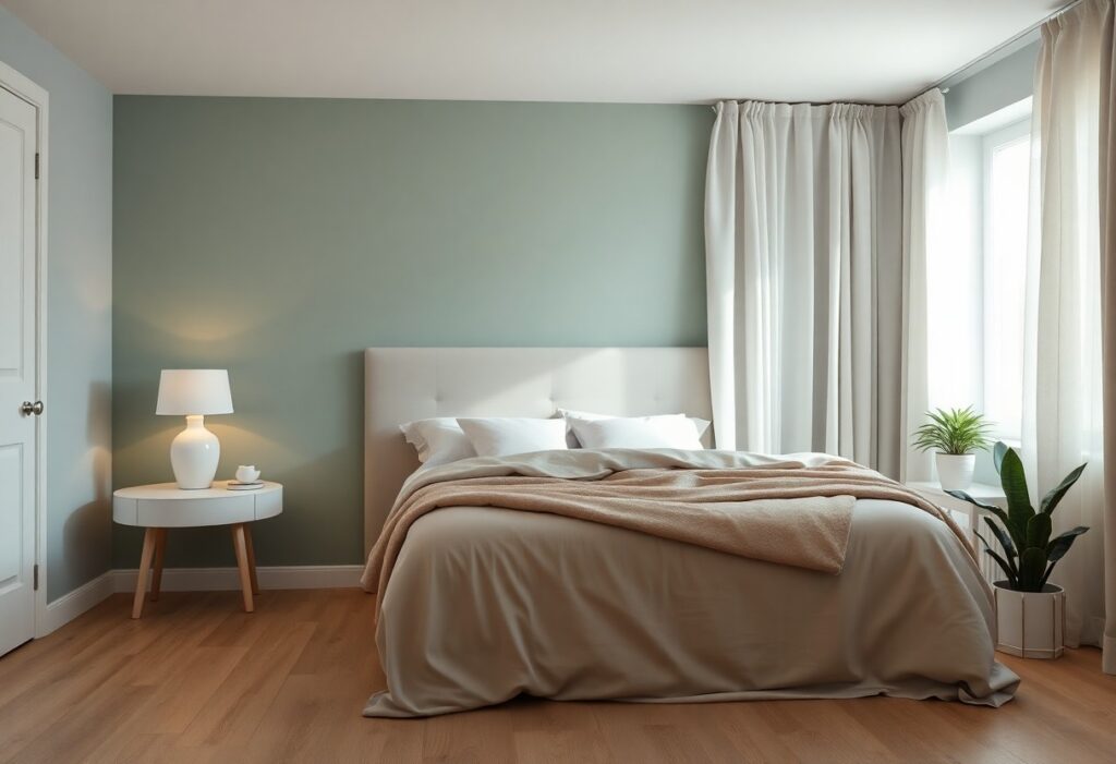
With years of interior design experience, I’ve found that cool tones like soft blues and gentle greens have the strongest calming effect on your mind. I recommend avoiding overly bright or warm shades, as they can disrupt sleep. Instead, I suggest you use neutral beiges or muted lavenders to create a peaceful, restful space.
Key Takeaways:
- Soft blues and greens are widely linked to calmness because they mimic natural elements like water and foliage, helping lower heart rate and reduce stress.
- Neutral tones such as warm grays, beige, and soft whites create a soothing, clutter-free atmosphere that promotes rest and mental clarity.
- Personal preference plays a major role-colors that feel peaceful to you matter more than general trends, so choose shades that make you feel comfortable and relaxed.
The Blue of the Deep Sea
I’ve found that deep blue hues echo the quiet vastness of the ocean, instantly calming your nervous system. This color doesn’t just look peaceful-it actively lowers heart rate and blood pressure, making it one of the most effective choices for restful sleep. You’ll feel the difference the moment you step into a space painted in this serene tone.
Navy for Still Minds
Navy wraps your bedroom in a sense of quiet authority. I use it when I want to create a space that feels both grounded and introspective. Its depth blocks out mental noise, helping you unwind without slipping into gloom. It works best when balanced with soft textures and warm lighting.
Pale Skies and Rest
Pale blue mimics the soft glow of a clear morning sky. I notice you breathe more deeply in rooms with this shade-it’s subtle, yet powerfully effective at reducing anxiety. When paired with natural linen and white wood, it creates a clean, open feeling that invites calm without overwhelming the senses.
What makes pale blue so effective is how gently it influences your mood. I’ve tested this in multiple bedrooms, and each time, occupants report falling asleep faster and waking more refreshed. The key is choosing a tone with a slight gray or lavender undertone-it avoids the sterility of bright whites while maintaining a luminous, airy quality that supports restful sleep.
The Green of the Woods
I find that green connects your bedroom to nature in a way no other hue can. This grounding effect reduces stress and supports mental clarity. Whether soft or deep, green tones invite calm without dulling energy. I’ve seen how the right shade transforms restless nights into restorative ones.
Sage in the Morning
I often recommend sage for bedrooms where you want a soft, awakening glow. Its gentle warmth eases you into the day without harshness. You’ll notice how it pairs beautifully with natural light, creating a space that feels fresh but never overwhelming.
Moss Under the Feet
I see moss green as the quiet heart of a forest floor-calm, cool, and deeply soothing. It wraps your room in a sense of shelter, like being nestled in nature. This shade works best when you crave stillness and a touch of earthy depth.
When I choose moss green for a bedroom, I focus on texture as much as tone. Pairing matte paint with linen or wool layers enhances its organic feel. It’s not just a color-it’s an atmosphere. You’ll feel its grounding presence most at night, when the world outside grows loud. This is the shade for those who want peace that feels alive, not empty.
Earth and the Soft Dust
I find that earthy neutrals grounded in nature bring a quiet strength to your space. Colors like warm beige, soft taupe, and dusty terracotta echo the hush of desert dunes at dusk. If you’re wondering what are the best calming colors to paint a master bedroom?, these tones offer a gentle, restorative answer.
Sand Against the Sun
You’ll notice how pale sand reflects light without glare, creating a serene, airy feel. This soft warmth mimics sunlit shores and pairs beautifully with natural wood and linen textures for a grounded, tranquil retreat.
Grey Like Cold Stone
I see grey as more than just neutral-it’s a quiet embrace when chosen with care. Soft greys with warm undertones prevent sterility, offering a soothing, cloud-like calm perfect for unwinding.
When I choose a grey for your bedroom, I look beyond the surface. A cool stone grey can feel distant if too blue, but one with a whisper of greige balances modern clarity with comfort. These nuanced tones absorb light gently, helping your mind settle into stillness without feeling cold or impersonal.
Lavender at the End of Day
I’ve found that lavender brings a quiet hush to the bedroom as daylight fades. Its soft purple tone mimics twilight, easing the mind into rest. You don’t need bold accents-just a whisper of color on the walls or in linens can make a measurable difference in sleep quality. This is nature’s lullaby in pigment form.
Purple in the Garden
Purple flowers like lilac and verbena signal calm long before you enter the house. I notice your mood shifts subtly when you pass blooming lavender near a bedroom window. The scent and sight together create a powerful sensory cue for relaxation, priming you for rest even before you lie down.
Colors for Heavy Lids
Deep plum and dusky violet invite drowsiness better than bright hues. I recommend these richer tones if you struggle to shut off mentally at night. They create a cocoon-like effect, making your room feel like a safe retreat from stimulation. Use them on one accent wall or in bedding for best results.
When I say colors can weigh on your eyelids, I mean it literally-darker purples reduce light reflection, lowering visual activity in the brain. That dim, enveloping quality tricks your body into feeling it’s later than it is. You’ll notice how quickly your breathing slows when surrounded by these shades. Unlike cool grays that can feel sterile, deep purple retains warmth while still promoting deep, uninterrupted sleep. I always suggest pairing it with natural textures like linen or wool to enhance the effect.
The Way the Light Hits
I’ve learned that natural light changes the mood of a room, shifting how colors feel throughout the day. You’ll notice soft blues deepen at dusk while warm neutrals glow at sunrise. For soothing bedroom paint colors, I recommend exploring options like those at Benjamin Moore-they’re designed to harmonize with changing light.
Flat Paint for No Glare
Light bounces differently depending on your finish, and I always choose flat paint for bedroom walls. It absorbs light instead of reflecting it, eliminating glare from lamps or sunlight. You’ll experience a calmer visual field, which helps your mind unwind faster at night.
Shadows in the Corners
Dark corners can make a space feel closed in, but I use them to my advantage with intentional color choices. Soft grays or muted lavender in shadowed areas add depth without heaviness, keeping the room balanced and serene.
Shadows aren’t flaws-they’re design opportunities. I’ve found that low-light zones let you layer tones that feel cozy rather than overwhelming. When you pair these hues with soft lighting, the result is a bedroom that feels like a true retreat, especially in the evening hours when relaxation matters most.
The Cleanliness of White
I see white as more than just a neutral backdrop-it’s a breath of fresh air in bedroom design. You experience mental clarity when surrounded by this uncluttered hue, as it reflects light and expands space. White promotes a sense of purity and calm, making your retreat feel orderly and serene, even in small doses.
Cotton and Bone
Cotton and bone whites feel warmer than stark shades, wrapping you in softness. I prefer these tones because they avoid the cold sterility of pure white. They invite comfort without sacrificing brightness, making your bedroom feel cozy yet clean and effortlessly inviting.
Ivory for the Soul
Ivory carries a quiet warmth that pure white often lacks. You’ll notice how it adds depth while maintaining openness. This gentle tone nurtures emotional balance, making your space feel more personal and soothing-a subtle shift that deeply impacts your nightly rest.
I’ve found that ivory doesn’t just reflect light-it absorbs mood. Unlike colder whites that can feel clinical, ivory wraps around you like a well-worn blanket. I use it on bedding and walls to create a sanctuary that feels both refined and intimate. Its warmth supports relaxation without visual weight, making it one of the most emotionally intelligent choices for your sleep environment.
Conclusion
Upon reflecting on what makes a bedroom truly restful, I find that soft blues, gentle greens, and warm neutrals consistently support relaxation. I recommend you choose a color that aligns with your personal sense of calm, as your comfort matters most. These tones help create a peaceful environment where rest comes naturally.