
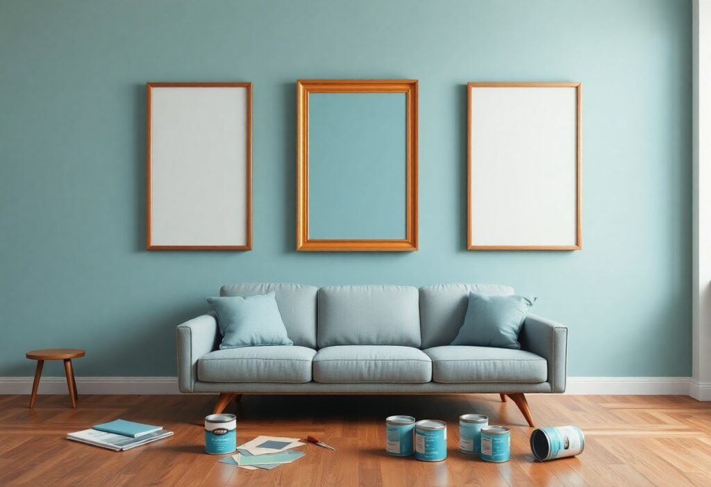
Over decades of studying environmental psychology, I’ve seen how color choices in your walls and artwork directly shape your mood and behavior. You may not realize it, but certain hues can trigger anxiety, while others promote calm and focus. I’ll show you how the palette you live with is far from neutral-it’s actively influencing your emotional state every day.
Key Takeaways:
- Warm colors like red, orange, and yellow on walls can energize a space, often increasing feelings of warmth and excitement, while cool tones like blue and green tend to promote calm and relaxation.
- The artwork you choose affects mood and perception-images of nature or open landscapes may reduce stress, whereas abstract or intense pieces can stimulate thought or even agitation depending on the viewer.
- Personal associations with color play a major role; cultural background and individual experiences shape how people respond to specific hues, so there’s no universal emotional effect for any single color.
The Red Pulse
I feel my breath shorten when I stand before a red wall. This color doesn’t whisper-it commands attention, accelerating heartbeats like a silent drum. You don’t choose to respond; your body does it for you. Red invades the senses, stirring energy, passion, and even urgency in ways no other hue can match.
Red is the color of the heart and the blood. It makes the pulse move fast when it sits on a wall.
Energy floods the room the moment red covers the walls. I notice your chest rising faster, even if you don’t realize it. This color mimics life’s rhythm-bloodflow, urgency, desire-triggering a primal reaction. It doesn’t soothe; it awakens, making spaces feel alive, charged, almost breathing.
A painting with red does not ask for your gaze. It takes it and it holds it tight like a debt.
Attention snaps to red before you decide to look. I’ve watched people turn mid-conversation, drawn like iron to a magnet. That painting in the corner? It claims your focus, refusing to let go. Red doesn’t wait for invitation-it occupies space with unapologetic force.
Once your eyes meet a red-dominated artwork, resistance fades. I’ve seen viewers try to look away, only to find their gaze pulled back, as if pulled by tension in the air. The color creates a visual gravity-intense, unavoidable, dominant-that shapes how long you linger and how deeply you feel. It doesn’t just hang on the wall; it performs, demanding emotional investment with every glance.
Blue Stillness
I’ve always been drawn to blue for its quiet strength. It calms the mind and slows the breath, making it ideal for spaces meant for reflection or rest. In my own home, a deep navy accent wall transformed a cramped study into a sanctuary. You can see how artists like Thomas Kinkade master this effect-learn more in The Psychology Of Color In Art: How Kinkade Uses Color.
Blue is the color of the sea and the sky. It is a quiet color that is very old.
Blue carries the weight of centuries, echoing in ancient textiles and sacred manuscripts. I feel its depth every time I stand by the ocean or gaze at a twilight sky. This timeless hue connects you to something vast and enduring, grounding your spirit in a way few colors can.
It makes a room feel large and cold. It is a good color for a man who wants to rest.
Space opens up under cool blue tones, but I warn you-too much can leave a room feeling distant. I once painted a bedroom entirely in slate blue and found it hard to feel warmth, no matter the lighting. It’s best balanced with soft textures if you want calm without chill.
Expanding on that sense of space and stillness, I’ve noticed blue works best when it’s paired intentionally. You might love the airy feeling it gives a small room, but without warm wood tones or layered lighting, the effect can become emotionally distancing. Men seeking solitude often choose blue, not just for its dignity, but because it creates a buffer from daily noise-just don’t let it isolate you completely.
Yellow Light
I see how yellow light shapes mood and mental clarity in subtle but powerful ways. It mimics daylight, triggering alertness and focus, making it ideal for morning spaces. But I also notice its intensity can overwhelm if not balanced. Your eyes don’t rest under constant yellow glow-it keeps the brain active when you might need calm.
Yellow is sharp like the morning sun. It wakes the brain and makes the eyes work hard.
Light floods the room like dawn when you use yellow tones, and I feel my thoughts sharpen instantly. You become more alert, more present. This brightness stimulates mental activity and enhances concentration, which is why I often recommend it for kitchens or home offices. But that same energy demands attention-it doesn’t let you fade into the background.
Too much yellow is a burden on the mind. It is like a light that will not turn off at night.
Constant exposure weighs on you, and I’ve seen how it leads to irritability and mental fatigue. Your mind stays tense, unable to wind down. This unrelenting brightness disrupts relaxation, making spaces feel restless instead of restful. I’ve learned that even energizing colors need limits.
When yellow dominates a room, I notice it doesn’t just energize-it can agitate. Your nervous system reacts to its high visibility, increasing heart rate and alertness even when you’re trying to relax. I’ve watched people grow impatient in overly yellow environments, unable to quiet their thoughts. The color’s persistence mimics insomnia in visual form, keeping the mind locked in daytime mode. That’s why balance is crucial-use it as an accent, not an anchor.
Green Earth
I explore how green transforms spaces into sanctuaries of calm and renewal. This grounded hue echoes nature’s rhythm, helping you feel more centered and emotionally balanced. Learn more about the psychology of colors – how wall colors affect our mood to make intentional choices in your home.
Green is the color of the hills and the trees. It is a steady color that does not lie to the eye.
Green offers visual honesty, mirroring the natural world without distortion. I find it reassures your mind with a sense of stability and authenticity, making rooms feel trustworthy and peaceful. Unlike artificial tones, it remains consistent, grounding your emotions in something real and enduring.
It brings the woods inside the house. It is the balance between the heat and the cold.
This shade softens hard edges, quietly bridging warmth and coolness in your space. I notice how it invites the serenity of the forest into your daily life, offering a soothing equilibrium that supports focus and emotional calm without dulling energy.
Bringing the woods inside doesn’t mean painting every wall forest green. I use subtle sage on accent walls or pair olive textiles with natural wood furniture to echo the outdoors. These choices create a quiet harmony, letting your environment breathe with you, reducing stress while maintaining a lively, connected feeling in your home.
The Heavy Shadows
I’ve watched people shift uncomfortably in rooms dominated by dark tones, not knowing why. Black and gray aren’t just colors-they’re emotional anchors. They don’t shout, but they pull at your mood, grounding or weighing you down depending on how you use them. These shades demand honesty from a space.
Black is the end of the light. It adds weight to a room and makes the walls feel thick and honest.
Black absorbs everything, even sound. I notice how it makes a ceiling seem lower, a corner deeper. You feel it before you see it-solid, unyielding. When I use black on walls or in frames, I do it with intention, because it doesn’t invite-it declares.
Gray is the color of stone. It does not take sides but gives the other colors a place to stand.
Gray stays neutral, but that doesn’t mean it’s passive. I rely on it to balance bold accents without competing. It’s the quiet support behind a vibrant painting or the calm between warm wood and cool metal. You don’t always see it, but you feel its stability.
Gray works best when treated as a foundation, not an afterthought. I’ve learned that the wrong gray can make a room feel lifeless, but the right one-cool like slate or warm like ash-creates space for emotion to unfold. It doesn’t dominate; it enables. When you pair it with texture or light, it reveals depth you didn’t expect, becoming more than just a background-it becomes context.
The Clean White
I see white not as emptiness, but as potential. It doesn’t shout or demand attention-instead, it listens. Your walls dressed in white become a quiet companion, shaping how you feel the moment you step into the room. This simplicity isn’t passive; it’s powerfully intentional.
White is a fresh start for an empty room. It is like a new day before the sun has risen.
You’ve felt it-that hush before the world wakes. I use white to capture that stillness. It doesn’t carry the weight of yesterday. Instead, it offers you space to begin again, untouched and full of quiet promise.
It gives the eyes room to breathe. It is the most honest of all the shades in the world.
I notice how clutter fades when surrounded by white. Your gaze isn’t pulled in ten directions. This shade refuses to pretend-it reveals everything, hides nothing. That honesty creates a rare sense of clarity and calm.
White doesn’t distort. I’ve watched people relax within seconds of entering a white room, their shoulders dropping as if released from a weight they didn’t know they carried. Because white reflects all light equally, it delivers visual relief-no shadows to mislead, no hues to sway mood. It’s the only color that shows you exactly what’s there, making it the most truthful backdrop for your life.
Final Words
As a reminder, I’ve seen how the colors on your walls and the artwork you choose directly shape your mood and mindset. I know that you don’t just live in a space-you feel it. The tones around you influence calm, energy, and focus every day, often without you noticing. I encourage you to use that power intentionally.