
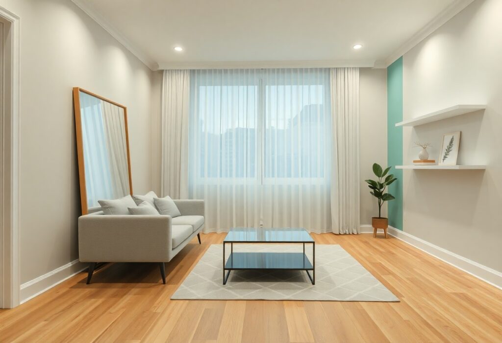
Most of us have faced that moment when our small living room feels just a bit too cozy-almost like the walls are inching closer. I’ve been there too. That’s why I’ve learned how a few thoughtful color choices can make your space feel noticeably more open and surprisingly airy, without moving a single wall. You don’t need a renovation, just a fresh perspective on paint and palette.
Key Takeaways:
- A light, cohesive color palette on walls and large surfaces can visually expand a small living room, with soft neutrals like warm white or pale greige helping to blur boundaries between walls and ceiling.
- Painting trim and ceiling the same color as the walls creates a seamless envelope effect, eliminating visual breaks that can make a space feel boxed in, as seen in many studio apartments in older urban buildings.
- Introducing subtle contrast through muted accent colors-like sage green or dusty blue-on a single wall or in textiles adds depth without shrinking the perceived size, a technique often used in coastal cottage designs.
Important Factors for Your Color Choice
Light, space, and existing furnishings shape how color behaves in your small living room. I always consider how natural and artificial lighting shifts throughout the day, since it changes how paint looks. Your current furniture and flooring also anchor the palette. The right choice enhances openness without ignoring what you already love.
Analyzing your room’s natural lighting
Morning light in my east-facing living room feels crisp and cool, making soft blues appear brighter. In the afternoon, sunlight streams in warmer and golden, shifting how beige or cream tones read. You might notice shadows in corners if windows are small or shaded. The light’s quality affects whether a pale green feels fresh or dull.
Matching colors to your current layout
I work around my dark hardwood floor and charcoal sofa by choosing wall colors that balance, not clash. A warm gray or greige keeps the space feeling cohesive instead of choppy. You don’t need to repaint everything at once. The existing layout guides which hues will flow naturally.
When I matched my walls to the undertones in the rug and curtains, the room instantly felt more unified. Cool-toned textiles played better with a soft sage than a warm beige, even though both are light. It’s not just about brightness, but harmony between surfaces. The sofa’s fabric now blends rather than contrasts, expanding the sense of space.
How to Use Airy Hues to Open the Room
I often reach for soft, light colors when I want to make a small living room feel more spacious, and you can see the difference quickly. Painting walls in airy hues like soft whites, gentle greys, or cool blues helps reflect light and visually push boundaries outward. For inspiration, check out this post on What are some ideas to make a small living room look … where real homeowners share their transformations. The effect is immediate and striking, especially in rooms with limited natural light.
Picking the best soft whites and greys
Soft whites with a hint of beige or greige-grey mixed with beige-tend to feel warmer and more inviting than stark white, which can sometimes feel cold. I’ve found that these nuanced tones help maintain brightness while adding subtle depth, making the space feel open yet cozy. Choosing a shade with the right undertone matters, especially under artificial lighting in the evening.
Why cool blues make walls feel further away
Cool blues have a receding effect on walls, making them appear farther from you than they actually are. I’ve used this trick in narrow rooms where I wanted to create breathing space without remodeling. The color’s calming nature also adds a quiet elegance, and the illusion of distance works especially well in north-facing rooms with cooler natural light.
One reason cool blues work so well is how our eyes process color. Unlike warm tones that seem to advance, cool hues like pale sky blue or misty grey-blue naturally recede in our perception. I once painted a small, boxy living area in a soft periwinkle, and guests immediately commented that the room felt longer. It’s not magic-it’s color psychology and light behavior working quietly behind the scenes.
Smart Tips for Painting Your Trim and Ceiling
Matching your trim to the walls blurs the edges of the room, making corners feel less boxy. I always paint my ceiling the same soft white as the walls to avoid visual breaks. Using the same finish matters too-eggshell everywhere keeps the light moving. Thou can find more inspiration in this guide to 8 Easy Ways To Make Your Room Feel Bigger (No Reno ….
- Use the same color for walls and trim to reduce visual separation
- Choose a soft, reflective white for both ceiling and walls
- Keep sheen consistent across surfaces to maintain flow
- Don’t overlook baseboards-paint them in line with the wall tone
Creating a seamless look with one shade
When I painted my trim the same hue as the walls, the room instantly felt more unified. The eye doesn’t catch on edges, so the space appears larger and calmer. This trick works especially well in rooms with lots of molding, where contrast would draw too much attention.
Making your ceiling feel much higher
Painting the ceiling a slightly lighter tint than the walls tricks the eye into perceiving more height. I once used a barely-there sky blue on the ceiling while keeping walls white, and the difference felt like an extra foot of air.
Some designers suggest going even further by painting the ceiling the same color as the walls but in a lower sheen, like flat instead of eggshell. This subtle shift in texture, not tone, keeps the surface from standing out while still managing light. In my last apartment, this method made the low 8-foot ceiling feel almost imperceptible, like the room just faded into the sky.
How to Incorporate Furniture Into the Palette
I treat furniture as part of the color story, not separate from it. When your sofa or bookshelf echoes the wall tone, the room feels more unified and spacious. I often choose upholstery and wood finishes that sit within the same family as the walls, creating a quiet flow that keeps the eye moving smoothly. This subtle coordination makes even a compact space breathe easier.
Blending bulky items with wall colors
Large furniture stands out when it clashes with its background. I paint bookshelves or media units in the same soft gray or warm white as the walls to reduce their visual weight. When a tall cabinet nearly disappears into the backdrop, the room gains a sense of openness. Matching these bulky pieces to the wall color is one of the easiest ways to expand a small living area.
Using monochromatic layers for a clean look
I build depth without clutter by layering similar tones across furniture and textiles. A light beige sofa paired with slightly darker throw pillows and a cream rug creates gentle contrast. This monochromatic approach keeps the space feeling calm and connected, letting light move freely from surface to surface.
Instead of relying on bold contrasts, I find that varying textures within one color family add richness. For example, a linen armchair, a wool ottoman, and a velvet cushion in differing shades of blue can coexist quietly. The eye registers the subtle differences without disruption, and the room maintains its airy feel. Even in a small footprint, this method supports both comfort and visual expansion.
Helpful Tips for Adding Strategic Accents
I’ve found that strategic accents can transform a flat space into one with rhythm and surprise. A few well-placed elements draw the eye without crowding the room. Think beyond paint-try a bold lamp, colorful art, or a textured throw. Contrast matters more than size. Knowing where to pause and add a spark makes all the difference.
- Use small doses of bright color to create focal points
- Choose one dark wall to add depth and dimension
- Pair contrasting accents with neutral backdrops for balance
- Anchor the space with intentional metallics like brass or copper
Using bright pops of color in small doses
I once added a tangerine cushion to a gray sofa and instantly lifted the whole room. Bright pops of color work best when contained-a single pillow, a small painting, or a ceramic vase. Too much overwhelms, but just a touch energizes. Knowing how little you need is half the battle.
Creating depth with a single dark wall
I painted the wall behind my bookshelf deep charcoal while keeping the others light, and it made the room feel longer. A single dark wall recedes visually, creating instant depth. It works especially well behind furniture or in corners. Knowing which wall to darken is key.
That back wall doesn’t need to be black-deep navy, forest green, or eggplant can have the same effect without feeling heavy. I’ve seen a mid-sized SaaS firm’s lounge use a matte burgundy behind a credenza, making the compact space feel like it stretched beyond its walls. The trick is keeping the ceiling and adjacent walls significantly lighter to maintain the illusion of space. Strong contrast between the dark wall and lighter surfaces enhances the sense of separation and dimension.
Conclusion
I’ve found that a few thoughtful color choices can truly transform your space, making it feel brighter and more open without needing to move a single wall. When you paint your walls in soft, reflective tones and carry those hues into your trim or ceiling, the room starts to breathe. I once helped a friend repaint her cramped city living room in a warm white with pale blue accents, and even her guests noticed how much larger it felt. You don’t need a renovation-just a fresh can of paint and a little courage to try something light.