
Livingroom walls can feel bare or overwhelming fast, and I’ve learned that the wrong piece can dominate a space or get lost completely. I’ll help you pick artwork that feels like it belongs, matches your light and layout, and sparks joy every time you walk in. The right choice makes your room feel finished, not forced.
Key Takeaways:
- A mid-sized SaaS firm redesigned their office lounge using large abstract canvases in muted tones, proving that artwork aligned with a room’s existing palette can enhance cohesion without overwhelming the space.
- One designer in Portland helped a client avoid common scale mistakes by using painter’s tape to outline the intended artwork dimensions on the wall, revealing how visualizing size in real space prevents costly mismatches.
- A collector in Austin layered a vintage botanical print with a modern metal frame and linen mat, showing how combining contrasting textures-like paper and metal-adds depth and draws the eye from across the room.
Assessing Your Space and Lighting
I always start by standing in the room and noticing how light moves throughout the day. The brightness and angle can completely change how a piece looks, especially if it’s glossy or framed under glass. Direct sunlight can fade delicate pigments over time, so I’m careful with watercolors near south-facing windows.
Measuring your walls for the best fit
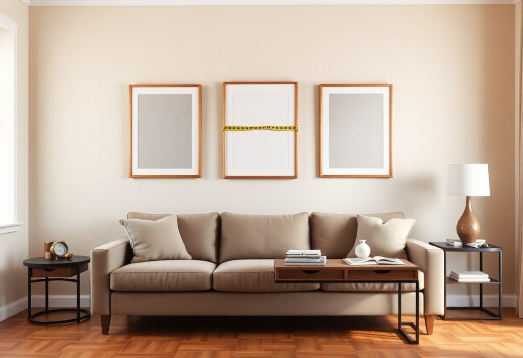
Before I hang anything, I measure the wall space with a soft tape, noting any obstructions like switches or molding. A piece that’s too small can get lost, while an oversized one might overwhelm the area. I aim for artwork that takes up about two-thirds of the wall’s width above a sofa, which keeps the balance just right.
How natural light affects your art choices
Morning light from an east-facing window gives a soft, cool glow that enhances blues and greens, while afternoon sun adds warmth that brings out reds and golds. I avoid placing sensitive prints where harsh light hits directly, opting instead for UV-protective glass or rotating pieces seasonally to prevent damage.
When I hung a delicate charcoal drawing in my sunlit living room, I noticed the tones began to lighten within months. Since then, I’ve learned that natural light isn’t just about visibility-it actively interacts with materials. Framing with UV-filtering glass made a visible difference in preserving depth and contrast, especially in works on paper. I now check the exposure at different times, imagining how the light will touch the surface over years, not just days.
Finding Your Personal Aesthetic
I pay attention to the pieces I’m naturally drawn to, whether in galleries or friends’ homes. Over time, I notice patterns-maybe I prefer soft watercolors or bold abstract shapes. Recognizing these preferences helps me build a collection that feels authentic. This
Tips for discovering styles you love
I explore different environments and take note of what resonates. Visiting museums, browsing curated online galleries, or flipping through art books introduces me to new possibilities. I pay close attention to color palettes, brushwork, and subject matter that spark joy. This
- Notice which paintings stop you mid-scroll
- Snap photos of murals or installations that catch your eye
- Save images from magazines or apps without overthinking
- Reflect on artwork from trips or meaningful moments
Matching the art to your room’s mood
I think about how I want to feel when I walk into the space-calm, energized, inspired. A serene bedroom might call for soft gradients and natural tones, while a lively living room benefits from dynamic shapes and rich contrast. The artwork should enhance the existing atmosphere, not fight it. This
When I placed a large, sunlit landscape above my sofa, the whole room felt brighter and more open, even on cloudy days. It didn’t just fill wall space-it shifted the emotional tone, making the area feel more inviting and warm. Art has that quiet power when it aligns with the room’s purpose. This
Considering Size and Scale Factors
Getting the size and scale right transforms how art interacts with your living room. I always measure wall space first, leaving at least 4-6 inches between furniture and the frame. A piece that’s too small feels lost, while an oversized one can overwhelm. Perceiving
- the proportion between your sofa and the art above it
- the ceiling height and how it affects visual weight
- the negative space around the artwork
- how multiple pieces form a cohesive group
Using the golden ratio for wall placement
I sometimes use the golden ratio to position art where the eye naturally lingers. Placing the center of the composition at the ratio’s focal point creates subtle harmony. You don’t need exact calculations-just aim slightly above center. Perceiving
Balancing large statement pieces with smaller accents
A bold centerpiece draws attention, but I balance it with smaller works nearby to avoid visual crowding. Grouping a large abstract painting with a pair of modest sketches adds rhythm. You control the flow by varying sizes thoughtfully. Perceiving
When I hang a large canvas behind the sofa, I flank it with a pair of slender vases or small framed photos on side tables. This creates a layered effect without competing for focus. The statement piece remains dominant, while the accents support its presence like background notes in a song. A mid-sized SaaS firm redesigned their lounge this way, and guests consistently notice the cohesion. Perceiving
Choosing the Right Medium and Texture
I often find that the medium shapes the mood of the room just as much as the image itself. Whether it’s a bold oil painting, a crisp photographic print, or a textured mixed-media piece, each brings a different energy. Scared To Choose Art? We Showed Our Photographer … how one couple found clarity through real-life examples, and it reminded me how personal this choice truly is.
Deciding between canvas, prints, and photography
Canvas adds warmth and depth, making it ideal for living rooms that feel a bit flat. I lean toward giclée prints when I want sharp detail without glare, especially in bright spaces. Photography can anchor a modern look, particularly in black and white, giving your wall a curated gallery feel.
How to mix different textures for a cozy feel
Layering a linen-wrapped canvas with a glossy photo and a framed sketch creates visual warmth. I love pairing a rough-textured abstract piece with a smooth metallic frame nearby. This contrast keeps the eye moving and makes the space feel lived-in and inviting.
One trick I use is placing a woven textile or a small sculptural object on the shelf beneath the art to extend the texture beyond the wall. A matte painting next to a shiny ceramic vase, for instance, creates a quiet rhythm. These small contrasts make the whole arrangement feel intentional, not staged, like it evolved naturally over time.
Picking Frames That Pop
A well-chosen frame can transform a good piece of art into a living room centerpiece. I pay attention to how the frame interacts with both the artwork and the surrounding decor, making sure it complements rather than competes. The right choice adds depth and draws the eye exactly where you want it.
Factors for selecting frame colors and materials
When I pick a frame, I consider the room’s existing tones and the artwork’s mood. A dark wood frame adds warmth, while metal finishes like brushed gold or black iron bring modern polish. Matte or textured surfaces can soften a bold piece, and glossy ones amplify brightness. This helps me match the frame to both the art and your space.
- Frame color should echo a hue in the artwork or contrast it for drama
- Material affects both style and durability-wood, metal, or composite each have their strengths
- Finish (glossy, matte, textured) influences how light interacts with the piece
- Proportion matters-thicker frames suit large canvases, thinner ones enhance delicate works
Why professional matting makes a difference
I once hung a watercolor without matting and noticed how cramped it felt on the wall. Adding a crisp white mat gave it breathing room and made the colors stand out. This small upgrade can elevate even an inexpensive print into something gallery-worthy.
Professional matting isn’t just about looks-it protects your artwork by preventing direct contact with glass, which reduces moisture damage and fading over time. I always choose acid-free mats because they preserve paper quality, especially for original drawings or prints. A well-cut mat also creates a visual border that focuses attention on the image, making the whole display feel intentional and polished.
Where to Shop for Your New Art
I often find that the best pieces come from places that match both my budget and style. Whether browsing nearby shops or scrolling through curated collections online, there are plenty of options. One of my go-to spots is Art For Living Room, where the variety makes it easy to discover something truly unique and fitting for your space.
Exploring local markets and galleries
Walking through a weekend art market, I love seeing how each piece carries the artist’s personality. Local galleries often showcase emerging talent you won’t find elsewhere, and building a relationship with creators can lead to first picks on new work. I’ve even brought home a small canvas that the artist personally signed, adding a special touch to my living room.
How to navigate online art stores with ease
Filters help me narrow down by color, size, or medium without feeling overwhelmed. I always check customer photos in real homes because they show how a piece looks in natural lighting. Some sites offer augmented reality previews, which let me visualize art on my wall using my phone-making it easier to avoid mistakes with scale or tone.
When I shop online, I pay close attention to return policies and shipping details. A few months ago, I ordered a large abstract print only to discover the frame wasn’t included-something clearly noted in the fine print I’d skipped. Now, I read descriptions thoroughly and save images of my living room to compare colors. This habit has saved me from mismatched hues and oversized deliveries that don’t fit through the door.
Final Words
I always keep in mind that your living room should feel like a reflection of you, not a showroom. I’ve found that the best pieces are the ones that make you pause, smile, or remember a place you loved. Whether it’s a bold canvas or a quiet sketch, if it feels right to you, it belongs.