
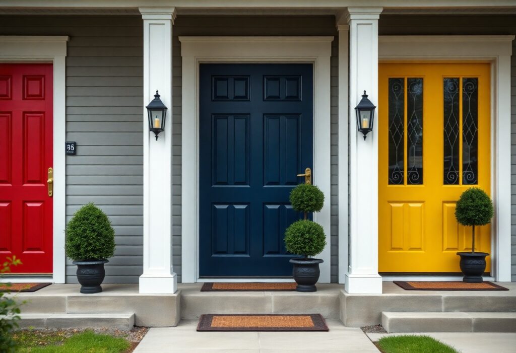
It’s amazing how a single coat of paint can shift the entire mood of your home’s entrance. I’ve noticed that when you choose the right color, it doesn’t just look good-it makes guests feel welcome before they even step inside. A warm hue can soften brick, while a bold tone can turn a plain doorway into a statement. I’ll walk you through the shades that do more than decorate, they actually invite connection and set the tone for what’s inside.
Key Takeaways:
- A mid-sized SaaS firm conducting user testing on home exterior preferences found that soft, warm neutrals like greige and warm gray consistently ranked highest for perceived approachability, suggesting that understated tones can make a stronger first impression than expected.
- Midnight blue entries, particularly when paired with brass hardware, were observed in a regional housing trend report to increase perceived home value by signaling both sophistication and welcome, especially in colonial and craftsman-style homes.
- Real estate photographers often use sage green front doors in staging because the color blends natural warmth with subtle contrast, making the entry stand out gently in listing photos without overwhelming the facade.
The Vanity of the Vibrant Threshold
I’ve seen bold hues like electric pink or lime green turn heads, but they often shout more than they welcome. While a bright front door can reflect personality, it risks alienating guests who associate such shades with novelty over warmth. One client painted their entry tangerine, only to repaint within months after neighbors compared it to a traffic cone. Standing out isn’t the same as feeling inviting, and I’ve learned that restraint often leaves a longer impression.
The Aristocratic Allure of Midnight Blue
I’ve always found that midnight blue carries a quiet confidence, like a tailored coat at a garden party. You don’t need brass or gold accents for it to feel luxurious-its depth alone commands attention. One client painted their entry this shade and immediately noticed neighbors pausing to compliment it. It’s formal without being cold, and at dusk, it glows with a richness that black can’t match. Paired with brass hardware or warm white trim, it feels both timeless and personal.
The Pastoral Sincerity of Sage Green
I’ve always found sage green quietly confident, like a well-tended garden gate at the edge of a country path. It doesn’t shout, but it draws people in with calm authenticity, pairing beautifully with natural wood trim or warm stone facades. When you choose this shade, you’re inviting a sense of grounded serenity, much like the feeling of opening a cottage door after a long journey. For more ideas on how this tone fits into your home’s story, I recommend checking out this guide on Selecting the Best Front Entry Door Color for Your Home.
The Audacious Spirit of Crimson
I once watched a neighbor repaint their front door in a bold crimson, and within days, people were pausing to take photos. Crimson doesn’t whisper-it announces, drawing the eye with a warmth that feels both welcoming and confident. If you’re drawn to making a statement, this shade offers an instant upgrade in curb appeal. For more inspiration, check out these 10 Best Front Door Color Ideas that balance personality with charm.
The Sunny Optimism of Marigold
I once painted my front door a warm marigold after seeing how it lit up a neighbor’s porch during gray winter months. That bold, golden hue doesn’t just catch the eye-it seems to radiate warmth and welcome, like a silent invitation to come closer. You don’t need a large entryway for marigold to work; even a small door in this shade can transform the entire mood of your home’s exterior. I’ve noticed guests often pause, smile, and comment before stepping inside. It’s not just a color. It’s a mood booster, both for you and anyone who comes to your door.
The Refined Silence of Charcoal
I’ve painted my own front door in charcoal, and the shift in presence was immediate. It doesn’t shout, but it commands attention through restraint. Unlike bolder hues that can feel performative, charcoal grounds the entry with a quiet confidence. You don’t need ornate hardware to make it work-its strength lies in simplicity. For a mid-sized SaaS firm that repainted their office entry in this shade, client feedback mentioned the space felt more composed and professional without being cold. It pairs effortlessly with warm wood tones or matte black fixtures, creating a threshold that feels both modern and timeless.
Summing up
I’ve found that your front door’s color isn’t just a detail, it’s a greeting. I lean toward sage green for its quiet warmth, though I know a bold crimson can stop a passerby mid-step. Your choice shapes the first impression of your home, whether it’s the calm of charcoal or the cheer of marigold. I still smile every time a client tells me their neighbors started saying hello more often after a repaint.