
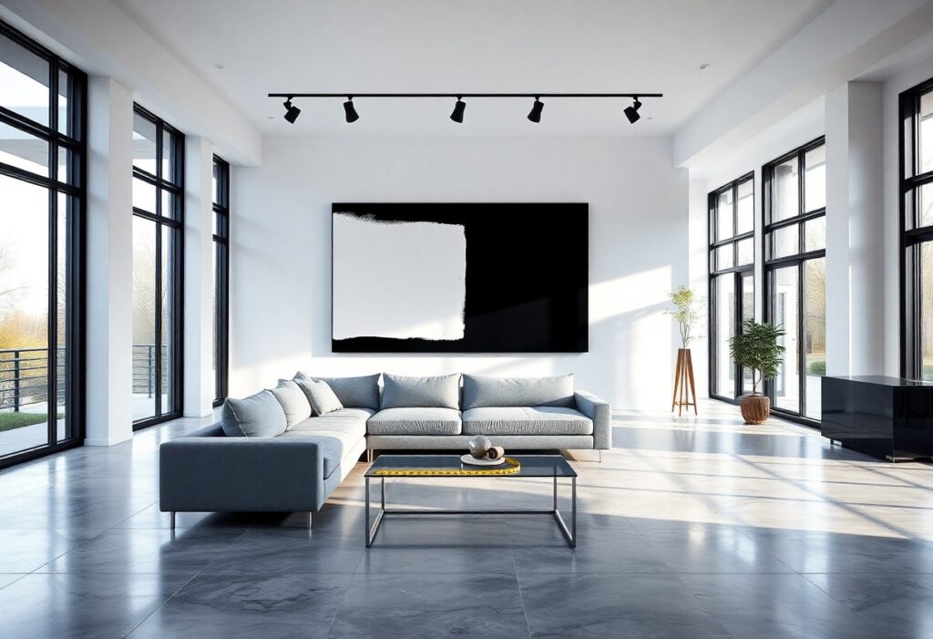
You step into a space defined by clean lines, open layouts, and minimalist surfaces, and immediately feel the need for art that doesn’t compete but complements. I’ve found that the right artwork can transform a contemporary home from stark to sophisticated, while the wrong piece risks undermining its architectural integrity. In my experience, selecting art isn’t about decoration alone-it’s about dialogue between form and function, where scale, materiality, and intention shape the outcome.
Key Takeaways:
- Contemporary architecture often emphasizes clean lines and open spaces, making large-scale or boldly composed artwork an effective anchor in expansive walls or high-ceilinged rooms, such as a monochromatic triptych in a double-height living area.
- Materials matter: artworks incorporating industrial elements like steel, glass, or polished resin can echo architectural features such as exposed beams, floor-to-ceiling windows, or concrete finishes, creating visual continuity between art and structure.
- Neutral palettes dominate many modern homes, allowing strategic use of color in artwork to introduce vibrancy without clashing-such as a single crimson abstract piece against a white oak and charcoal backdrop in a Pacific Northwest-inspired home.
Analyzing Architectural Factors
Architectural lines, spatial volume, and material finishes directly influence how artwork functions within a contemporary home. I assess ceiling height, wall expanse, and natural light exposure to determine suitable scale, placement, and medium. After identifying these core elements, choices become less about preference and more about alignment with the home’s inherent rhythm.
Evaluating open floor plans and spatial flow
Open layouts demand artwork that respects movement and visual continuity. I consider how pieces guide the eye across zones without disrupting the sense of spatial flow. Large-scale works can define areas subtly, while a series of smaller pieces may echo the path of travel. After establishing functional zones, art becomes a silent wayfinder.
Identifying structural focal points and sightlines
Stairwells, floor-to-ceiling windows, or exposed beams naturally draw attention. I position artwork to either complement or contrast these focal points, depending on whether I want to amplify or balance their impact. Sightlines from key entry points or seating areas determine visibility and placement precision. After mapping these visual anchors, decisions shift from decorative to intentional.
When I examine structural focal points, I look beyond aesthetics to how light interacts with form throughout the day. A cantilevered staircase, for instance, casts dynamic shadows that change with the sun’s angle, making it a living element in the space. Placing a bold, static sculpture nearby can create tension, while a linear wall piece might echo the staircase’s geometry. These relationships matter most when viewed from primary vantage points like the living area or entry hall. After observing these patterns over time, I adjust positioning to enhance, not compete with, the architecture.
Selecting the Right Artistic Mediums
I prioritize materials that echo the clean lines and intentional simplicity of contemporary design, often turning to canvas, metal, or mixed media works that align with architectural precision. For deeper insight, I recommend reviewing How to Choose the Right Art for a Room, which illustrates how medium impacts spatial perception.
Integrating abstract and minimalist styles
Abstract pieces with restrained palettes and geometric forms complement the structured openness of modern homes. I look for compositions that mirror architectural elements, such as floating walls or angular windows, creating a dialogue between art and space without visual clutter.
Incorporating sculpture and three-dimensional installations
Sculptures add depth and invite movement through a room, enhancing the spatial dynamics inherent in contemporary design. I favor freestanding or wall-mounted works with sleek profiles that interact with light and shadow, reinforcing the architecture’s emphasis on form and volume.
When I incorporate three-dimensional installations, I consider negative space as critically as the object itself. A polished steel piece in a corner of a loft with floor-to-ceiling glass can reflect changing daylight, transforming throughout the day. These works don’t just occupy space-they redefine it, becoming part of the home’s structural narrative.
Determining Scale and Proportions
I assess wall dimensions and ceiling height before selecting any piece, ensuring the artwork aligns with the room’s structural rhythm. Oversized walls demand larger compositions, while low ceilings limit vertical scale. I avoid undersized art that drowns in space, a common misstep that weakens visual impact. Proportion isn’t just measurement-it’s about presence.
Sizing artwork for expansive wall surfaces and high ceilings
Large walls in modern homes require bold, expansive pieces that match their volume. I often recommend a single large canvas or a grouped installation that spans at least two-thirds of the wall’s width. Filling vertical space thoughtfully prevents the artwork from appearing like an afterthought in rooms with soaring ceilings.
Balancing bold statements with intentional negative space
A powerful piece gains strength when surrounded by breathing room. I use negative space to draw focus, ensuring the artwork remains the centerpiece without competing elements nearby. Strategic emptiness enhances clarity and sophistication, especially in minimalist interiors where restraint amplifies impact.
When I place a large abstract painting on a wide wall, I leave at least 18 inches of clear space on each side, allowing the form to stand in isolation. This approach works best in open-plan living areas where sightlines are long and unobstructed. Too many objects nearby fracture attention, but a single work with ample surrounding wall surface commands authority and balance.
Tips for Harmonizing Color and Texture
Matching artwork to the color palette and surface finishes of contemporary architecture ensures visual cohesion. I consider wall materials, flooring, and cabinetry when selecting pieces with complementary or intentionally contrasting textures. A matte painting can soften a high-gloss kitchen, while a vibrant abstract work can energize a neutral concrete wall. Recognizing subtle undertones in both art and architecture prevents clashing and deepens aesthetic alignment.
- Choose artwork with colors that echo or thoughtfully contrast your space’s finishes
- Balance smooth architectural surfaces with art that introduces tactile variation
- Use framing materials to bridge the texture gap between wall and canvas
- Test prints or mockups in natural and artificial lighting before final placement
Coordinating with industrial materials like concrete and glass
Raw concrete walls and floor-to-ceiling glass call for artwork that respects their minimalist integrity without disappearing into the background. I often select pieces with organic pigments or hand-applied layers that introduce warmth against cold surfaces. A large-format photograph on aluminum can mirror the building’s reflective elements, creating continuity. Recognizing how material honesty defines modern spaces guides my choices toward authenticity over decoration.
Utilizing contrast to enhance visual impact
Placing a richly textured textile piece against a sleek glass partition creates an immediate focal point. I look for opportunities where softness disrupts rigidity, or where saturated color interrupts monochrome zones. A blackened steel beam becomes a frame for a crimson silk hanging, intensifying both elements. Recognizing the power of deliberate opposition transforms passive walls into dynamic conversations.
Contrast works best when it’s intentional, not accidental. I once installed a handwoven jute mural in a loft with polished concrete floors and exposed ductwork-the fibrous, earth-toned surface drew people in, inviting touch in a space otherwise defined by hardness. The artwork didn’t compete with the architecture; it provided relief. Strong visual tension, like pairing a gestural oil painting with a monolithic white wall, can anchor a room without overwhelming it. Recognizing that contrast isn’t about conflict but about balance ensures the art enhances, rather than fractures, the design narrative.
How to Optimize Lighting and Placement
I always assess how natural and artificial light interact with wall surfaces before positioning a piece, since improper illumination can distort color and shadow, diminishing the artwork’s intended impact. For guidance on pairing large-scale pieces with modern spaces, see this detailed resource on How to Choose Large Contemporary Wall Art for Modern ….
Implementing specialized gallery-grade lighting
Gallery-grade LED track lighting allows precise control over beam angles and color temperature, ensuring the artwork remains the focal point. I use adjustable fixtures to avoid glare on glossy surfaces, maintaining clarity and depth in high-contrast compositions, especially in open-concept areas with reflective flooring.
Ensuring proper height and sightline alignment
The center of a piece should align with average eye level, roughly 57 to 60 inches from the floor, to create a natural viewing experience. In rooms with tall ceilings or multi-tiered walls, I adjust incrementally based on furniture groupings, preserving visual balance without distorting architectural intent.
When working with floor-to-ceiling walls in a contemporary penthouse, I anchored a triptych above a low credenza, positioning the central panel at 58 inches from the ground. This alignment ensured cohesion with seated and standing sightlines, particularly in transitional spaces where movement patterns cross multiple zones. Correct vertical placement prevented the work from appearing floaty or disconnected, integrating it as a grounded element within the architecture.
Curating a Cohesive Collection
I guide clients through the emotional weight of selecting art by focusing on personal resonance over trends. If you’re unsure where to begin, Scared To Choose Art? We Showed Our Photographer … offers a relatable, human-centered approach that prioritizes instinct and lived experience in the decision-making process.
Navigating the selection process for high-end interiors
Confidence in curation grows when you treat each piece as part of a larger narrative. I look for works that reflect the homeowner’s journey while respecting the clean lines and intentional minimalism of contemporary spaces, ensuring every selection feels deliberate, not decorative.
Investing in pieces that maintain architectural integrity
I prioritize artworks that honor the structure’s design language, avoiding anything so dominant it competes with the architecture. A bold abstract painting might work in a loft with exposed steel, but in a glass-walled modern home, subtlety preserves the balance between art and environment.
One client inherited a Richard Neutra-inspired home where floor-to-ceiling glazing defined the living experience. Instead of hanging large canvases that would disrupt the transparency, I commissioned a series of small-scale, framed architectural drawings mounted in a precise grid near a private hallway. The rhythm of the arrangement echoed the home’s modular design, reinforcing its geometric clarity without overwhelming it. Art in such spaces should feel like a quiet extension of the walls, not a contrast to them.
To wrap up
I find that pairing artwork with contemporary architecture comes down to respecting the integrity of the space while allowing your personal taste to surface. You don’t need to fill every wall, but each piece you choose should feel intentional-whether it’s a large-scale black-and-white photograph in a minimalist living room or a sculptural object on a floating shelf in a concrete-and-glass entryway. I’ve seen clients transform sterile spaces by introducing handcrafted ceramics or textured fiber art that softens sharp lines without clashing with the design language. Your selections don’t have to match the architecture exactly; contrast can work powerfully, as long as the scale, color, and material feel considered. A single well-placed piece in a high-traffic area often resonates more than a gallery wall that feels imposed. I always advise stepping back-literally-to assess how the art interacts with light, sightlines, and movement through the home. When it feels balanced, the artwork doesn’t just hang on the wall, it becomes part of the architecture.