
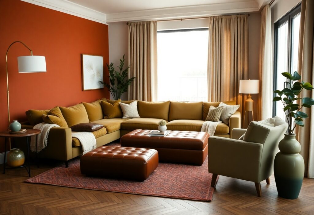
Many homeowners overlook how much color impacts mood and comfort in a space, but I’ve found that the right palette transforms your living room into a warm retreat. I recommend soft neutrals, warm earth tones, and deep, saturated hues like terracotta or navy-they add depth without feeling cold. You’ll notice how lighting interacts dramatically with these choices, enhancing coziness. I always advise testing samples first, as the wrong shade can make a room feel closed in.
Key Takeaways:
- Warm neutrals like beige, taupe, and warm gray create a soft, inviting backdrop that enhances comfort and pairs well with textured fabrics and natural materials.
- Earthy tones such as terracotta, olive green, and deep rust add depth and warmth, bringing a grounded, organic feel to the space.
- Accent colors like mustard yellow or burnt orange in throw pillows, rugs, or artwork can energize the room without overwhelming it, adding personality and coziness.
The Radiance of a Permanent Sunset
I’ve found that warm, sunset-inspired hues bring an enduring sense of calm to a living room. These tones mimic the golden hour’s glow, wrapping your space in soft light even after dusk. You don’t need large windows to achieve this effect-just the right palette. Amber, ochre, and muted terracotta work together to create a space that feels inherently inviting.
Honeyed Amber Glow
I love how honeyed amber adds a quiet richness to walls or upholstery. This shade catches the light beautifully, making your room feel warmer without overwhelming it. You’ll notice how it enhances wood tones and soft textiles, creating a cozy intimacy that shifts gently throughout the day.
Soft Ochre Comforts
I see soft ochre as the quiet heart of a welcoming palette. It’s warm but never loud, blending seamlessly with neutrals while still making a presence. You can use it on walls, curtains, or throw pillows to introduce a gentle, sun-kissed comfort that feels timeless.
Soft ochre works because it doesn’t demand attention-it earns it. I’ve used it in rooms with gray sofas and natural linen, and each time, it brought a subtle warmth that made the space feel lived-in and comforting. It pairs beautifully with matte finishes and handwoven textures, letting you build depth without clutter. This is the color of slow mornings and quiet evenings, the kind that make guests linger just a little longer.
The Dignity of the Earthly Soil
I find something deeply grounding in colors drawn straight from the earth. These tones carry a quiet strength, a sense of permanence that synthetic shades rarely match. You don’t just see them-you feel them. They invite stillness, warmth, and a natural elegance that makes your living room feel both timeless and intimate.
Terracotta Whispers
Warmth rises from terracotta like sunbaked clay after a long afternoon. I love how it wraps the room in a soft, reddish glow that never overwhelms. It pairs beautifully with natural wood and linen, creating a space that feels lived-in and deeply welcoming.
Deep Moss Refinement
Green emerges in its most composed form with deep moss. I see it as nature’s quiet luxury-rich but never loud. It brings balance and a sense of calm that transforms your living room into a sanctuary, especially when layered with textured neutrals.
Deep moss works because it’s both grounding and restorative. I’ve used it on accent walls and upholstery, and each time, it adds a layer of quiet sophistication. Its depth hides imperfections while enhancing natural light, making even small rooms feel more cohesive and serene. You’ll notice how it subtly shifts with the daylight, deepening at dusk into something truly enveloping.
The Melancholy of the Midnight Sky
I find deep inspiration in the quiet beauty of nightfall, where darkness brings comfort instead of coldness. What are some cozy living room paint color and decor ideas? often leads me back to midnight tones-rich, enveloping, and deeply calming.
Midnight Sky Serenity
Color sets the mood before you even light a candle. I use soft midnight blue on walls to mimic the hush of twilight, creating a soothing backdrop that makes your space feel intimate and secure, especially when paired with warm wood and dimmable lighting.
Navy Velvet Stillness
Texture transforms tone. I love wrapping sofas in navy velvet-it catches the light subtly and adds a luxe depth that flat finishes can’t match. This fabric invites touch and turns your seating into a quiet sanctuary.
When I choose navy velvet for upholstery, I focus on pieces that anchor the room-like a deep sectional or accent armchair. The fabric’s slight sheen reflects lamplight gently, enhancing the calming ambiance without glare. Paired with brass accents and a soft wool rug, it becomes the heart of a truly restful living room.
The Luxury of Pale Simplicity
I find that soft, understated tones bring a quiet elegance to any living room. Pale shades aren’t just calming-they create space, light, and a sense of order. You don’t need bold statements to make a room feel rich; sometimes, the most powerful design choice is restraint. Simplicity, when done right, feels intentional and deeply comforting.
Antique Cream Simplicity
This shade wraps your walls in soft warmth, like sunlight caught in old linen. I love how antique cream avoids the sterility of pure white while still feeling clean and open. It pairs beautifully with natural wood and textured fabrics, giving your space a timeless, lived-in grace that invites lingering conversations.
Warm Greige Harmony
Greige-part gray, part beige-offers balance where cooler grays fall short. I’ve seen how this tone brings depth without heaviness, making your living room feel both modern and cozy. When you choose the right warm undertones, the result is a serene backdrop that enhances every furnishing without competing.
What sets warm greige apart is its ability to adapt to light throughout the day. In the morning, it reads soft and creamy; by evening, it deepens into a soothing, grounded neutral. I recommend testing swatches on multiple walls to see how your space transforms. With the right finish-like a matte or eggshell-you create a surface that feels inviting to the eye and calming to the spirit. It’s not just a color; it’s a mood enhancer for daily living.
The Romance of the Fading Petal
I’ve found that soft, faded pinks and warm blush tones bring an unexpected depth to a living room’s warmth. What colors make a living room cozy? Design experts advise choosing hues that mimic nature’s subtlety-like a rose at dusk. These shades create a serene intimacy without feeling overly sweet.
Blushing Sunset Walls
Color shifts throughout the day, and this soft coral-pink captures evening light like no other. I paint walls in this tone when you want gentle warmth without heaviness. It pairs beautifully with natural wood and ivory textiles, making your space feel quietly alive.
Muted Petal Sophistication
Here, restraint becomes elegance. I use dusty rose or grayed mauve when you crave calm with character. These tones offer understated luxury, working well with matte finishes and organic textures. They’re never loud, but always felt.
What makes Muted Petal Sophistication stand out is its ability to balance emotion and composure. I’ve layered it with linen upholstery, blackened steel accents, and warm oak floors to create a space that feels both grounded and tender. The color doesn’t dominate-it lingers, inviting quiet conversation and long evenings. When lit softly, its nuanced depth reveals itself, proving that subtlety can be powerful.
The Significance of the Small Detail
I’ve learned that subtle choices shape how you experience a space. A single warm-toned throw pillow or a well-placed ceramic vase can shift the mood dramatically. These details aren’t afterthoughts-they’re the quiet anchors of comfort that make your living room feel truly lived-in and personal.
Burnished Brass Accents
Brass pulls on a sideboard or a lamp base catch the light just right, adding a soft glow. I use them sparingly because too much can feel flashy. When balanced, they bring a touch of understated luxury that elevates the entire room without overpowering it.
Rich Mahogany Depth
Mahogany furniture grounds a room with its deep, reddish-brown tones. I find it pairs beautifully with warm neutrals and soft textiles. Its presence adds instant warmth and timeless character, making your space feel both refined and inviting.
What sets rich mahogany apart is how it ages-developing a deeper luster over time. I’ve watched my own coffee table gain a subtle patina, enhancing its grain and soul. When you choose solid mahogany pieces, you’re investing in longevity and emotional resonance, not just furniture. It becomes a quiet heirloom, one that holds memories as well as style.
To wrap up
With this in mind, I’ve found that warm neutrals like beige and soft gray, paired with deep terracotta or muted sage, create the most inviting living rooms. I always recommend choosing colors that reflect your taste while enhancing comfort. You’ll feel the difference when your space feels like a true retreat.