
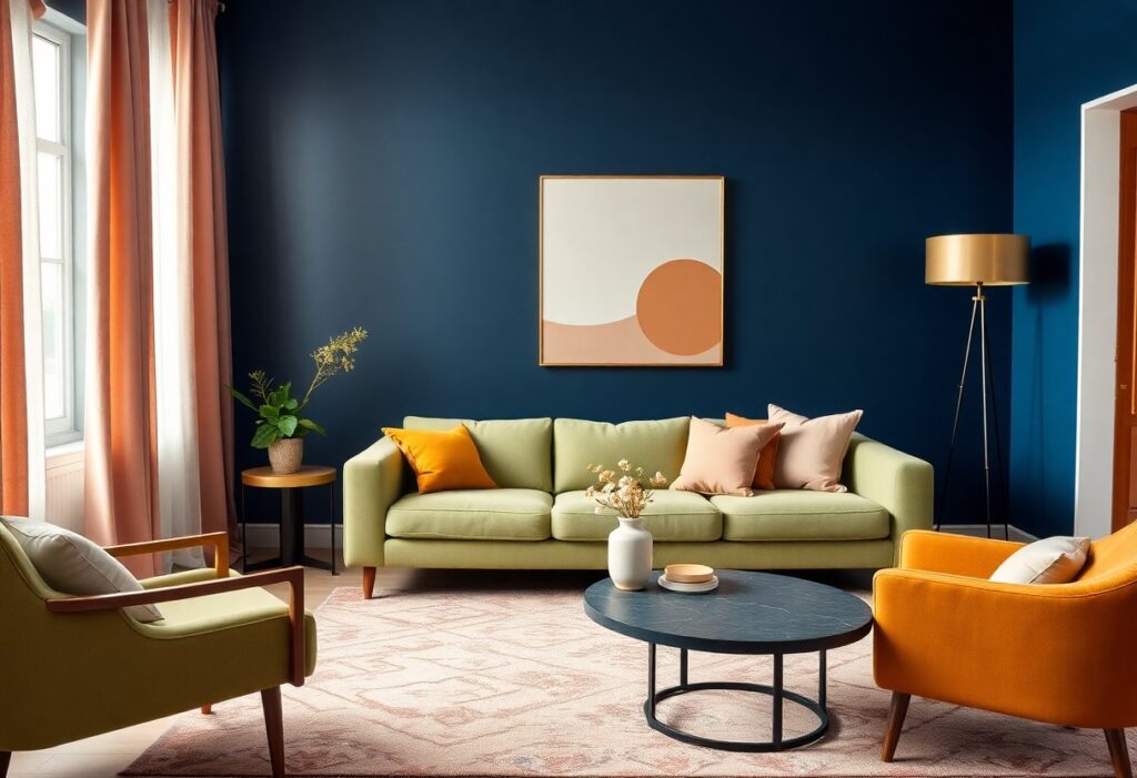
Many homeowners overlook how deeply color influences mood, but I’ve studied the latest palettes shaping interiors and their psychological effects. I’ve found that bold terracotta boosts warmth and connection, while cool grays can dangerously dampen energy if overused. You’ll feel calmer with soft sage and more inspired with sunlit yellow in your space.
Key Takeaways:
- Warm earth tones like terracotta, olive green, and sandy beige are rising in popularity, creating spaces that feel grounded and calming, helping reduce stress and promote relaxation.
- Soft, muted blues and greens are being used to bring a quiet sense of serenity into living areas, supporting mental clarity and a slower, more mindful pace of life.
- Bold, expressive colors such as deep maroon and burnt orange are making a statement in accent walls and furnishings, adding warmth and confidence to rooms without overwhelming the senses.
The Resurgence of Earthy Terracotta
I’ve watched terracotta surge back into living rooms, kitchens, and bedrooms, not as a fleeting accent but as a foundational hue. This isn’t just nostalgia-it’s a return to authenticity. The warmth of sun-baked clay speaks to our need for stability, offering a tactile connection to nature even in urban spaces.
Grounding the Restless Spirit
You’ve likely felt it-the low hum of anxiety that modern life leaves behind. I’ve found that terracotta, with its deep, earth-rooted tone, helps quiet that noise. It doesn’t shout for attention; instead, it holds space, gently anchoring your thoughts and slowing your breath.
Warmth in the Shadowed Corner
Even in dim corners where light barely reaches, I’ve seen terracotta bring life. It doesn’t reflect brightness-it generates its own. This subtle radiance transforms cold spots into intimate retreats, making you want to linger where you once passed by.
When I place a terracotta vase, wall finish, or textile in a shadowed area, something shifts-the space feels intentional, not neglected. Unlike cooler tones that can amplify gloom, terracotta emits a quiet warmth, like embers in a dying fire. It invites stillness, turning overlooked areas into places of reflection and comfort, proving that color can redefine not just decor, but mood and movement through a room.
The Ethereal Calm of Soft Sage
Soft sage has quietly become my go-to for spaces meant to breathe and settle the spirit. I see it everywhere now-not just on walls, but in textiles and cabinetry-because it carries a soothing neutrality that feels both fresh and timeless. It’s not just a color; it’s a mood.
Bringing the Garden Indoors
Greenery once stayed outside, but I now invite it in through hue, not just plants. Soft sage mimics the quiet rustle of leaves in morning light, giving your rooms a living, organic rhythm. You don’t need a greenhouse-just a painted accent wall or linen curtains to feel the shift.
Quietude for the Modern Mind
Stillness is rare in our always-on world, yet soft sage offers a visual pause. I use it where focus fades and stress builds-bedrooms, studies, baths-because it delivers a gentle mental reset without dulling awareness. It’s calm with purpose.
What makes soft sage so effective for mental quietude is its balanced undertone-neither too gray nor too green, it avoids coldness while staying grounded. I’ve watched clients relax more deeply in spaces painted this shade, reporting better sleep and clearer mornings. The color doesn’t shout; it whispers balance, aligning your environment with your need for peace. It’s not an escape-it’s a return.
Deep Cobalt and the Sea of Thought
I find deep cobalt pulls you into a space of introspection, much like staring into twilight waters. This shade doesn’t just decorate-it transforms rooms into sanctuaries for clarity and calm. According to The Psychology of Color in Interior Design, it activates focus while soothing emotional turbulence.
Courage in Darker Pigments
You gain strength from bold choices, and deep cobalt offers that quiet confidence. It’s not loud, but it’s unyielding-a backdrop that supports resilience without demanding attention. I see it as color with integrity, perfect for spaces where decisions are made and ideas take root.
Stability Amidst Life’s Tides
I trust this hue to ground a room, much like an anchor holds firm in shifting currents. Deep cobalt brings a steady presence, helping you feel centered even during chaos. It’s not about escape-it’s about creating a space where you can breathe, think, and simply be.
Stability Amidst Life’s Tides goes beyond aesthetics-it’s about designing with intention. I’ve noticed that when you surround yourself with colors that mimic the depth of the ocean, your mind begins to mirror that stillness. Deep cobalt doesn’t suppress emotion; it contains it, offering a safe environment where stress softens and clarity emerges. This is the kind of color that supports long-term well-being, not just a passing trend.
Sunlight Captured in Muted Ochre
I see muted ochre emerging as a quiet force in modern interiors, offering warmth without overwhelming the senses. This grounded earth tone brings a sense of settled calm, transforming spaces into serene retreats. You’ll find it on living room walls, bedroom accents, and ceramic fixtures, where its subtle glow feels both timeless and refreshingly current.
Optimism Without the Glare
Light reflects differently in this shade, delivering uplifting energy without visual strain. I’ve noticed how it replaces harsh yellows that once dominated trend cycles, offering a softer invitation to joy. You experience brightness that soothes rather than stirs, making it ideal for spaces meant to inspire clarity and gentle focus.
Comfort in Golden Hues
Golden ochre wraps your space in a gentle embrace, evoking memories of sunbaked clay and autumn fields. I find it especially effective in rooms where you seek emotional grounding. Its warmth feels nurturing, not overwhelming, making it a powerful tool for creating intimate, welcoming environments.
What makes golden ochre so effective is its ability to mimic natural light even in dim corners. I’ve used it in north-facing rooms to counteract cool shadows, and the change is immediately comforting. Unlike bolder golds that risk opulence or kitsch, this hue stays humble and honest. You begin to feel its presence not as decoration, but as a quiet companion-something that steadies mood and softens the edges of a busy day. It’s not just a color choice; it’s a well-being strategy in pigment form.
The Minimalism of Warm White
I embrace warm white not just for its clean look, but for how it calms the mind-creating a serene backdrop that lets your thoughts settle. This subtle hue offers emotional clarity without coldness, making spaces feel open yet inviting. To understand how this fits into broader shifts, explore the Psychology of Color: 2026 Design Trends.
Clarity for the Crowded Soul
You don’t need bold tones to reset your mood-warm white clears mental clutter like a deep breath after chaos. Its soft neutrality brings instant relief to overstimulated minds, offering a quiet pause in fast-paced lives.
Space to Breathe and Dream
I find that warm white doesn’t just reflect light-it reflects intention. It gives you room to pause, to imagine, to simply be without pressure. This shade supports stillness in a world that rarely allows it.
When I surround myself with warm white, I notice how it softens edges-both visual and emotional. It doesn’t erase life’s complexities, but it frames them gently, allowing you to reclaim mental space and emotional balance. Unlike stark whites, it holds warmth, making solitude feel safe, not sterile. This is design that serves your inner life.
To wrap up
From above, I see how color choices shape your space and mood. I’ve watched warm terracottas bring comfort, cool blues invite calm, and bold greens renew energy. Your walls do more than decorate-they influence how you feel every day. I trust you’ll choose hues that reflect not just style, but emotional truth.