
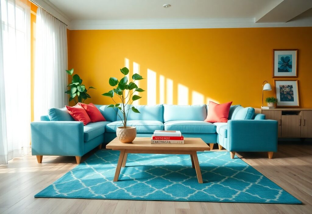
Over years of interior design work, I’ve seen how color directly impacts mood and energy in a home. I use specific hues to shape how you feel in your space. You don’t need a renovation-just strategic color choices in walls, textiles, or accents. I’ll show you how to create a calm, joyful, or energizing atmosphere with confidence.
Key Takeaways:
- Warm colors like soft yellows, warm beiges, and gentle oranges can make common areas feel inviting and encourage conversation and connection among family members.
- Cool tones such as light blues and soft greens in bedrooms or reading nooks help promote calm, relaxation, and better sleep by reducing visual stimulation.
- Personalizing spaces with accent colors that reflect individual personalities-like a favorite shade on a feature wall or in decor-adds emotional comfort and a sense of belonging.

The Soul of the Spectrum
Color speaks where words fall silent, and I’ve learned it shapes the emotional tone of your home more than any decor choice. I see how a single hue can shift your mood the moment you walk through the door. Your walls don’t just surround you-they respond to you, holding space for joy, calm, or energy depending on the shade you choose.
Sunny Yellows for Joyous Wit
Yellow lifts your spirit like morning light spilling across the floor. I use soft golden tones in kitchens and breakfast nooks because they spark conversation and awaken a sense of playful optimism. You’ll notice how even a hint of yellow makes a room feel more alive, inviting laughter and warmth into everyday moments.
Serene Blues for Poetic Peace
Blue wraps your space in quiet clarity, like the hush just before dawn. I reach for muted aquas and soft navies in bedrooms and reading corners because they slow your breath and quiet mental noise. You’ll feel your shoulders drop when you enter a room painted in these tranquil tones.
When I design with serene blues, I focus on depth, not brightness-think dusty sky, weathered denim, or distant mountain haze. These shades don’t shout; they whisper calm. I’ve watched clients unwind faster, sleep deeper, and feel more centered simply by replacing harsh neutrals with a gentle blue. It’s one of the most effective tools I know for creating emotional safety in your home. You don’t need bold statements-just a quiet wash of color that tells your mind it’s safe to rest.
The Social Canvas of the Parlor
I see the parlor as your home’s heartbeat, where connections unfold and stories take flight. The colors you choose here don’t just decorate-they shape the mood, guiding laughter and quiet moments alike. I’ve found that a well-painted wall can invite openness and make guests feel instantly at ease.
Crimson Accents for Spirited Talk
Color can spark conversation, and I’ve seen crimson do it best. A bold throw pillow or a painted tray in deep red energizes the space without overwhelming it. You’ll notice people lean in a little closer, voices lifting with warmth and animation.
Verdant Tones for Natural Grace
Green brings the calm of the outdoors inside, and I use it to soften formality. A sage wall or eucalyptus-toned curtain grounds the room in serenity, making even tense discussions feel more balanced. You’ll feel the difference the moment you walk in.
When I choose verdant tones for a parlor, I’m not just picking a color-I’m introducing a quiet rhythm that mirrors nature’s balance. You don’t need lush plants to feel this effect; a well-chosen green on the walls can lower stress and invite thoughtful dialogue. I recommend matte finishes to reduce glare and deepen the sense of calm. This isn’t just decoration-it’s emotional design at work, and you’ll notice how effortlessly your guests settle in.
Chambers of Quiet Reflection
I believe a home should offer spaces where stillness speaks louder than noise. For rooms meant for calm and introspection, I choose hues that invite serenity. Colors To Bring Positive Energy Into Your Home often mirror nature’s quiet moments-soft skies, misty mornings, and shaded gardens. These tones support emotional balance and deep mental clarity.
Lavender for Dreamy Repose
Lavender wraps your bedroom in a gentle hush, easing the mind after a long day. I use this shade when I want to create a space that feels both soothing and slightly magical. Its calming influence helps you drift into restful sleep without dulling the room’s warmth.
Soft Neutrals for Subtle Elegance
Neutral tones like warm beige, greige, or oat milk white ground a room in quiet sophistication. I rely on them when I want walls to breathe rather than speak. These colors offer timeless balance and let natural light shape the mood.
I’ve found that soft neutrals do more than just recede-they create a canvas for your life to unfold. When I paint a room in these tones, I notice how they adapt to every season and shift with the daylight. Their strength lies in subtlety: they don’t demand attention, yet they enhance every texture and accent you introduce, making your personal touches feel intentional and serene.
The Culinary Theatre
I believe your kitchen should spark joy every time you step into it, and color is my go-to tool for setting the mood. By choosing hues that reflect energy and warmth, you create a space where meals feel like events. For inspiration on building a joyful palette, I recommend this guide to a Colorful Home: How to Create Your Colorful Space in 5 Steps.
Appetizing Oranges for Zest
Orange lifts your spirits the moment you enter the kitchen. I use this vibrant tone on accent walls or small appliances to inject energy and warmth. It stimulates appetite and conversation, making it ideal for spaces where food and fellowship meet. You’ll find even a small pop can make a lasting impression.
Crisp Whites for Culinary Clarity
White gives your kitchen a clean, open feel that makes decision-making easier. I rely on it to reflect light and create breathing room among bolder choices. It brings focus to ingredients and tools, helping you stay organized and calm during busy cooking moments. This simplicity supports both function and peace.
When I choose whites, I don’t just pick “white”-I look for undertones that complement your lighting and cabinetry. A warm white with a hint of cream keeps the space cozy, while a cooler white adds modern sharpness. The right white can make your countertops appear brighter and your space feel larger. It’s not emptiness-it’s clarity in color form, giving your creativity room to breathe.

The Artifice of Light
I’ve learned that color doesn’t act alone-light shapes how your eyes perceive every hue in your space. Natural or artificial, light alters saturation, depth, and mood, turning soft blues into icy tones or warming neutral walls into inviting backdrops. Getting this balance right transforms how you experience your home.
Sunlight as a Master Painter
Sunlight reveals the truest version of your chosen colors, shifting them throughout the day. I notice how morning rays brighten cool tones, while midday sun intensifies warmth in yellows and beiges. You’ll see subtle undertones emerge-colors come alive when bathed in natural light, making rooms feel dynamic and connected to the outdoors.
Evening Shadows and Amber Glow
As daylight fades, artificial lighting takes over, and I rely on warm bulbs to maintain comfort. Shadows deepen, but amber tones soften edges, creating intimacy. You’ll find that evening light wraps rooms in calm, making rich reds, ochres, and warm grays feel cozier and more personal.
During the evening, I intentionally lower light levels to encourage relaxation, using table lamps and dimmers to cast gentle pools of illumination. The shift from daylight to amber glow signals your body it’s time to unwind-this transition supports circadian rhythms while enhancing the emotional warmth of your color palette. Choosing finishes like matte or eggshell helps diffuse light evenly, reducing harsh contrasts in shadowed areas.

The Dandy’s Personal Touch
I believe your home should reflect your personality, not a catalog. A well-chosen color scheme becomes an extension of who you are-bold, refined, or quietly confident. I don’t decorate to impress; I do it to feel truly at ease in my space. Color, when used with intention, turns walls into statements and rooms into expressions of self.
Selecting a Signature Hue
You’ll find your confidence in a single, well-chosen color. I suggest starting with a shade that makes you pause-something that feels unmistakably you. Whether it’s a deep emerald or a warm ochre, let it anchor your rooms. This isn’t about trends; it’s about resonance.
Banishing the Sin of Drabness
Gray walls won’t protect you from bad design-they often invite monotony. I’ve seen neutral spaces drain energy instead of restoring it. Drabness is a choice, not a safe default. You deserve rooms that spark joy, not ones that whisper indifference.
Drabness doesn’t just dull the eye-it affects your mood and energy over time. I once lived in a beige-on-beige apartment that made every morning feel like a delay. When I introduced a rich terracotta in the living area, the change was immediate: guests lingered longer, and I felt more present. Color is emotional architecture; denying it is like refusing light to a room. You don’t need boldness everywhere, but you do need one defiant hue to say, “I’m here.”
To wrap up
Summing up, I choose colors that reflect your personality and promote calm, like soft blues or warm neutrals, to shape a positive home atmosphere. I know the right hues can influence mood, so I use them intentionally in each room. You feel more at ease and connected when your space supports emotional well-being through thoughtful color choices.