
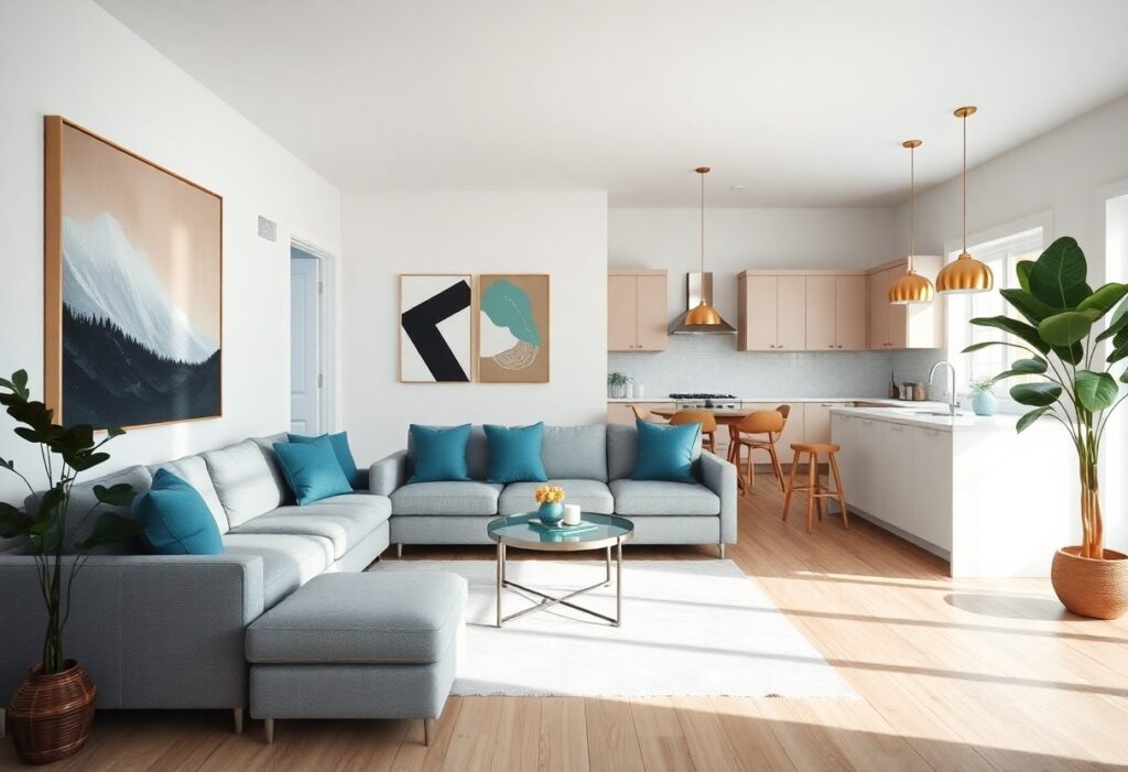
With open-concept living spaces blurring the lines between kitchen, dining, and lounge areas, I’ve found that your artwork’s color choices can either harmonize the flow or create visual chaos. A single bold hue repeated across canvases can anchor separate zones, while clashing tones tend to amplify clutter. I guide you through the colors that bring calm, connection, and clarity-because the wrong palette can make even a spacious room feel disjointed.
Key Takeaways:
- Large open-concept areas benefit most from a restrained color palette, where one or two dominant hues anchor the space and prevent visual clutter across connected zones.
- A single bold artwork in a high-contrast color can serve as a focal point, drawing the eye and creating intentional pauses in otherwise fluid layouts.
- Repeating a subtle accent color from artwork in smaller decor elements-such as cushions, rugs, or vases-creates cohesion without overwhelming the shared sightlines of open living areas.
The Tyranny of the Open Floor
Open-concept spaces often create visual chaos when artwork lacks strategic color alignment. I’ve seen homes where mismatched frames and clashing tones make the room feel disjointed, not free. Without intentional color cues, the eye has no resting point, leading to sensory overload. A single dominant hue can anchor the expanse, transforming emptiness into rhythm.
Flowing through the Void
Color guides movement even in unpartitioned areas. I use warm reds near seating zones to draw people in, while cooler accents recede, opening up tight corners. A well-placed ochre canvas can act as a directional beacon, subtly shaping how you experience the space without blocking it.
Boundaries without Walls
Tonal shifts define zones where drywall does not. I rely on deep indigo in dining nooks to signal intimacy, while adjacent lounges stay light and airy. Your brain registers these as separate rooms, even when no door or wall exists, simply through pigment psychology.
One mid-sized SaaS founder’s loft used navy-blue gallery walls to separate a workspace from the living area, eliminating the need for dividers. The color didn’t just suggest a boundary-it enforced one. Guests consistently identified the zone as “the office” despite zero physical separation, proving how strongly pigment influences spatial perception.
The Grace of Neutral Palettes
I find neutral palettes effortlessly unify open-concept areas, where walls don’t dictate boundaries. These tones create a quiet backdrop, allowing furniture and light to shape the mood. You’re not confined by bold contrasts that can overwhelm expansive sightlines. Instead, soft grays, warm taupes, and muted beiges offer flexibility and calm, making transitions between kitchen, dining, and living zones feel natural and unhurried.
Whispers of Ivory and Stone
Ivory and stone hues reflect light with subtlety, enhancing brightness without glare. You’ll notice how these tones maintain warmth in large spaces that might otherwise feel cold. Unlike stark white, they hide everyday wear while contributing to an airy, cohesive atmosphere that doesn’t demand attention but supports every other design choice you make.
Anchoring the Airy Expanse
Even in light-filled openness, a space can feel ungrounded without visual weight. I use deeper neutrals in flooring or built-ins to anchor the volume. You gain stability without sacrificing brightness-think charcoal rugs or walnut baseboards. These elements provide subtle contrast, preventing the room from dissolving into a flat, floating expanse.
Flooring in a warm charcoal oak, for instance, draws the eye downward and creates a foundation for lighter walls and ceilings. I’ve seen how this balance transforms a potentially hollow space into one that feels lived-in and intentional. Your eye settles where contrast is thoughtfully placed, not distracted by chaos. A mid-sized SaaS firm’s office lounge used this principle to great effect, blending open collaboration with a sense of enclosure through layered neutrals.
The Power of a Singular Statement
I’ve seen too many open-concept spaces diluted by competing colors, each wall vying for attention. A single bold hue, applied with intent, creates immediate focus and emotional resonance. One saturated wall behind a sofa or in a dining zone can define the area without walls. For guidance on balancing such choices, see this discussion on what paint colors work well for open concept floor plans?.
The Courage of Crimson
Crimson, when used on a single wall, radiates warmth and intimacy in expansive areas. I once advised a client to paint the back wall of their combined kitchen-living space a deep blood-red, and the effect was transformative-the color anchored the room, making the space feel grounded rather than scattered.
Commanding the Viewer’s Eye
Strategic color placement directs movement and attention through open layouts. I rely on high-contrast hues to pull the eye toward focal points like artwork or architectural details, ensuring the space feels intentional rather than accidental in its design.
Positioning a saturated color at the end of a visual axis-such as a hallway leading into the living area-creates a magnetic draw. I’ve used this technique in a loft where a cobalt accent wall sits opposite the entry, making the entire space feel deeper and more layered. The brain naturally follows color gradients, and a well-placed bold tone becomes a silent guide through the room’s flow.
Cohesion through Chromatic Echoes
I rely on chromatic echoes to bind open spaces into a unified whole. Repeating select colors across zones creates subtle threads that guide the eye and temper visual chaos. A single hue, carried from lounge to kitchen in measured doses, can transform disjointed areas into a coherent narrative. These repetitions don’t shout; they whisper continuity.
Repeating the Primary Hue
One effective method I use is repeating the primary hue in small, intentional accents. A terracotta vase in the lounge mirrored by a set of ceramic knobs in the kitchen ties the spaces together without overwhelming either. This repetition builds familiarity, making the transition between zones feel natural and intentional.
Harmonizing the Kitchen and Lounge
When I align the kitchen and lounge, I focus on shared undertones rather than matching colors exactly. A warm gray backsplash complements a beige sofa, creating harmony through temperature, not duplication. This subtle alignment prevents dissonance while allowing each area to maintain its identity and functional clarity.
Working with a mid-sized SaaS firm’s office lounge and kitchenette, I applied a soft sage as an accent in both zones-on barstool piping and a single gallery wall frame. The color appeared only three times total, yet its strategic placement made the 400-square-foot space feel curated, not fragmented. The restraint amplified its impact, proving that minimal repetition can yield maximum cohesion.
The Whims of Natural Light
I’ve observed that natural light transforms how colors behave across open spaces, shifting hues from warm ochre to cool gray depending on the hour. You’ll want to test paint samples at different times, as southern exposure intensifies reds and yellows while northern light softens them. For deeper insight, explore Colors & Lighting for Open-Concept Spaces, where light dynamics are broken down room by room.
Sunbeams and Oil Pigments
Direct sunlight enhances the depth of oil-based pigments, making rich terracottas and deep sages appear more saturated by noon. I’ve seen west-facing walls take on a glowing quality in the late afternoon, almost as if backlit. You’ll notice this effect most in rooms with large, unobstructed windows.
Shadow Play in Large Halls
Long stretches of open space create extended shadows that can mute lighter tones, especially in the early morning or late evening. I’ve watched gray-blue walls near stairwells appear nearly charcoal when hit by slanted light. You may need to balance these zones with reflective surfaces or strategic accent lighting.
Extended ceiling heights and unbroken floor planes allow shadows to stretch dramatically, often creating unintended visual divides. I once worked in a loft where afternoon light carved the room into distinct temperature zones-warm near the windows, cool in the center. Using lighter mid-tone walls helped blur those lines, maintaining a sense of continuity without sacrificing depth.
Scale and the Visual Spectacle
I find that oversized artwork commands attention in open-concept spaces, where walls are fewer and sightlines expansive. A single large piece can anchor a living area, preventing the design from feeling scattered. For guidance on balancing bold choices with harmony, I often refer to The Best Colours for Open Floor Plan Spaces, which emphasizes scale as a silent partner to color.
Oversized Dreams
Large-scale pieces absorb empty walls without competing with furniture lines. I’ve seen a 6-foot abstract canvas transform a double-height corner, its deep indigo echoing the sofa below while adding vertical rhythm. Size, when balanced with color, becomes structure.
The Intimacy of Small Frames
Small artworks invite closeness, creating pockets of personal narrative within vast zones. I prefer grouping three to five modest pieces at eye level, using consistent framing to link them. Their impact lies in detail, not dominance.
When I arrange smaller works, I focus on proximity and theme to maintain cohesion. A series of botanical prints in matching oak frames, spaced two inches apart, can feel deliberate rather than fragmented. The restraint in scale allows color to whisper, not shout, guiding the eye like quiet notes in a melody. A mid-sized SaaS firm’s office lounge used this tactic to soften a concrete-and-steel environment, proving that intimacy thrives even in minimalist settings.
Summing up
I find that your open-concept living space thrives when color is used with intention, not excess. I rely on neutral backdrops to unify disparate zones, then introduce depth through a single bold artwork or coordinated accents that echo across the area. Natural light shifts how pigments read throughout the day, so I test swatches and observe them in different conditions. For me, the right palette balances continuity and contrast, guiding movement and mood without dividing what architecture has chosen to join.