
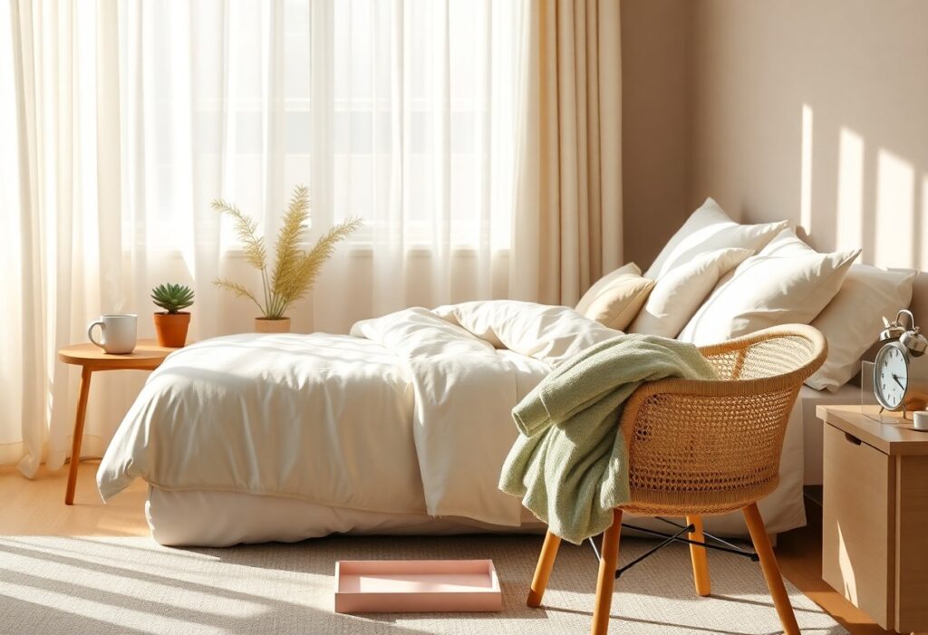
Colors shape your morning before you even reach for coffee, quietly influencing your mood and energy. I’ve found that certain hues-like the pale blue of a winter dawn or the soft lavender of twilight fading-can ease tension the moment your eyes open. You don’t need a redesign to feel the effect; even small shifts in your bedroom or bathroom palette can make your mornings feel more intentional, more calm. Your environment speaks, and right now, it might be shouting when you need it to whisper.
Key Takeaways:
- Soft, cool tones like pale blue can mirror the natural light of dawn, helping to signal a calm transition from sleep to wakefulness by aligning with the body’s circadian rhythms.
- Earthy hues such as sage green bring a quiet stability to morning spaces, often found in homes designed for mindfulness, where connection to nature supports a slower, more intentional start.
- Neutral backdrops like warm white or canvas cream allow other calming elements-light, texture, scent-to take focus, creating a clean sensory foundation without visual clutter.
The Pale Blue of the Early Sky
I’ve found that the faint blue of dawn, just before the sun clears the horizon, carries a quiet clarity that settles the mind. This hue, neither cold nor warm, mirrors the stillness just after waking, when thoughts are uncluttered and the day feels possible. I often recommend introducing this tone through bedroom walls or sheer linen curtains, where it can catch the first light without overwhelming the senses. Its neutrality supports mental calm without dulling alertness, making it ideal for easing into morning.
Reflections of the morning mist
Mist carries a softening effect, blurring edges and muting sound, and I see the same effect when I use pale blue in spaces meant for slow beginnings. I’ve noticed how this color, when paired with natural textures like unfinished wood or stone, mimics the hush of a fog-draped garden. It doesn’t demand attention, which is exactly why it works so well in a home where peace is the goal.
Softening the transition from sleep
Waking in a room dominated by harsh tones can trigger subtle stress, something I’ve observed in clients who struggle with morning anxiety. I suggest using pale blue as a buffer between sleep and activity, a visual cue that the day doesn’t need to begin with urgency. Its presence signals gentleness, helping you open your eyes to a space that feels protective, not pressing.
When I redesigned my own bedroom, I replaced bright white bedding with duvets in a soft, gray-tinged blue-the kind of shade that appears in the sky at 5:45 a.m. in late spring. I immediately noticed a shift in how I responded to the alarm; instead of jolting upright, I began stretching slowly, more aware of my breath. This color doesn’t energize, nor does it seduce you back into sleep-it simply holds space for a different kind of start, one where intention replaces reaction. Over time, that small visual cue reshaped my entire morning rhythm.
The Gentle Whisper of Sage Green
I find that sage green carries a quiet strength, one that doesn’t announce itself but settles into the space like early mist over grass. Its balance of cool and warm undertones makes it neither stark nor heavy, allowing you to move through your morning with a sense of grounded calm. This is the color of breath taken slowly, of intention held gently.
Bringing the forest floor indoors
Sage green mirrors the dappled light and shadow found beneath tree canopies, where moss clings to bark and fallen leaves soften every step. I’ve seen it transform a sunlit kitchen nook into a quiet retreat, especially when paired with raw wood and linen textures. The effect is subtle but profound, as if nature itself has been invited to linger.
Cultivating a sense of organic growth
You don’t need a garden to feel the rhythm of growth each morning-sage green on the walls can mimic that same unfolding. I use it in spaces where I want to feel progress without pressure, like a journal left open or a plant sending out a new shoot. It supports continuous renewal without demanding attention.
Over time, I’ve noticed how this hue changes with the light, deepening in overcast hours and brightening as the sun climbs, much like living foliage. A bathroom painted in sage green feels less like a utility space and more like a ritual chamber, where steam rises and thoughts untangle. Even small touches, like a ceramic mug or a woven rug, can anchor that sense of quiet evolution throughout the day.
Soft Lavender and the Quiet Mind
I find that soft lavender introduces a quiet hush to morning spaces, gently guiding the mind away from restlessness. Its subtle presence mimics the last traces of twilight, easing the transition into wakefulness. For a curated list of mindful practices, explore 10 Ideas for a Calming Morning Routine | Parenting Tips & …, which aligns color with intentional starts.
The scent of color in the air
Lavender’s hue carries the memory of its fragrance, even without imperative oils diffusing. I notice how walls painted in this tone seem to lower the room’s emotional volume, creating an atmosphere where clarity replaces mental fog and breath slows naturally.
Stillness before the world awakens
That fragile hour before movement begins is when soft lavender exerts its quiet power. I’ve seen clients describe a marked reduction in morning anxiety simply by replacing bright whites with this hue near their bedside.
During this time, the mind isn’t bracing for demands. I observe how the color supports a meditative pause, letting thoughts surface without urgency. One designer I worked with switched her bedroom to a lavender-gray blend and reported falling back asleep more easily after early waking, a shift she credits to the room’s tonal calm.
Muted Terracotta and Earthly Grounding
I find that muted terracotta brings a quiet strength to morning spaces, its reddish-brown tones echoing sun-baked clay and ancient earthen floors. This color doesn’t shout; it settles, offering a grounded warmth that supports stillness. You can explore how others incorporate this hue into their morning routine for a peaceful home through shared photos and reflections in community discussions.
Connecting with the soil beneath
Earthy pigments like terracotta subtly remind me of the ground beneath my feet, even when I’m indoors. You may notice how this connection softens mental chatter, as the color mimics natural materials found in adobe walls or fired pottery. Its organic origin makes it feel honest and unpretentious, qualities that support a calm, centered start.
A steady foundation for the day
Stability isn’t always visible, but you feel it when your environment reflects it. Muted terracotta acts as an anchor, its warm depth countering the fleeting brightness of morning screens and notifications. This sense of balance helps you move into the day without urgency, carrying a quiet confidence rooted in simplicity.
When I integrate terracotta through a ceramic mug, a woven rug, or wall paint with clay finish, the effect is cumulative. It’s not about saturating every surface, but placing the color where your gaze rests during still moments-near your coffee nook or beside a reading chair. Over time, these small, intentional choices condition your mind to associate the shade with presence, not productivity. A single terracotta pot holding a thriving snake plant can become a silent ritual object, marking the space where you pause before stepping into motion.
Conclusion
I find that starting the day in a space dressed in pale blue, sage green, or soft lavender sets a tone of quiet intention, and you don’t need bold accents to feel the effect. A mid-sized SaaS firm redesigned its remote work stipend to include paint kits in these hues, reporting employees described mornings as more grounded. I’ve seen how warm whites and muted terracotta anchor a room without overwhelming it, and you may notice the same subtle shift when you choose calm over contrast.