
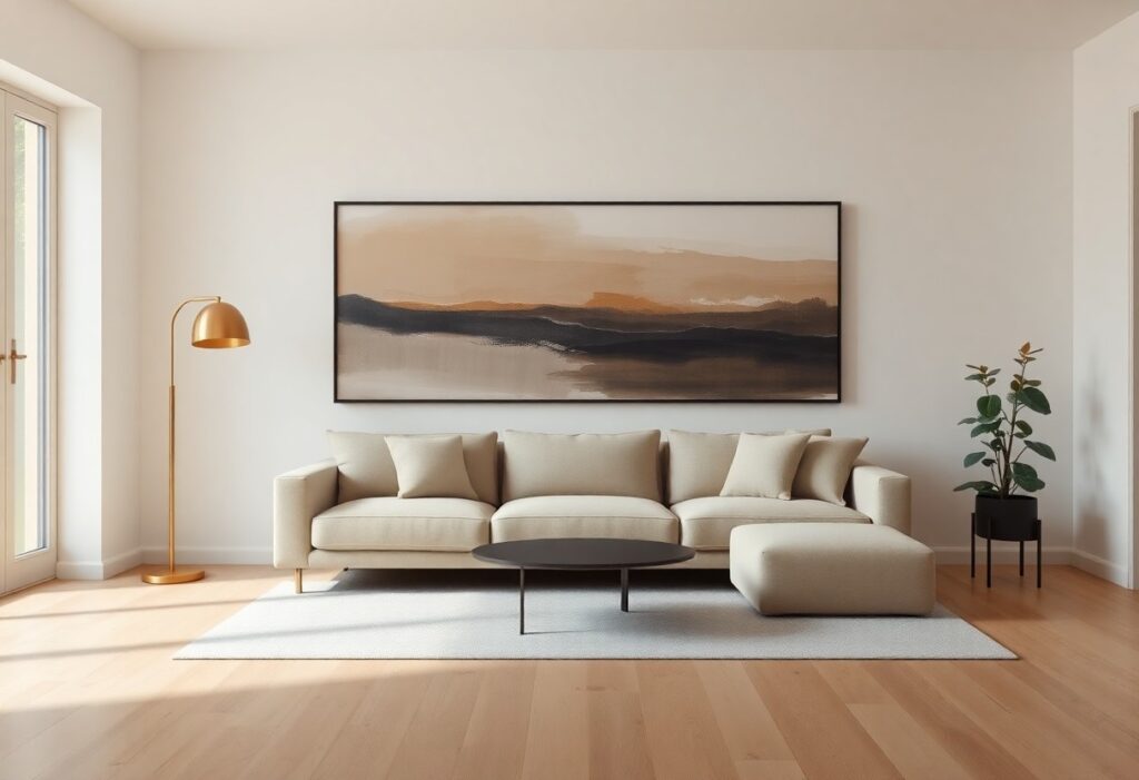
Artwork transforms neutral interiors from平淡 to intentional, and I’ve learned through years of interior styling that the right piece can anchor a room without overwhelming it. You don’t need bold walls to make a statement-your art can carry the emotion, texture, and energy. I’ll show you how to select pieces that feel inherently connected to your space, using color, scale, and frame choices that enhance, not clash with, your neutral palette.
Key Takeaways:
- A mid-sized SaaS firm redesigned its open-concept office using warm gray walls and introduced abstract canvas pieces with deep indigo and rust accents, demonstrating how artwork can introduce subtle color without disrupting a neutral palette.
- Texture plays a defining role-artworks incorporating linen, burlap, or sculptural elements add depth to minimalist spaces, as seen in a Brooklyn-based design studio that uses woven fiber installations to break visual monotony.
- Scale must align with wall dimensions; a common misstep is undersizing artwork above a sofa, whereas a single large piece or a tightly grouped triptych can anchor a space, such as a 48×72 inch photograph centered on a 10-foot wall in a Chicago loft.
Identifying Key Factors of Your Neutral Space
Every neutral room carries its own character, shaped by wall tones, furniture finishes, and architectural details. I assess these elements to determine which artwork will harmonize rather than clash. Natural materials like oak or travertine introduce warmth that affects color perception. After identifying the dominant undertones and lighting conditions, I select pieces that enhance the space’s inherent balance.
Defining the Undertones of Your Palette
Neutral doesn’t mean colorless-your walls may lean warm, cool, or even greenish under certain light. I check how your paint shifts from morning to evening, noting whether grays appear blue, purple, or green. Beige can reveal pink or yellow hints depending on surroundings. After understanding these subtle cues, I choose artwork that either complements or intentionally contrasts them.
Evaluating Natural and Artificial Light Sources
Light changes how both your walls and artwork appear throughout the day. North-facing rooms receive cool, consistent light, while south-facing ones get strong warmth. I observe where sunlight falls and when artificial bulbs take over, knowing LED versus incandescent alters color accuracy. After mapping these patterns, I decide which hues remain stable and which need adjustment.
Direct sunlight can fade pigments over time, especially in south- or west-facing rooms where exposure is strongest. I avoid placing delicate works like watercolors or printed canvases in these zones unless UV-protective glass is used. In dimmer areas, I opt for pieces with reflective surfaces-such as metallic inks or glossy finishes-to catch available light. Matte finishes work better in evenly lit spaces to prevent glare. The interplay between light direction and surface texture directly influences how a piece reads at different times of day.
How to Balance Texture and Dimension
I rely on layered materials to prevent neutral spaces from feeling flat. A matte canvas beside a glossy photograph introduces subtle contrast, while a linen-textured frame next to smooth drywall creates quiet intrigue. The goal isn’t drama but depth-small shifts in finish and form that invite closer inspection without disrupting calm.
Utilizing Mixed Media to Add Depth
Combining photography, fabric, and metal in a single piece adds complexity without color. I once styled a triptych with embedded burlap and silver leaf that transformed a beige living wall into a focal point. The variation in surface quality draws the eye longer, making the space feel curated, not sparse.
Incorporating Sculptural Elements in Minimalist Rooms
Wall-mounted sculptures in ceramic or bronze introduce volume without visual clutter. I prefer pieces under 18 inches wide, placed at eye level above a console. Their shadows shift with daylight, adding a dynamic layer that paint or canvas alone can’t achieve.
When I integrate sculptural art, I prioritize negative space around the object. A small bronze form feels lost in a crowded gallery wall but commands attention when isolated. The interplay between the object and empty wall becomes part of the composition, reinforcing the minimalist ethos while deepening spatial interest. I often choose matte finishes to avoid glare and maintain harmony with soft textiles nearby.
Tips for Choosing a Color Strategy
Building a cohesive color strategy starts with assessing your existing palette and deciding how much contrast you want. I focus on undertones in walls and furnishings to guide my selections. A dominant accent hue can unify multiple pieces across a room. Some prefer a monochromatic rhythm, while others introduce muted complements. Knowing your desired mood-calm, dynamic, grounded-shapes every choice.
- Select hues that reflect the undertones in your neutral palette
- Use a dominant accent color to create visual continuity
- Consider a monochromatic rhythm for subtle depth
- Test swatches under natural and artificial light
- Limit your palette to three supporting colors max
Creating a Monochromatic Layered Look
I often layer artwork in varying shades of the same hue to add depth without disrupting harmony. A beige wall might pair with pieces in oat, taupe, and charcoal, creating dimension through tonal variation. Texture in the frame or canvas enhances the effect. Knowing how light shifts across these tones ensures consistency throughout the day.
Introducing Subtle Pops of Accent Colors
A single piece with a soft sage or dusty terracotta edge can enliven a neutral room without overwhelming it. I look for accents that already appear in a pillow, rug, or ceramic detail. These small echoes create cohesion. Knowing where to repeat the hue keeps the space feeling intentional.
When I introduce subtle pops of accent colors, I prioritize restraint and repetition. Rather than bold contrasts, I choose artwork where the color appears in small proportions-along a horizon line, within a shadow, or in the brushstroke texture. A mid-sized SaaS firm’s office lounge, for example, used abstract canvases with faint ochre edges that mirrored the seam on their linen sofas. This method maintains neutrality while adding quiet points of interest. Knowing how to echo the accent elsewhere ensures it doesn’t read as isolated or accidental.
Determining the Ideal Scale and Proportions
I assess wall space before selecting any piece, ensuring the artwork aligns with the room’s visual weight. A common mistake is choosing something too small, which can look lost and weaken the design impact. For guidance on how to choose minimalist wall art to complement a neutral interior, see this discussion that breaks down real-life examples and common pitfalls.
Measuring Wall Space Relative to Furniture
I always measure the wall from side to side and compare it to the furniture beneath, aiming for artwork that covers about 60 to 75 percent of the horizontal surface. A sofa flanked by narrow side tables, for instance, needs a larger piece above to avoid a disjointed look. Leaving too much empty space between the furniture and frame disrupts visual cohesion.
Guidelines for Oversized Statement Pieces
I reserve oversized art for open walls where it can dominate without crowding. A single large canvas in a minimalist dining area, for example, draws the eye and anchors the space. The key is balance-overly large pieces in small rooms can overwhelm, while in expansive areas, they add necessary focus.
When I install oversized artwork, I consider ceiling height and sightlines, especially in entryways or living rooms. A piece stretching nearly floor to ceiling in a high-arched hallway creates drama without clutter. I avoid overcrowding adjacent walls, allowing the statement work room to breathe. Proper lighting enhances depth and ensures the scale reads correctly from multiple angles.
How to Select Frames That Enhance the Aesthetic
I recommend selecting frames that subtly reinforce your neutral palette while adding quiet refinement. A thin black metal frame can ground a light-toned abstract piece, whereas a warm oak finish softens a high-contrast photograph. I often guide clients to How to Choose Neutral Wall Art for a Living Room (Size, …) for practical examples of proportion and tone matching. The right frame doesn’t compete-it completes.
Choosing Natural Wood vs. Metallic Finishes
Natural wood frames bring organic warmth that softens cool grays and whites, making them ideal for living rooms aiming for relaxed sophistication. I’ve seen a mid-sized SaaS firm’s lounge transform when swapping silver frames for walnut-the shift in perceived comfort was immediate. Metallic finishes, in contrast, reflect light and work best where you want subtle sparkle, like a gallery wall near a window.
Deciding Between Framed and Gallery-Wrapped Canvas
Framed artwork offers structure and formality, ideal when your space leans minimalist or traditional. I find gallery-wrapped canvases suit modern lofts where the absence of glass reduces glare and adds depth. A client’s dining area gained intimacy with a large canvas that echoed the table’s grain, proving material continuity strengthens cohesion.
When I evaluate framed versus frameless options, I consider maintenance and lighting. Glass-protected pieces resist dust but can create reflections under overhead lights, especially in sun-drenched rooms. Gallery-wrapped canvases eliminate that issue and often feel more immersive at larger scales. For a recent project with consistent afternoon light, I chose a linen-wrapped piece in a matte black floater frame-it absorbed glare while defining the composition’s edge.
Tips for Effective Artwork Placement
Positioning artwork at eye level creates an immediate connection, though I adjust height based on furniture layout and ceiling height. Use visual weight to anchor empty walls, and consider negative space as part of the composition. Lighting plays a decisive role in how a piece is perceived-overhead or directional lights can deepen impact. Any well-placed piece follows intentional design principles, such as those outlined in the 5 Golden Rules for Choosing Artwork for your Interior.
- Hang art at average eye level unless architectural features suggest otherwise
- Allow 5-7 inches between furniture and the artwork above it
- Use picture lights or track lighting to highlight texture and color
- Step back frequently to assess balance within the full room context
Establishing a Focal Point in Open Floor Plans
A large-scale piece draws attention naturally in expansive areas where visual anchors are sparse. I often place a single bold work on the longest wall or opposite the main entry to guide movement. The focal point should contrast subtly with surrounding neutrals-through tone, texture, or shape-without disrupting harmony. Any strong composition in an open space defines zones without physical barriers.
Arranging a Balanced Gallery Wall in Neutral Tones
Creating rhythm with varied frame sizes and matting keeps a gallery wall from feeling static. I align outer edges to form an invisible rectangle, ensuring spacing stays consistent-typically 2 to 3 inches. Monochromatic prints with tonal variation add depth while preserving serenity. Any cohesive arrangement respects the room’s existing lines and proportions.
When assembling a gallery wall in neutral interiors, I begin by laying out the arrangement on the floor to test combinations. Mixing media-such as a charcoal sketch beside a linen-textured print-introduces subtle contrast without relying on color. I avoid overcrowding by leaving breathing room around each piece, allowing the wall’s neutral backdrop to function as part of the design. Framing in matching finishes unifies the collection, while slight asymmetry can add organic movement. A balanced gallery wall ultimately reflects curated intention, not random accumulation.
Summing up
I choose artwork that introduces subtle contrast or quiet focal points, knowing your neutral palette thrives on understated impact. You don’t need bold hues to create depth-tonal variation, organic forms, or a single warm accent in a large abstract piece can define a space just as effectively. I always consider how natural light shifts across a canvas throughout the day, because your room’s mood changes with it. A well-placed black-and-white photograph in a simple oak frame can ground a minimalist living area, just as a textured linen painting adds quiet movement to a beige bedroom. I rely on intention, not volume, ensuring each piece earns its place.