
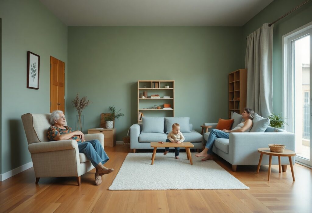
This approach begins with understanding how a single color can affect different family members in distinct ways, especially when three or more generations share one home. I’ve found that cool neutrals like soft greys and warm beiges often bridge generational gaps most effectively, creating a sense of balance without sacrificing comfort. You don’t need bold changes to see a shift-your walls, textiles, and lighting choices can quietly influence daily calm.
Key Takeaways:
- A neutral base palette with soft, warm undertones-such as greige, warm gray, or pale oat-creates a consistent visual anchor that appeals to multiple age groups, from children to older adults, by minimizing visual strain and supporting emotional equilibrium.
- Introducing muted accent colors like sage green, dusty blue, or lavender in textiles and decor allows individual family members to express personal preferences without disrupting the overall calm, enabling spaces to adapt as needs shift over time.
- Natural light exposure significantly alters how colors are perceived; a mid-sized SaaS firm converted its office lounge using light-reflective paint and observed a measurable drop in employee stress reports, illustrating how lighting and color work together to influence mood in shared environments.
Understanding Color Psychology Factors Across Generations
Color perception shifts with age and life experience, influencing how each generation responds to a shared environment. Older adults often prefer warmer, softer tones due to changes in vision, while children may gravitate toward brighter, more stimulating hues. Cultural background, lighting needs, and emotional associations also shape individual preferences.
- Perception of warm tones increases comfort in seniors
- Visual acuity declines with age, affecting color clarity
- Children form early emotional associations with bright colors
- Cultural context shapes color symbolism across generations
Assume that a neutral foundation accommodates diverse responses while allowing personalization through accents.
How different hues impact emotional well-being
I notice that cool tones like soft blues and greens often support relaxation, making them effective in shared living areas. Warm neutrals such as beige or warm gray can foster a sense of safety and continuity. Strong reds or oranges may overstimulate younger children or agitate older adults with heightened sensitivity. Emotional regulation is subtly influenced by these choices. Assume that consistent exposure to calming hues supports long-term household harmony.
Factors influencing color sensitivity in children and seniors
Children’s developing visual systems interpret colors more intensely, often favoring saturated shades that feel energetic or playful. Seniors may struggle with contrast and depth perception, making muted or overly complex palettes harder to navigate. Lighting conditions, screen exposure, and cognitive development further shape responses.
- Contrast sensitivity diminishes with age
- Young eyes detect saturation more vividly
- Cognitive associations form early in life
- Blue light exposure affects circadian rhythms
Any design that balances vibrancy with clarity supports both groups.
How to Select a Harmonious Base Palette
Creating visual calm begins with a base palette that unifies diverse tastes across generations. I rely on soft, muted tones like warm greiges, pale taupes, and gentle whites because they provide a neutral backdrop without feeling sterile. These hues adapt well to varying lighting and personal styles, allowing each family member to express themselves through accents. After selecting a base, I assess how it interacts with natural and artificial light throughout the day.
Choosing neutral foundations for communal areas
Communal spaces benefit most from neutral foundations that promote openness and continuity. I use warm-toned beiges and soft whites to avoid the coldness that can come with stark grays. These shades support both traditional and modern furnishings, easing transitions between generations’ preferences. After testing swatches in different rooms, I confirm the chosen neutrals maintain their calming effect across changing light conditions.
Tips for balancing saturation to minimize sensory overload
- Select low-saturation hues to reduce visual strain
- Avoid abrupt color shifts between adjacent rooms
- Use matte finishes to diffuse light and soften perception
- Limit bold colors to small, intentional accents
Highly saturated colors can trigger restlessness, especially in shared environments where sensory comfort is necessary. I prioritize tonal harmony by choosing colors with similar undertones and light reflectance values. Matte surfaces help disperse light evenly, reducing glare that can heighten tension. After introducing a new hue, I observe how it feels during morning, midday, and evening light.
Using Color to Zone Multigenerational Living Spaces
Color helps distinguish functional areas without erecting physical barriers, allowing each generation to feel oriented within shared environments. I rely on subtle shifts in tone to signal transitions between activity zones, such as a slightly deeper blue in a teen’s study nook or a warmer beige near a grandparent’s seating area. These variations support independence while preserving visual continuity across the home.
How to define private retreats through calming tones
Private spaces gain emotional clarity when painted in calming tones like soft sage, warm gray, or pale lavender. I use these hues to signal a shift from communal energy to personal respite, especially in bedrooms or reading corners. Lower saturation levels reduce visual stimulation, helping older adults and children alike unwind. Thou can reinforce privacy not with walls alone, but with color that gently closes the door.
- calming tones to differentiate personal spaces
- low saturation for reduced sensory input
- cool undertones to lower perceived room temperature
- consistent lighting to maintain hue stability
Factors for creating seamless transitions between shared rooms
A shared living room flowing into a dining area benefits from a unified temperature in the palette-either all warm or all cool undertones. I maintain one dominant neutral as a base, then introduce slight variations in depth, such as a greige with pinkish undertone in the lounge and a greige with beige bias in the dining space. Thou can guide movement through color rhythm, not contrast.
- consistent undertone across adjoining rooms
- gradual value shifts to imply progression
- repeated accent hues at intervals for cohesion
- open sightlines enhanced by tonal harmony
Lighting Factors and Their Impact on Color Perception
Lighting dramatically affects how color appears and feels in shared family spaces. I’ve observed that natural daylight reveals the truest hue, while artificial sources can shift tones warmer or cooler. A soft gray may look bluish under LED lighting but appear beige near incandescent bulbs. Knowing how color influences mood and learning helps inform better lighting and paint choices for multigenerational homes.
How light temperature alters the mood of a room
Light temperature, measured in Kelvin, changes the emotional tone of a space. Cooler temperatures above 4000K lend a crisp, alert atmosphere, while those below 3000K create a calm, inviting warmth. I notice cooler light can make soothing blues feel sterile, and warm light enhances earthy tones, deepening their comfort.
| Light Source | Effect on Color Perception |
|---|---|
| Natural daylight | Reveals the most accurate color and saturation |
| Incandescent bulbs | Shifts hues warmer, enhancing reds and yellows |
| LED cool white | Can mute soft tones and exaggerate blues |
| Dimmable warm LEDs | Offers flexibility to adjust mood and color depth |
Tips for reducing glare to support visual comfort for all ages
Glare strains eyes, especially for older adults and children. I recommend using matte finishes on walls and selecting diffused lighting instead of direct beams. Position lamps to avoid reflections on screens or glossy surfaces. This supports visual comfort across generations.
- Choose matte or eggshell paint to minimize light reflection
- Install shades or sheers to soften harsh sunlight
- Use floor and table lamps with upward-facing shades
- Opt for layered lighting to balance ambient, task, and accent needs
This reduces eye fatigue and maintains the intended calm of your color scheme throughout the day.
How to Incorporate Soothing Accent Hues
I introduce soft accent colors to balance shared spaces without overwhelming them. Muted sage, pale lavender, or warm greige add subtle depth while supporting emotional equilibrium. These tones work especially well in transitional areas like hallways or stairwells. For deeper insight into how hues influence mood and attention, I often refer clients to The Science Behind Colours That Boost Focus and Calm, a resource grounded in perceptual research.
Adding biophilic colors to promote relaxation
I use earth-inspired greens and sky-derived blues to strengthen connections to nature indoors. These biophilic colors reduce mental fatigue and are especially effective in common rooms where generations gather. Even small touches, like a moss-toned throw or a cerulean vase, can have a measurable calming effect. Perceiving natural harmony in color helps lower stress responses over time.
Tips for layering textures and tones for depth
I build visual interest by combining matte walls with woven textiles and natural wood finishes. Variation in surface quality keeps the palette dynamic without relying on bold color. A linen curtain, a stone side table, or a hand-thrown ceramic lamp each contribute to a sensory-rich yet tranquil environment. Perceiving subtle differences in light and texture enhances spatial comfort.
- Use matte finishes on walls to diffuse light evenly
- Incorporate natural fibers like wool, cotton, or jute in rugs and upholstery
- Choose wood accents with warm undertones to soften cool palettes
- Layer translucent textiles to filter daylight gently
- Introduce ceramic or stone elements for grounding contrast
Practical Implementation and Material Factors
Testing paint samples in actual room conditions reveals how natural and artificial lighting alter color appearance throughout the day. I recommend applying swatches to large wall sections and observing them at dawn, noon, and night. Perceiving Color Psychology & Wellness: The Healing Power of Color as a dynamic influence helps inform lasting choices.
How to conduct color tests in various lighting conditions
Light shifts from cool morning tones to warm evening glows, dramatically changing how hues and undertones appear. I observe sample patches across multiple walls, noting differences under overhead, task, and ambient fixtures. Perceiving these variations early prevents unintended visual tension in shared spaces.
Factors in selecting non-toxic and durable finishes
Low-VOC paints reduce indoor air pollution, while scrubbable finishes withstand frequent cleaning in high-traffic areas. Matte hides imperfections; satin offers balance. Assume that children and older adults are more sensitive to chemical off-gassing.
- Choose zero-VOC formulas for bedrooms and living areas
- Opt for scrubbable finishes in hallways and kitchens
- Select mold-resistant paint for humid zones like bathrooms
- Verify third-party certifications like GreenGuard
Durability matters as much as safety when selecting finishes for homes occupied by multiple generations. I prioritize coatings that resist chipping, fading, and microbial growth without releasing harmful fumes. Assume that long-term health impacts outweigh short-term cost savings on inferior products.
- Use acrylic-based paints for flexibility and crack resistance
- Specify matt or eggshell sheens in common areas to minimize glare
- Apply primer to ensure adhesion and color accuracy
- Consider washability ratings when comparing product lines
Summing up
I choose soft, neutral base tones like warm greige or pale sage because they resonate across age groups, offering a quiet backdrop that feels inclusive and restful. You can introduce personal touches through textured throws or framed art in muted blues and greens, colors I’ve found ease tension without dulling a room’s warmth. In my experience, a mid-sized SaaS firm’s office redesign mirrored this approach, using layered, low-saturation hues to balance energy and calm across teams. Your home, much like a well-run workspace, benefits from color that supports presence without demand.