
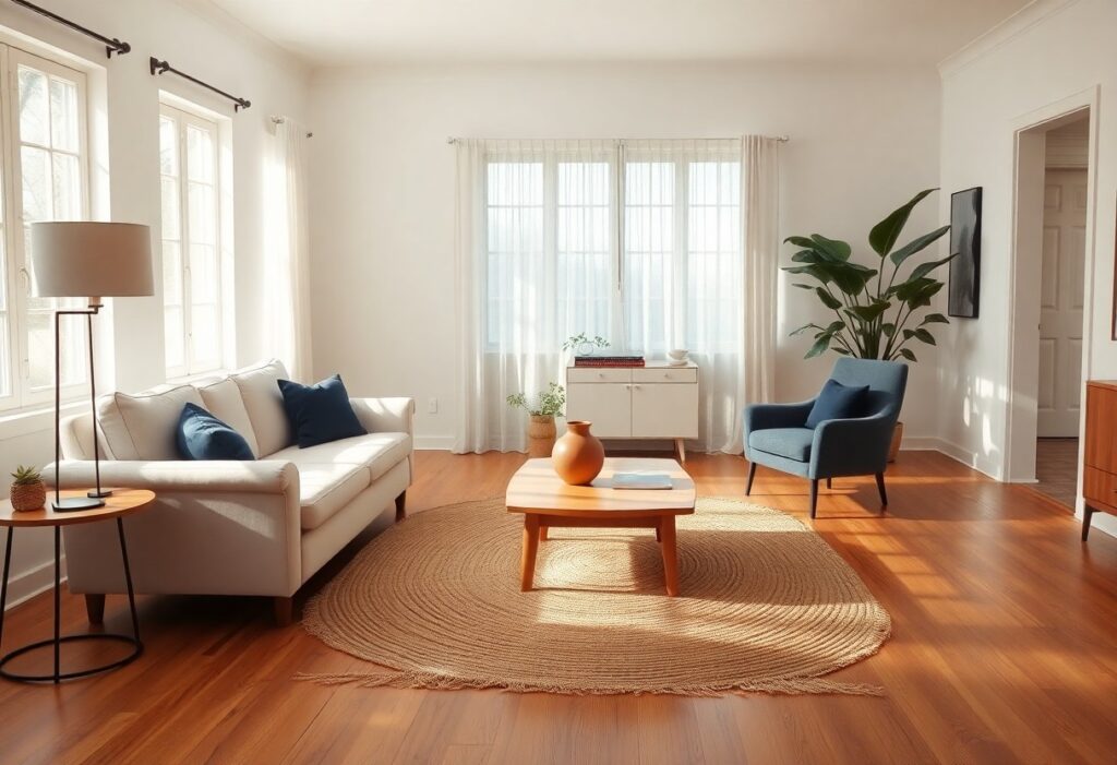
Over the years, I’ve learned that pairing colors with wooden floors isn’t just about taste, it’s about balance. I once painted a client’s living room a deep charcoal right after installing honey oak floors, and the clash was instant and jarring. Since then, I’ve paid closer attention to how light bounces, how grain patterns pull the eye, and how a single wall can make a room feel warm or cold. You don’t need a design degree to get it right, but you do need to see how your floor sets the tone. I’ll show you what actually works.
Key Takeaways:
- Soft neutrals like warm gray, beige, and creamy white tend to complement most wooden floors by enhancing the natural warmth of the wood without competing for attention, making them ideal for creating a cohesive and calming atmosphere in living rooms or bedrooms.
- A mid-sized SaaS firm that recently redesigned its open-plan office space chose muted sage green for its walls alongside light ash flooring, resulting in a workspace that employees described as both grounded and refreshing, proving that earthy tones can harmonize beautifully with pale wood finishes.
- For those drawn to contrast, deep navy or charcoal on walls can work strikingly against golden oak floors, as seen in a well-known Brooklyn brownstone renovation where the bold pairing added depth and sophistication without making the room feel smaller.
The Symphony of Wood and Pigment
I’ve found that pairing paint with wooden floors is less about rules and more about rhythm. When I chose a warm terracotta for my living room, the honeyed oak beneath it seemed to glow even more, as if the color pulled the sunlight right out of the grain. The right wall shade doesn’t compete-it converses. You don’t need to match tones exactly; sometimes a soft sage next to a cool-toned maple creates a quiet harmony that feels both grounded and fresh. It’s that balance where the wood still feels like wood, and the paint feels like home.
The Golden Glow of Honeyed Oak
I love how honeyed oak floors bring a warm, sunlit quality to a room, almost like late afternoon light caught in the grain. When I choose colors for spaces with these golden undertones, I lean into soft terracottas, warm whites, and muted sage greens that enhance the natural radiance instead of fighting it. A client once painted their living room in a creamy peach tone, and the way it deepened the wood’s glow was nothing short of magical.
The Melancholy Beauty of Dark Walnut
I’ve always been drawn to the quiet depth of dark walnut floors, their rich, almost moody grain adding a sense of history to a room. They pair beautifully with soft greys, warm taupes, or even a muted sage green that lets the wood take center stage. You don’t need bold accents-the floor itself becomes the statement. For more on timeless pairings, check out this guide to Wood Flooring Colors That Never Go Out of Style, where I found inspiration for balancing warmth and sophistication in my own living space.
Pale Ash and the Pursuit of Light
I’ve found that pale ash floors, with their cool, silvery undertones, make a room feel larger and airier, especially when paired with soft whites and muted pastels. You’ll notice how light bounces off the surface, creating a serene backdrop that doesn’t compete with your decor. What stands out most is how these floors handle northern light-they don’t turn gray or lifeless, but instead enhance the calm, almost misty atmosphere. A mid-sized SaaS firm renovated their home office using pale ash and sage green accents, and the feedback from video calls was unanimous: the space looked both professional and inviting.
The Scandal of Bold Contrast
I once painted an accent wall deep navy in a room with warm cherry floors, expecting drama with depth, and instead got a fight between elements. Bold contrasts can turn stylish very quickly, but they demand balance-something I underestimated. Without enough neutral breathing room or coordinating textiles, the wood and paint pull against each other, creating tension instead of harmony. A friend tried emerald green with teak and had to repaint within weeks. Strong color choices aren’t wrong, but they need intention, not impulse.
Conclusion
I’ve found that the best colors for your home with wooden floors aren’t about rigid rules, but harmony and contrast that feel right to you. I love how soft sage brings out the warmth in honeyed oak, while deep charcoal can make dark walnut feel even more grounded and rich. If you have pale ash floors, I often suggest warm whites or muted terracotta-they keep the space airy but still inviting. Even bold choices, like navy in a room with golden pine, can work beautifully when balanced with texture and light. I always recommend testing paint swatches at different times of day, since natural light shifts can completely change how a color feels beside your floors. In my experience, the most satisfying results come from trusting your eye, not just the sample jar.