
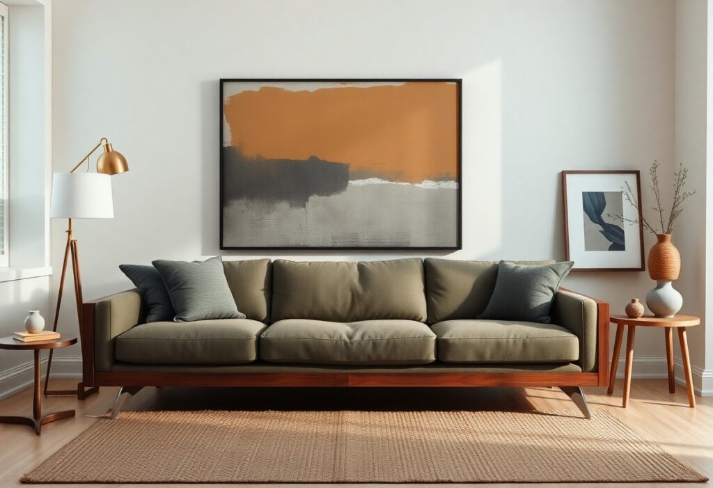
Furniture is often the anchor of a room, but I’ve learned that pairing it with artwork doesn’t mean everything must match perfectly. You want cohesion, not a catalog look. The danger lies in over-coordinating-think matching your sofa’s exact blue in a painting or framing everything uniformly. Instead, I aim for subtle harmony through tone, texture, or theme, leaving room for surprise. A mid-sized SaaS firm’s office might mix vintage posters with modern desks, and so can your living room.
Key Takeaways:
- A single shared color tone between your artwork and furniture-like a rust hue in both a painting and a linen sofa-creates subtle harmony without appearing staged, allowing other elements in the room to stand out.
- Choosing art with a frame material that echoes a detail in your furniture, such as a walnut frame next to a teak coffee table, ties the pieces together while still leaving room for creative contrast in style or period.
- One oversized abstract piece above a minimalist couch can balance visual weight without matching exactly, proving that scale and intention matter more than color or theme alignment.
Finding Your Personal Aesthetic Balance
I’ve learned that harmony in a room doesn’t come from matching every piece exactly, but from trusting my gut when something feels right. It’s about balancing what I love with what works, letting a vintage chair sit comfortably beside a bold, modern print. The magic happens in the mix, not in the mimicry.
Defining your room’s main personality
A room’s personality often reveals itself in its anchor pieces-like the deep charcoal sofa I chose for my living area. That decision set a moody, grounded tone, so I leaned into it with warm wood accents and a single, sun-drenched abstract painting. The sofa became the mood setter, not just seating.
Why “perfectly matched” can feel a bit flat
When everything coordinates too closely, the space can lose its spark-like a living room where the art, pillows, and rug all echo the same blue tone exactly. It’s neat, yes, but neat isn’t always interesting. My cousin’s apartment looked like a catalog shoot, and honestly, it felt untouchable, not lived-in.
That overly coordinated living room I mentioned? It lacked tension-the slight pull between contrasting shapes, textures, or eras that makes a space feel alive. I once hung a jagged, black-and-white contemporary drawing above a soft, curved mid-century credenza, and the contrast made both pieces stand out more. Dissonance, in small doses, creates energy, not chaos.
How to Mix Different Art and Furniture Eras
I’ve found that pairing unexpected time periods can add real personality to a room, as long as there’s a unifying thread like color, texture, or mood. You don’t need everything to match perfectly-in fact, a little contrast often makes the space feel more alive. For more on this idea, check out this helpful guide on Does Wall Art Have to Match Your Furniture.
Pairing modern pieces with vintage finds
Modern art above a mid-century dresser creates a clean dialogue between old and new. I like to let the simplicity of the frame or canvas balance the ornate details of vintage furniture, so neither feels overwhelming. The contrast becomes the focal point, not the clash.
Blending traditional sofas with abstract canvases
A rolled-arm sofa in a soft neutral shade gains instant energy when paired with a bold abstract piece. I often choose artwork with a single shared hue from the sofa’s accent pillows to tie them together subtly. It’s the small connections that keep the look intentional, not chaotic.
When I placed a large, gestural abstract painting over my grandmother’s tufted camelback sofa, I worried it might feel disjointed. Instead, the dynamic brushwork softened the formality of the piece, adding movement and modern ease. Choosing a canvas with warm undertones echoed the wood finish of the coffee table, creating harmony without matching anything exactly. The room now feels both personal and thoughtfully layered.
Essential Factors for Choosing the Right Size
Getting the size right makes a noticeable difference in how your space feels. I always consider the wall space, the furniture dimensions, and the viewing distance when selecting a piece. Any decision starts with these elements in mind. For deeper insight, I recommend checking out Mixing and Matching Art in Interior Design: A Balancing Act.
Measuring for the perfect wall-to-furniture ratio
I usually aim for artwork that covers about two-thirds to three-quarters of the furniture’s width. This keeps the composition balanced without overwhelming the piece below. The visual weight matters just as much as the measurement.
Avoiding the “tiny art over big sofa” mistake
Placing a small frame above a large sofa creates a disjointed look, like a hat too small for your head. I avoid this by choosing a single larger piece or a grouped arrangement that matches the sofa’s scale. The proportion between art and furniture defines harmony.
I once saw a striking 9-foot sectional paired with a postcard-sized print, floating in the center. It felt accidental, not intentional. Instead, I prefer anchoring wide furniture with a bold canvas or a curated gallery wall that spans the width. A well-scaled piece becomes a natural extension of the furniture, not an afterthought.
Tips for Playing with Color Palettes
- Start with your upholstery as the base and pull one secondary color from its pattern to highlight in your art.
- Use a neutral wall to let bold frames or colorful pieces stand out without overwhelming the space.
- Thou can always swap in new prints seasonally to keep the color story fresh and personal.
Using complementary colors for a cohesive look
I often pull a quiet blue from my sofa’s trim and echo it in a small abstract piece above. That subtle repeat ties the room together without matching too closely. A warm terracotta frame next to cool gray fabric adds balance, not contrast, because the tones align. The effect feels intentional, not staged.
Picking accent shades that pop against your upholstery
A mustard yellow canvas jumps beautifully beside charcoal linen chairs. That little spark keeps the corner from feeling flat. I watch how light moves across the fabric and art at different times, making sure the accent doesn’t shout over the furniture.
I once hung a deep plum painting across from a sage green sectional and was surprised how the two softened each other. The richness in the paint deepened the green’s earthiness. Choosing shades that differ in temperature-warm against cool-adds depth without clashing. It’s not about contrast for drama but harmony through difference.
How to Use Texture and Frames to Break the Mold
I like to think of frames and texture as quiet rebels in a room’s design story. They don’t shout, but they shift the energy. A rough linen canvas next to a glossy credenza creates subtle tension, while a thick, hand-carved frame around a simple print adds unexpected weight. These choices keep the eye moving and prevent the space from feeling too matchy or staged. It’s the small contrasts that make a room feel lived-in and authentic.
Choosing frames that contrast with your wood finishes
A black metal frame around artwork can ground a light oak sideboard, creating a visual anchor. I often pick frame finishes that oppose my furniture tones-warm walnut frames over cool gray upholstery, or sleek aluminum against a rustic pine table. This contrast keeps the composition from blending into the background, giving each piece room to breathe and stand out.
Adding depth with mixed media and 3D elements
I love hanging a woven textile beside a ceramic wall sculpture or a small shadowbox with layered paper cuts. These pieces catch the light differently throughout the day, adding movement. Including even one three-dimensional work can shift how you experience a wall, making it feel more dynamic and less like a gallery checklist.
One of my favorite tricks is pairing a flat photograph with a sculptural piece made from reclaimed wood or metal. The photograph grounds the arrangement, while the 3D element draws you in from different angles. I once hung a simple line drawing next to a folded copper wall piece, and the way the light bounced between them changed completely from morning to evening. These layered textures create a quiet rhythm, turning a static wall into something that feels alive.
Final Words
I’ve learned that the best rooms feel collected, not designed, and I like leaving a little mismatch on purpose. You don’t need matching sets to create harmony-sometimes your favorite abstract painting looks better beside a sleek mid-century chair than anything “coordinated.” I always leave room for surprise, like hanging a rustic frame above a modern sofa or letting a bold color repeat in just one pillow and one brushstroke. It keeps the eye moving and the space feeling like you.