
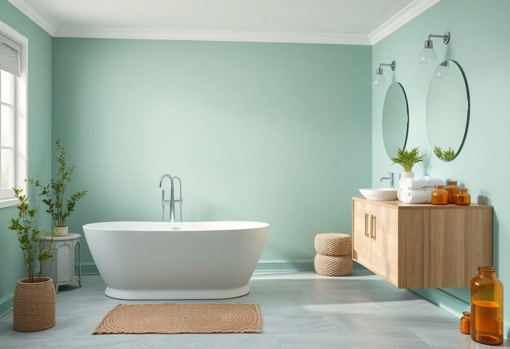
Bathroom spaces can shift from ordinary to restorative with the right color choices, and I’ve found that subtle, nature-inspired tones make the most difference. You don’t need a renovation to evoke calm-you need the right palette. I rely on colors that mimic water, stone, and forest because they reduce visual noise and promote mental stillness. Your bathroom should feel like a retreat, not a task zone, and color is the quietest, most powerful tool you have.
Key Takeaways:
- Soft, cool tones like pale blue and misty gray mimic natural water and sky, helping lower visual stimulation and support a sense of mental clarity, similar to the effect seen in hospital recovery rooms that use analogous hues to reduce patient stress.
- Earthy neutrals such as warm beige, sandstone, and soft taupe ground a space by evoking natural materials like stone and clay, a strategy frequently applied in Japanese bath design where harmony with nature is central to the experience.
- White, when used thoughtfully with layered textures like linen curtains or matte ceramic fixtures, avoids sterility and instead creates a quiet backdrop that allows light to diffuse gently, much like the whitewashed walls in Mediterranean bathhouses that reflect sunlight without glare.
The Pale Blue of the Morning Sea
I often recommend a soft, pale blue inspired by the first light over calm water because it brings an immediate sense of stillness to a bathroom. You don’t need to mimic the ocean exactly-a hint of gray or green in the undertone keeps it from feeling cold. I’ve seen this shade transform even the smallest powder room into a quiet retreat, especially when paired with matte finishes and natural wood accents. Your eyes relax into it, and the color seems to recede, making the space feel larger and airier.
The Earth and the Stone
I find grounding power in hues drawn directly from the soil and bedrock beneath our feet. You don’t need dramatic shifts to feel it-a warm terracotta tile band, slate-gray grout lines, or a vessel sink in unpolished basalt can redefine a space. These tones, ranging from ochre to charcoal, absorb light rather than reflect it, creating a quiet, cave-like serenity. I’ve seen a mid-sized SaaS founder replace glossy white fixtures with matte stone finishes and report a noticeable drop in evening stress. The effect isn’t decorative-it’s physiological.
White and the Absence of Noise
I find that white does more than just reflect light-it removes visual clutter, creating a sense of quiet that few colors can match. When you surround yourself with pure, clean white, your mind registers the absence of distraction, which deepens the feeling of calm in a bathroom space. I often recommend pairing white with natural materials like teak or stone to avoid sterility, grounding the room in warmth. For more insight, check out this guide on 5 Color Tips That Will Make Your Bathroom Feel Like a Spa, where subtle shifts in tone can make a lasting difference.
Green Like the Deep Woods
I find that deep forest green brings an immediate sense of grounded calm, mimicking the hush of a shaded woodland canopy. This shade works especially well in bathrooms with natural wood accents or stone finishes, reinforcing a connection to the outdoors. For inspiration, I often revisit 65 Dreamy, Spa-Inspired Bathrooms, where several designs use emerald and pine tones to create enveloping serenity. A matte finish on the walls enhances the effect, absorbing light softly and reducing glare.
Elements of Natural Light
I’ve found that natural light transforms even the most carefully designed bathroom into a true sanctuary when balanced with the right colors. You don’t need floor-to-ceiling windows-just a well-placed skylight or a translucent glass door can make a dramatic difference. I always recommend positioning mirrors to reflect daylight, which doubles the sense of openness and enhances cooler tones like pale blue or soft green. Your space will feel less static, more alive, as the light shifts from morning’s cool glow to the warm wash of late afternoon. A sheer linen curtain can diffuse harsh midday sun while preserving privacy, letting you maintain the calm without compromise.
The Texture of Calm
I notice how often people overlook texture when chasing a serene bathroom aesthetic, focusing only on color. A smooth pebble finish on the floor, the slight resistance of a linen shower curtain, or the cool density of a matte ceramic sink-these sensations shape your experience as much as any hue. I’ve seen a mid-sized SaaS founder transform her ensuite simply by replacing a glossy tile with a honed travertine backsplash; the way light diffuses across its surface softened the entire room. Even the weight of a thick cotton towel contributes to the feeling of grounded stillness. Your skin reads these subtleties before your mind does.
Summing up
I find that your ideal spa-like bathroom doesn’t depend on a single shade but on how well the colors you choose work together to quiet the mind. I’ve seen a mid-sized SaaS founder transform a cramped master bath using only soft gray-green tiles and a matte white vanity, proving that subtlety often speaks louder than bold statements. Natural materials, diffused light, and tonal layering matter just as much as hue. I use linen towels, unlacquered brass, and a single potted fern because they age quietly, deepening the sense of calm over time. A palette rooted in nature doesn’t need explanation-it simply feels like relief.