
Key Takeaways:
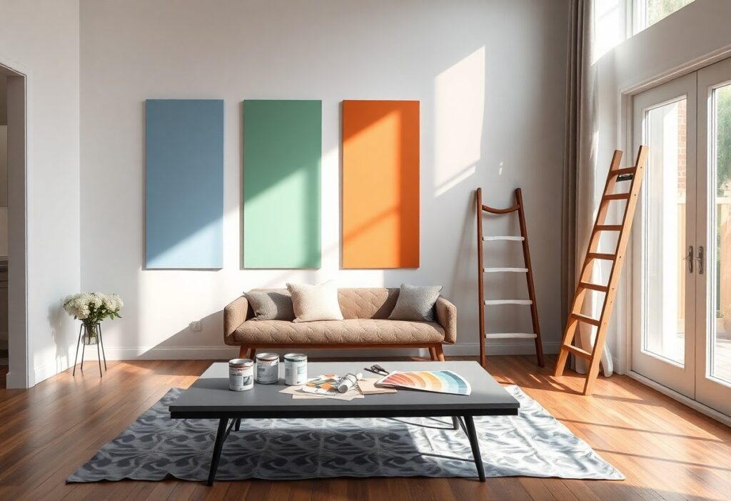
- Color choices in interior design directly influence mood and behavior-cool tones like blue and green promote calm and focus, while warm shades such as red and orange can energize and stimulate conversation.
- Personal emotional response matters more than trends; selecting colors that resonate with your feelings and memories creates a more authentic and comforting living space.
- Using color strategically in different rooms-like soft neutrals in bedrooms for relaxation and bold accents in creative areas-can enhance the function and emotional tone of each space.
The Psychology of Color in Living Spaces
Color shapes how you feel the moment you walk into a room. I’ve seen neutral walls calm anxiety, while bold reds spark energy and conversation. Your space doesn’t just reflect your taste-it influences your mood, focus, and even sleep. I use color as a quiet architect of emotion, designing environments that support how you want to live.
Emotional Responses to Warm and Cool Tones
Warm tones like red, orange, and yellow invite energy and connection. I notice you tend to feel more alert and social in these spaces, but too much intensity can cause restlessness or irritability. Cool tones-blue, green, purple-bring calm and focus, though overuse may make a room feel emotionally distant or cold. Balance is key.
How Saturation and Brightness Influence Mood
Saturation changes how strongly a color affects you. I’ve watched highly saturated rooms energize at first, then overwhelm with sensory strain. Brightness alters perception-lighter shades feel open and safe, while dark tones add intimacy but risk making a space feel confined or heavy. You respond to these cues whether you realize it or not.
When I design with saturation, I think about emotional endurance. A deeply saturated wall might look dramatic in a photo, but living with it is different-your eyes never fully relax. I guide you toward mid-saturation hues that hold their beauty without draining your energy. Brightness, too, needs intention: a pale blue feels serene, but flood a room with bright yellow, and you might feel constantly on edge. I adjust both elements like a volume knob on mood, ensuring your space supports peace, not stress.
Primary Types of Color Schemes for Interior Design
I use specific color arrangements to shape how you experience a room. Each scheme influences mood and space differently. Monochromatic designs rely on one hue in varying tones, creating calm. Analogous schemes blend neighboring colors for subtle harmony. Complementary pairs offer bold contrast. Split-complementary softens that intensity. Perceiving
| Color Scheme | Effect on Space & Emotion |
| Monochromatic | Creates serene, unified spaces; ideal for relaxation |
| Analogous | Feels natural and soothing; enhances flow between rooms |
| Complementary | Delivers high contrast and energy; best in small doses |
| Split-Complementary | Offers visual interest without tension; easier to balance |
Harmonious Monochromatic and Analogous Palettes
Monochromatic schemes build depth using one base color in different shades and saturations. I find them perfect for crafting serene bedrooms or minimalist spaces. Analogous combinations use colors side-by-side on the wheel, like blue and green. You feel their quiet rhythm instantly. Perceiving
Dynamic Complementary and Split-Complementary Systems
Complementary schemes pair opposite colors, such as red and green, generating bold visual punch. I use them to highlight focal points without overwhelming the room. Split-complementary replaces one opposite with two neighbors, softening the contrast. You gain vibrancy with more flexibility. Perceiving
Opposite hues create the strongest contrast, which can feel jarring if applied equally. That’s why I limit one color to 70% and use the other as an accent. Split-complementary schemes reduce strain by replacing the direct opposite with adjacent tones-like pairing blue with yellow-orange and red-orange. This maintains energy while improving balance. You retain drama but with greater comfort, making it ideal for living areas where engagement matters.
Critical Factors When Choosing Your Home Palette
Selecting the right colors for your home involves more than personal taste.
- Natural light exposure
- Room orientation
- Functionality of space
- Wall dimensions
- Emotional impact
Perceiving how each element interacts with pigment helps you make intentional, lasting choices.
Natural Light Exposure and Room Orientation
Light changes how your walls appear throughout the day. North-facing rooms receive cool, soft light, making warm tones ideal for balance. South-facing spaces flood with sunlight, intensifying bright hues. I always test paint at different times. Perceiving these shifts ensures your color stays true.
Functional Requirements and Spatial Dimensions
A room’s purpose shapes its ideal palette. I use calming blues in bedrooms to support rest, while energetic yellows work in kitchens. Small areas benefit from light, reflective shades that expand perception. Tall ceilings handle darker ceilings without pressure. Perceiving function guides emotional harmony.
Every space carries a unique rhythm based on how you use it and how it’s shaped. A narrow hallway feels oppressive with deep colors unless you balance them with strategic lighting and reflective finishes. I’ve seen cool grays transform a cramped home office into a focused retreat, while soft whites with warm undertones made a large living room feel intimate. Storage needs, traffic flow, and even ceiling height influence how color behaves. Perceiving these details ensures your palette supports real life, not just aesthetics.
Step-by-Step Guide to Executing a Color Transformation
| Phase | Action |
| 1. Planning | Define your emotional goals and room function |
| 2. Inspiration | Create a mood board with textures, tones, and lighting |
| 3. Testing | Apply large swatches and observe under different light |
| 4. Execution | Paint with proper prep and technique for lasting results |
Establishing a Mood Board and Visual Concept
I begin by gathering images, fabrics, and paint samples that reflect the emotion I want you to feel in the space. Your mood board becomes a visual compass-keeping color choices aligned with your intended atmosphere. It prevents impulsive decisions and ensures harmony between furniture, lighting, and wall tones.
Applying Swatches and Monitoring Metamerism
I paint large swatches directly on the wall to see how your chosen colors shift throughout the day. Metamerism-the way colors change under different light-can completely alter your experience. You’ll notice blues turning gray or warm tones cooling down, so observing these shifts is necessary before committing.
Lighting plays a powerful role in how your eyes interpret color, and I never rely on small sample chips alone. I apply swatches across multiple walls to evaluate depth, undertones, and interaction with natural and artificial light. This step prevents costly mistakes-what looks calming at noon might feel cold at dusk. Watching how your color behaves over time ensures the final result matches your emotional vision.
Professional Tips for Achieving Visual Balance
I rely on color harmony, contrast, and proportion to create interiors that feel naturally balanced. Designers often use the 60-30-10 rule and layer textures to enhance depth. Visual balance prevents spaces from feeling chaotic or flat. Knowing The Power of Color in Design: Psychology & Inspiring Ideas can transform your approach to color.
Utilizing the 60-30-10 Rule for Proportions
Your primary color should cover 60% of the space, creating a steady backdrop. I use the next 30% for a complementary tone that supports the main hue. The final 10% is reserved for an accent color that adds energy. Knowing this ratio brings instant cohesion to any room.
Enhancing Atmosphere through Textures and Finishes
Texture changes how color is perceived under different lighting. I mix matte, glossy, and tactile surfaces to add dimension. A soft rug or polished finish can shift the mood dramatically. Knowing how materials interact with color deepens emotional impact.
Light reflects differently across surfaces, and I’ve found that a flat paint absorbs color, making it appear deeper, while a satin finish bounces light and lifts the tone. You can use velvet curtains to warm a cool gray or introduce a metallic lamp to energize a neutral palette. These subtle choices shape how you experience a room, turning color into a full sensory experience.
Pros and Cons of Bold vs. Neutral Design Strategies
I’ve tested both bold and neutral design approaches in real homes, and each carries distinct advantages and trade-offs. Your choice shapes not only daily mood but long-term flexibility. Below is a clear breakdown to guide your decision. For deeper insight into how color influences space and emotion, I recommend exploring Color theory in interior design.
| Bold Design Pros | Bold Design Cons |
| Expresses strong personality | Can overwhelm small spaces |
| Creates memorable focal points | May require frequent updates |
| Stimulates energy and creativity | Harder to coordinate with furniture |
| Reflects confidence and individuality | Higher risk of buyer resistance |
| Enhances artistic interior themes | Costly to repaint frequently |
| Supports psychological intentionality | Lighting affects color drastically |
| Encourages emotional engagement | Limits future decor flexibility |
| Transforms dull rooms instantly | May clash with art or textiles |
| Boosts confidence in personal spaces | Not ideal for rental properties |
| Aligns with expressive lifestyles | Can feel dated quickly |
Longevity and Resale Value of Neutral Tones
I find neutral tones offer lasting appeal, making them smart for homes you plan to sell. You’re more likely to attract a broad range of buyers who envision their own style in a calm, adaptable space. Neutral walls often increase resale speed and value, especially in competitive markets.
Psychological Impact and Personalization of Bold Hues
I see bold hues as emotional catalysts-they can energize a room or soothe your mind, depending on shade and placement. You gain a deeply personal environment that reflects your inner world. Color becomes a form of daily self-expression that neutral schemes rarely match.
Bold colors do more than catch the eye-they shape how you feel the moment you walk into a room. I’ve watched deep blues bring calm to anxious clients and fiery reds ignite conversation in lifeless dining areas. When you choose a vibrant hue, you’re not just decorating; you’re setting a psychological tone. The right bold color, aligned with your personality and needs, turns walls into emotional allies. Just be mindful-an overpowering shade can create tension or fatigue over time, so balance is key.
To wrap up
From above, I see how color transforms your space and your mood. I’ve shown you how specific hues influence emotion and behavior in your home. With this guide, you can confidently choose palettes that reflect your personality and support your daily life. I trust you now feel equipped to use color as a powerful tool in your interior design journey.