
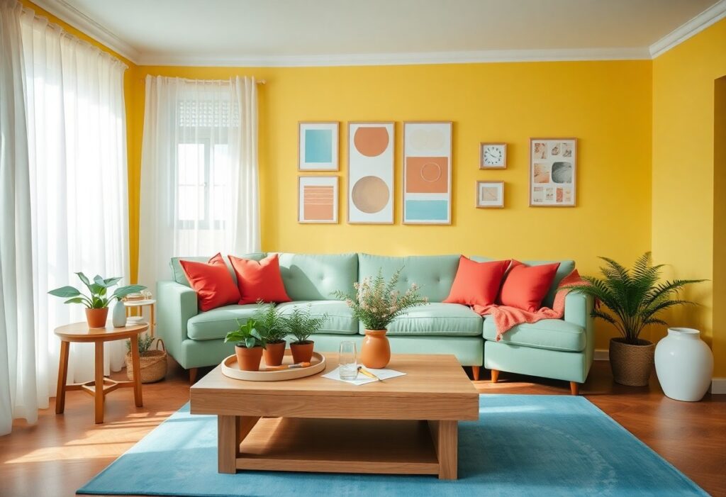
Home is where your mood begins, and I’ve found that the right colors can transform how you feel every day. I use warm yellows in kitchens to spark joy and soft blues in bedrooms to calm your mind. You don’t need a renovation-just strategic color choices to create a space that feels lighter, brighter, and truly yours.
Evaluating the Psychological Factors of Color Selection
Color shapes how you feel in your space more than you might realize.
- I pay attention to how warm tones like reds and oranges energize a room
- Cool tones such as blues and greens often bring calm
- Your personal associations with certain colors matter deeply
- Cultural and emotional connections influence perception
This shapes the foundation of intentional, mood-supporting design.
Analyzing the impact of warm versus cool tones on mood
Warm tones like coral and golden yellow spark energy and conversation in living areas. I notice they make spaces feel more inviting and intimate. Cool tones, in contrast, slow the mind and work well in bedrooms or bathrooms. This supports emotional balance through intentional color use.
Identifying hues that reduce stress and promote tranquility
Soft sage green and muted lavender help quiet the mind after a long day. I’ve found these shades lower visual noise and support relaxation. You don’t need dim lighting or silence-just the right hue. This creates a sanctuary within your own walls.
When I choose calming colors, I focus on low saturation and natural references. A pale blue that mimics morning sky or a warm greige that echoes stone walls grounds the space in nature. These tones don’t shout; they whisper comfort. You begin to breathe deeper without even noticing. This quiet influence is the most powerful aspect of color psychology in home design.
How to Choose a Happiness-Inducing Color Palette
I believe your color choices can directly influence your mood and energy at home. I focus on warm yellows, soft greens, and gentle blues-they consistently bring a positive emotional lift without overwhelming the senses. You don’t need bold hues to feel joy; sometimes, the softest tint can make the biggest difference in how you experience your space.
Assessing the natural light and function of each room
Light changes how colors behave, so I always check each room at different times of day. You’ll notice that north-facing rooms feel cooler, so I recommend warmer tones to balance the light. A kitchen meant for lively gatherings benefits from energizing shades, while a bedroom needs calmer hues to support relaxation and peace.
Testing paint samples against existing furniture and decor
I paint large swatches directly onto the wall and live with them for a few days. You’ll see how the color interacts with your furniture, flooring, and textiles in real light. This step reveals whether the tone feels harmonious or jarring-a small shift can make your favorite couch look mismatched or perfectly complemented.
Seeing a paint sample next to your actual decor removes guesswork. I watch how the undertones shift at sunrise versus evening, and how they blend-or clash-with your rug, art, or sofa. You might love a sunny yellow in the store, but under your living room light, it could lean too orange. That’s why I never skip this test-it protects your time, budget, and the emotional impact you’re trying to create.
Essential Tips for Incorporating Vibrant Accent Colors
- Use the 60-30-10 rule to maintain visual harmony
- Introduce bold hues through removable decor for flexibility
- Pair complementary colors to energize a space
- Balance saturated tones with neutral backdrops
I find that smart use of color can transform your mood at home. Assume that 5 Ways to Decorate a Home to Make You Happy offers practical inspiration for bringing more joy through design.
Applying the 60-30-10 rule for balanced distribution
Your primary color should cover 60% of the space, creating a calm foundation. I use the next 30% for a secondary shade that supports depth, while the final 10% is where I add a lively accent color to spark joy. This ratio keeps bold choices from overwhelming your senses.
Adding pops of color through textiles, art, and accessories
Color doesn’t need to dominate walls to make an impact. I prefer introducing cheerful tones through throw pillows, rugs, or framed art. These elements are easy to switch and let you experiment. Assume that small changes can create big emotional shifts in how you experience your space.
Textiles like cushions, curtains, and blankets offer a soft way to weave in color without commitment. I often choose a vibrant painting or a gallery wall to serve as a focal point that radiates positivity. Even small accessories-vases, lamps, or trays-can carry a bold hue that surprises and delights you daily. These touches keep the energy fresh and personal, letting your personality shine through in joyful bursts.
Factors Influencing Color Perception and Atmosphere
Light, space, and personal experience shape how you see color in your home.
- Your brain interprets hues differently under warm or cool lighting
- Room size and ceiling height affect visual impact
- Personal memories tied to certain shades influence emotional response
Recognizing these elements helps you choose tones that truly uplift your space.
Understanding how artificial lighting alters paint hues
Light bulbs change the way your walls look at night. Cool white LEDs make blues and grays feel sharper, while warm incandescents soften reds and yellows. I always test paint swatches under your actual fixtures. Recognizing this shift prevents unwanted surprises after sunset.
Considering the architectural features of your living space
High ceilings let you play with bold accents without overwhelming the room. I notice how crown molding or exposed beams interact with light and shade. Small spaces benefit from reflective finishes that enhance brightness. Recognizing your home’s structure ensures color enhances, not fights, its character.
Architectural details like trim, window placement, and floor material affect how color flows through a room. I’ve seen how a dark ceiling in a room with tall windows creates a cozy sky effect, while open floor plans need cohesive palettes to maintain balance. Your home’s bones guide where to intensify or soften tones for emotional harmony.
How to Create Positive Energy in High-Traffic Areas
I focus on colors that uplift mood and encourage movement in spaces like hallways and staircases. You don’t need bold hues-soft yellows or warm grays can make a big difference. These tones keep energy flowing without overwhelming your senses, making daily transitions through your home feel smoother and more pleasant.
Designing an inviting entryway with welcoming tones
I choose warm neutrals like creamy beige or soft terracotta because they make guests feel instantly at ease. You want your entryway to say “welcome” without shouting it. A pop of coral or buttery yellow on the door adds just enough cheer to set a positive tone from the moment you walk in.
Promoting social interaction in the living room through warm schemes
I use warm reds, oranges, and earthy tones to draw people together naturally. You’ll notice conversations flow easier when the space feels cozy and intimate. These colors stimulate connection without being overstimulating, making your living room the heart of joyful gatherings.
Warm color schemes in the living room do more than just look comforting-they influence how you and your guests behave. I’ve seen how a rust-colored accent wall or amber-toned textiles can turn a stiff, formal space into one that invites laughter and lingering. Reds and oranges increase heart rate slightly, which can boost energy and engagement during social moments. You don’t need to paint every wall; even throw pillows, rugs, or art in warm palettes can shift the mood. I always recommend balancing these tones with soft lighting and natural textures so the space stays warm, not overwhelming. This is where your home truly comes alive with connection.
Tips for Refreshing Small Spaces with Bright Hues
Small rooms thrive with the right splash of color. I use bright hues like sunny yellow, coral, and mint green to instantly uplift tight areas. A pop of cheerful color on an accent wall or in accessories can transform a cramped space into something inviting.
- Choose light-reflective paints to amplify natural light
- Use contrasting trims to add visual interest
- Stick to a cohesive color palette to avoid clutter
After boost your mood by incorporating these happy colors into your compact interiors, you’ll notice a surprising sense of openness and joy.
Using light-reflective colors to increase perceived space
Light-reflective colors make walls appear farther apart. I often recommend soft citrus tones or pale aqua because they bounce daylight around, creating an airy feel. You’ll find that even north-facing rooms gain warmth with these luminous shades. After painting, the difference in perceived size is often striking.
Creating depth with strategic contrast and layering
Contrast pulls the eye through a room, making it feel larger than it is. I paint lower walls in deeper tones and transition to lighter hues above to simulate height. Using layered colors in textiles and art adds richness without crowding the space. After introducing subtle shifts in value, your small room gains dimension and calm.
Layering isn’t just about color-it’s about perception. I build depth by pairing a bold baseboard with a mid-tone wall and a ceiling in a soft complementary shade. This technique draws the gaze upward and encourages movement through the space. The emotional impact of a well-layered room is often immediate: you feel more relaxed, more engaged. After experimenting with tonal gradation, you’ll see how small shifts in color can create a surprisingly expansive atmosphere.
Final Words
I’ve shown you how color choices directly influence mood and atmosphere in your home. I choose warm yellows and soft greens because they bring energy and calm. You don’t need bold changes-small updates in decor or paint can shift how you feel. I trust you’ll use these insights to create spaces that reflect joy and positivity every day.