
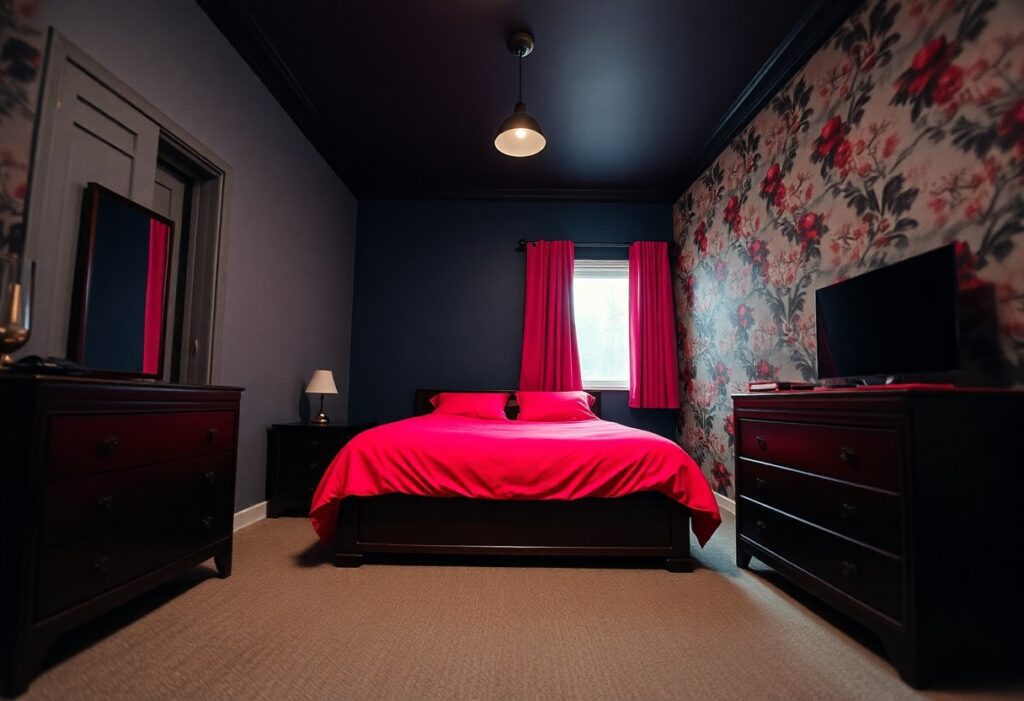
Design can quietly shape how a room feels, and I’ve learned the hard way that some colors make small bedrooms feel cramped and heavy. You might love deep navy in a living room, but in your sleep space, it could create a closed-in sensation. I’ll help you spot the shades that work against you-and which ones give your room breathing room instead.
Key Takeaways:
- Deep, saturated hues like navy or charcoal can make a small bedroom feel enclosed, especially without ample natural light, as they absorb rather than reflect brightness.
- Overly bright neons-think electric green or hot pink-create visual noise that overwhelms compact spaces, making it harder for the eye to rest and the room to feel calming.
- Monotonous earth tones, such as beige or muddy brown, risk flattening the space, particularly when used on all walls, trims, and furniture without contrast or texture.
The Melancholy of the Midnight Palette
I’ve seen how easily a dreamy color idea can turn into a nighttime trap. Deep, dark hues like midnight blue or forest green might feel calming in a swatch, but on all four walls, they can make your room feel like a cave. I once helped a client repaint their bedroom after they confessed they felt heavier every time they walked in.
Midnight Blues and Obsidian Dreams
That rich navy you love in a throw pillow becomes something else entirely when it wraps the room. I tried obsidian gray in my own guest room once, thinking it would feel cozy. Instead, the space felt shut off from light, even at noon. The color absorbed everything, leaving the room visually smaller and strangely somber.
The Claustrophobia of Deep Forest Greens
Deep forest green can mimic the feeling of being deep in a shaded thicket-intimate at first, then suffocating. I watched a friend’s bedroom transform into a space no one wanted to relax in, despite beautiful decor. The walls seemed to lean inward, especially under artificial light.
One evening, with just a floor lamp on, the green turned almost black in the corners, creating shadows that felt intentional, like the room was hiding something. It wasn’t just about size anymore-it was about mood. That shade, while elegant in theory, drained the energy instead of supporting rest. I noticed their bedtime routine suffered, with complaints of restlessness and a sense of unease they couldn’t explain.
The Vulgarity of the Fluorescent Glow
Bright, artificial tones mimic the harshness of office lighting, and I’ve seen them turn cozy nooks into sterile waiting rooms. These shades reflect light aggressively, making walls feel like they’re closing in. The most disruptive hues emit a glare that strains the eyes long after bedtime, sabotaging the calm your sanctuary should provide.
Electric Yellows That Murder Sleep
That neon lemon shade might feel cheerful at noon, but under lamplight, it buzzes like a trapped fly. I once stayed in a guest room painted in a fluorescent yellow that made my thoughts race. These high-energy tones overstimulate the brain, blocking the quiet mental drift needed for rest.
Hot Pinks and the Death of Serenity
Fuchsia, magenta, and other intense pinks vibrate on the retina, creating a sense of constant motion. I tried a bold pink accent wall once and found myself unusually restless at night. The color’s intensity tricks the body into staying alert, disrupting natural wind-down rhythms.
One client painted her entire bedroom in a hot pink she loved in a swatch, only to report trouble falling asleep within days. The color looked nothing like the sample in evening light-instead of soft warmth, it radiated an almost pulsing energy. Even after adding blackout curtains and dim lamps, the walls seemed to hum. She eventually repainted with a dusty rose, and her sleep improved almost immediately.
The Despair of the Earthly Brown
I’ve seen how certain browns quietly drain the life from a small bedroom, making walls feel like they’re closing in. While earth tones can ground a space, the wrong shade risks turning your retreat into a cave of fatigue. For a deeper look at problematic hues, check out this guide on colors to avoid in a bedroom – 7 shades never to paint walls.
Drab Browns That Smother the Spirit
That dull, grayish brown you picked for its “natural” vibe? I’ve watched it mute sunlight and dull even the cheeriest bedding. It doesn’t warm the room-it weighs it down, like a perpetual overcast sky pressed onto your walls.
Heavy Terracotta and the Loss of Air
Rich terracotta might feel inviting in a sun-drenched living room, but in a compact bedroom, it often becomes oppressive. The pigment absorbs light instead of reflecting it, making the ceiling seem lower and corners feel tighter.
One client painted their narrow bedroom in a deep terracotta, hoping for a Mediterranean escape. Instead, the space felt like a root cellar by evening. The color’s density blocked what little natural light entered, demanding brighter lamps and creating harsh contrasts at night. Even adding white trim couldn’t lift the heaviness.
The Exhaustion of the Patterned Wall
I once tried a bold geometric wallpaper in my guest bedroom, thinking it would add character. Instead, the busy design made the space feel restless and visually draining. Large or high-contrast patterns pull the eye in too many directions, creating a sense of unease rather than calm. If you’re wondering what colors should be avoided when decorating a small bedroom, consider that it’s not just hue but pattern intensity that overwhelms.
High-Contrast Patterns That Agitate
Black-and-white stripes or checkerboard walls might look chic in magazines, but in a compact room, they create visual noise. The stark contrast between colors triggers eye fatigue, making it harder to relax. I noticed my own sleep suffered when I kept a zebra-print accent wall, so I replaced it with a soft linen texture. Strong shifts in tone, especially in repeating forms, are the most disruptive to a peaceful atmosphere.
The Clutter of Multi-Colored Accents
Adding multiple bright colors through throw pillows, art, and curtains can unintentionally mimic visual chaos. Without a unifying base, each hue competes for attention. I learned this when my lavender, teal, and mustard decor made the room feel like a scattered palette. Too many colors in small doses lack cohesion and make the space seem disorganized and restless.
When I reduced the accent colors to just one-keeping the rest in neutral tones-the room instantly felt calmer. A single pop of color gives personality without overwhelming. Even if the shades are soft, scattering them across too many objects fragments focus. Simplicity in accent choices supports a sense of flow, letting the eye rest instead of race from one bright spot to the next. This balance is imperative for small bedrooms meant to soothe, not stimulate.
Summing up
I’ve learned that choosing the right colors for your small bedroom makes a real difference in how the space feels. I avoid deep midnight blues because they can make the walls feel too close, and I skip fluorescent brights that tend to vibrate and overwhelm. Earthy browns sometimes add a dull heaviness, and busy patterned walls pull the eye in too many directions. For your best rest, I stick with soft, light tones that give the room a quiet, open breath-like a pale sage or warm greige that lets the space feel like it’s truly yours.