
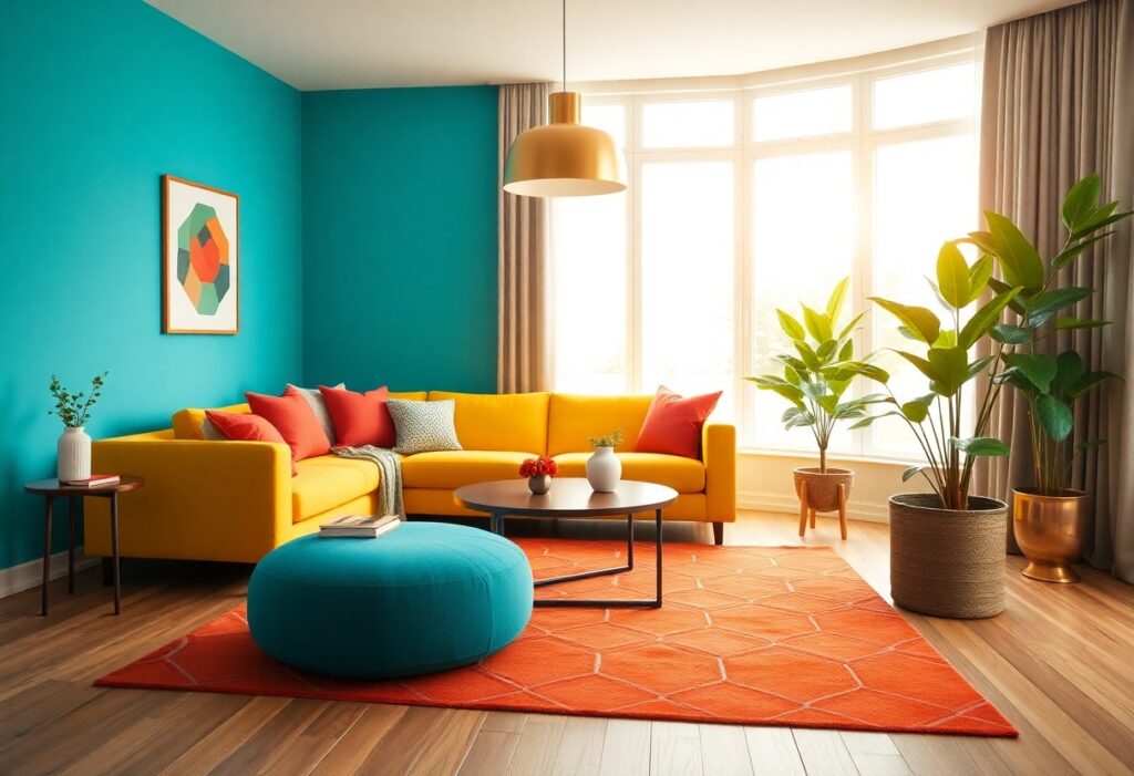
Most rooms feel flat because their colors don’t reflect the energy you want. I use bold reds, sunny yellows, and vibrant oranges to instantly transform dull spaces into lively environments. You don’t need to repaint everything-just one strategic accent wall can make a dramatic difference. I’ll show you how to choose the right tones for your mood and space.
Key Takeaways:
- Warm colors like red, orange, and yellow naturally stimulate activity and conversation, making them ideal for spaces where energy and interaction are desired.
- Using high-contrast color combinations-such as pairing deep blues with bright yellows-can create visual excitement and draw people’s attention, instantly enlivening a room.
- Even small doses of bold color through accents like pillows, art, or rugs can have a big impact, injecting vibrancy without overwhelming the space.
Understanding the Psychology of High-Energy Hues
Color shapes how you feel in a space more than you might realize. I’ve seen dull rooms transform into lively hubs just by introducing bold, energizing tones. Warm reds, radiant oranges, and sunny yellows don’t just catch the eye-they trigger emotional responses that make a room feel alive. These high-energy hues stimulate alertness and conversation, making them ideal for social or creative areas where activity thrives.
The Stimulating Effects of Warm Tones
Warm tones like crimson, amber, and terracotta naturally draw people in. I notice how they increase heart rate and spark enthusiasm, making spaces feel more intimate and dynamic. You’ll often feel more engaged and present in a room washed with these colors. Their ability to generate warmth and movement makes them powerful tools for re-energizing stagnant environments.
Leveraging Vibrancy to Alter Room Mood
Vibrant shades such as electric blue or lime green can shift a room’s entire atmosphere in seconds. I’ve used them as accents to break monotony and inject excitement. When you introduce these bold tones thoughtfully, they create focal points that uplift the spirit. The right pop of color can turn a flat space into one that feels charged and intentional.
Choosing vibrant colors isn’t just about aesthetics-it’s about shaping experience. I pay close attention to saturation and context, because overly intense hues can overwhelm if not balanced. In my projects, I often pair vivid walls with neutral furnishings to let energy shine without chaos. You don’t need to repaint everything; even a single boldly colored chair or artwork can radiate energy throughout the room. It’s about smart, intentional choices that align with how you want to feel in the space.
Key Factors for Selecting Your Palette
Choosing the right colors starts with understanding your space. I consider natural light, room size, existing furnishings, and emotional tone you want to create. Each element influences how a hue behaves throughout the day. Knowing how these factors interact helps you make confident, impactful choices.
Assessing Natural Light and Room Orientation
Light changes how paint looks, so I always check the room at different times. North-facing rooms get cool, soft light, making warm tones ideal for balance. South-facing spaces flood with sunlight, allowing cooler or deeper shades to shine without feeling heavy. You’ll see truer color results by observing how light shifts across your walls.
Matching Color Intensity to Room Function
Energy levels should align with purpose. I use bright reds or electric yellows in spaces for activity, like kitchens or playrooms. Bedrooms and reading nooks benefit from soft, low-intensity hues that calm rather than stimulate. Knowing how saturation affects mood ensures your color supports how you live.
High-intensity colors trigger alertness and conversation, which is why I often recommend them for social areas. A bold orange in a breakfast nook can make mornings feel lively, while an intense blue in a home office may boost focus. But in spaces meant for rest, strong hues can disrupt relaxation. I guide you to match the strength of the color to the room’s daily role-keeping energy where you want it and minimizing it where you don’t.
How to Implement Bold Accent Walls
I believe a bold accent wall can transform your space instantly. By selecting one wall to showcase a vibrant hue, you create depth and focus without overwhelming the room. Learn more about emotional responses to shade and tone in The psychology of room color.
Choosing the Right Focal Point for Maximum Impact
Your eye naturally lands on the first thing it sees-use that to your advantage. I always recommend anchoring bold color behind a bed, fireplace, or built-in shelf where it enhances existing architecture. This creates a powerful visual anchor that draws people in without feeling chaotic.
Balancing Dominant Colors with Grounding Neutrals
I’ve found that intense hues work best when balanced with soft, neutral backdrops. Walls in warm beige, soft gray, or creamy white keep bold accents from feeling overwhelming. These grounding tones give your eyes a place to rest, creating a harmonious and energized atmosphere you can live in comfortably.
When I use a deep emerald or fiery terracotta on one wall, I counter it with light linen curtains, a neutral sofa, or pale wood floors. This contrast doesn’t mute the energy-it enhances it. The neutral elements act as a buffer, letting the color shine without dominating the space. You get the full emotional lift of bold pigment while maintaining balance and calm.
Practical Tips for Using Complementary Schemes
I use complementary colors to instantly boost a room’s energy.
- Pair blue with orange for balanced warmth
- Use red and green in small doses to avoid visual fatigue
- Apply one dominant hue and let the other accent
Recognizing how these opposites interact on the color wheel helps me create dynamic yet harmonious spaces.
Creating High Contrast via the Color Wheel
Opposite hues on the wheel generate the strongest visual punch. I often choose a deep navy against a bright coral to make walls feel alive. This kind of contrast draws the eye and adds movement. You don’t need large areas-just strategic placements. Recognizing where light hits helps me amplify the effect naturally.
Incorporating Energetic Patterns and Textures
Patterns add rhythm where solid colors might fall flat. I introduce geometric prints or ethnic motifs through cushions or rugs to spark visual interest. Textured fabrics like bouclé or linen catch light differently, enhancing the sense of motion. You can layer these without overwhelming the space. Recognizing the balance between boldness and cohesion keeps energy high but not chaotic.
When I bring in energetic patterns, I focus on scale and repetition. A large-scale zigzag on a single chair can become a focal point, while smaller matching prints in throw pillows echo the rhythm. I pair smooth matte walls with nubby textiles to create subtle tension. These layers don’t just look lively-they feel engaging to the touch. Your space becomes something people want to step into, not just observe.
Strategic Placement of Colorful Accessories
I place bold accessories where they catch the eye-near seating areas, entryways, or empty shelves. A vibrant vase or colorful lamp draws attention and lifts the mood instantly. You don’t need to repaint; just target key zones with energetic hues. For inspiration on balancing brightness, check out this guide: How to Decorate & Paint a Bright Room: 3 Case Studies –.
Enhancing Energy through Textiles and Art
Textiles like throw pillows, rugs, and curtains instantly shift a room’s vibe. I choose patterns and colors that reflect your personality. Art on the walls adds emotional depth-bold strokes and bright palettes spark joy and movement. You can easily swap these elements to refresh the space whenever energy lags.
Using Small Pops of Color for Visual Interest
Small accents-like a turquoise book, a red coaster, or a yellow frame-create surprise and rhythm. I use these touches to guide your eye across the room. They’re low-risk, high-reward choices that add energy without overwhelming your senses. Even the tiniest splash can make a lasting impression.
When I add small pops of color, I focus on contrast and placement. A single magenta notebook on a neutral desk or a cobalt blue candle on a shelf can become a focal point. These details invite closer looks and create moments of delight. You maintain control over intensity while giving your space a dynamic, lively personality that evolves with your mood.
Maintaining Harmony Amidst High Energy
I keep energetic color schemes from overwhelming a space by grounding them with balanced design choices. You can embrace bold hues without sacrificing comfort when you pair them with intentional neutrals and thoughtful layouts. The key is contrast that calms, allowing excitement to shine without chaos taking over your environment.
Applying the 60-30-10 Rule for Interior Balance
I rely on the 60-30-10 rule to create visual stability in vibrant rooms. You use 60% dominant color, 30% secondary shade, and 10% accent-this ratio prevents overload while letting energy flow naturally. It’s my go-to method for keeping bold choices feeling cohesive and intentional.
Transitioning Colors Between Connected Living Spaces
I ensure connected areas feel unified by carrying a base hue across rooms with shifting tones. You maintain flow by varying intensity, not starting from scratch in each space. Consistency in undertones keeps your home feeling connected, even when colors evolve from bold to soft.
When I transition colors between open-concept areas, I focus on gradual shifts rather than abrupt changes. You might start with a deep terracotta in the living room, then ease into a warm peach in the dining area, using trim or furniture to bridge the gap. This subtle progression supports energy without jarring the eye, making your entire layout feel intentional and alive.
Final Words
On the whole, I’ve found that you can transform your space with just a few bold or thoughtful color choices. I use warm reds and yellows to ignite energy, while guiding you to balance them with lighter tones so the room feels alive, not overwhelming. Your walls don’t just reflect light-they shape mood. Choose with intention, and you’ll feel the difference the moment you walk in.