
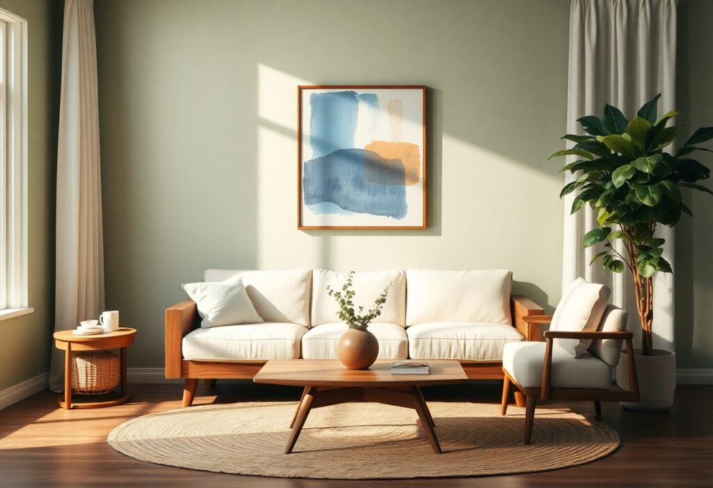
Art shapes how you feel in a room, and I’ve found that the right colors and artwork can transform your space into a calm retreat. I use soft blues and warm neutrals because they have a proven calming effect. When you choose pieces that resonate with you, they do more than decorate-they lower stress. I always recommend avoiding harsh contrasts and overly stimulating hues, as they can disrupt relaxation. Your space should reflect peace, not chaos.
Key Takeaways:
- Soft, cool colors like pale blues, greens, and lavenders help lower stress and create a calming atmosphere in any room.
- Art that reflects peaceful imagery-such as nature scenes or abstract pieces with gentle lines and muted tones-can enhance a space’s sense of tranquility.
- Personal connection matters; choose artwork that resonates with you emotionally to make the space feel truly restful and inviting.
Understanding the Psychology of Calming Colors
Color shapes mood in ways you might not consciously notice. I’ve found that soft blues and gentle greens often slow the breath and quiet the mind. Your walls don’t just reflect style-they influence how you feel moment to moment. Choosing hues aligned with tranquility supports mental clarity and emotional balance, making your space a true retreat.
Selecting cool tones for serenity
Cool tones like misty blue, sage green, and lavender naturally signal calm to your brain. I use these shades in bedrooms and reading nooks where stillness matters most. They lower visual intensity and help you unwind faster, turning ordinary rooms into peaceful escapes.
Utilizing neutrals to reduce visual noise
Neutral colors like warm gray, beige, and soft white act as visual rest zones. I rely on them to create balance when surrounding elements might feel overwhelming. They minimize distraction and let your mind settle, making a room feel spacious and grounded.
When I design a calming space, I treat neutrals as anchors. They don’t compete for attention, allowing texture and light to take center stage. Your eyes aren’t pulled in multiple directions, which reduces subconscious stress. A well-chosen neutral palette can transform a cluttered or chaotic room into a serene, cohesive environment-even without bold accents. I often pair them with natural materials to deepen the sense of quiet.
Identifying Key Factors for Spatial Harmony
I focus on color balance, art placement, and emotional resonance to create calm. Natural light, room purpose, and movement all shape your experience. Perceiving how to use color psychology in interior design helps you align your space with your inner state.
Assessing natural light levels
Light changes how colors and artwork appear throughout the day. I check each room at different times to see where shadows fall and where brightness peaks. You’ll want to choose pigments and frames that respond well to your specific light. Perceiving these shifts ensures your palette stays soothing, not jarring.
Evaluating room functionality and flow
How you use a space defines its ideal mood. A bedroom needs soft tones and gentle imagery, while a home office might benefit from subtle energy. I map how you move through the room and where you pause. Perceiving these patterns helps align design with daily rhythm.
Every room serves a purpose that shapes its emotional tone. I consider how long you stay in the space, who uses it, and what activities happen there. A kitchen open to a living area requires cohesive color transitions and art that supports both nourishment and relaxation. Foot traffic, furniture layout, and even door swings affect how art is seen and how color feels. Matching the room’s function with intentional design choices creates a sense of ease that lasts.
How to Choose Art that Promotes Mindfulness
I look for pieces that invite stillness rather than demand attention. Art that supports mindfulness doesn’t shout-it breathes. You’ll know it when your gaze lingers without effort, when your shoulders drop just a little. The right image becomes a quiet companion, not a distraction.
Selecting minimalist and abstract compositions
Simple shapes and soft gradients often speak louder than detail. I choose minimalist works because they leave room for your thoughts to settle. Too much visual noise disrupts calm-clean lines guide the eye gently. You don’t need to “understand” the piece; you just need to feel at ease within it.
Incorporating nature-inspired imagery
Nature has an innate ability to ground us. I recommend artwork featuring forests, water, or open skies-scenes that mirror the rhythm of breath. These images subtly signal safety to your nervous system. You don’t need literal landscapes; even abstracted natural forms can evoke deep calm.
When I incorporate nature-inspired imagery, I focus on authenticity over decoration. A painting of a quiet forest path or a slow-moving river isn’t just pleasant-it taps into your body’s natural response to serenity. Studies show exposure to natural elements, even in art, can lower heart rate and reduce stress. I suggest choosing pieces that reflect seasons, light, or movement you personally find soothing. Your connection to the image matters more than its style.
Expert Tips for Balancing Color and Decor
I rely on harmony, contrast, and intentional placement to bring balance to a room. A well-layered space uses color and art to guide emotion, not overwhelm it. The
- Choose a dominant color that reflects your desired mood
- Use accent pieces to add depth without clutter
- Match art tone and scale to the room’s purpose
- Let negative space breathe around focal artwork
Applying the 60-30-10 color rule
I apply the 60-30-10 rule to maintain visual flow: 60% dominant hue, 30% secondary color, and 10% accent tone. This ratio keeps your space cohesive while allowing creative expression. The
Creating focal points without overstimulation
I place one bold piece of art where natural sightlines lead, using subtle framing and calm surroundings to highlight it. Too many competing elements fracture attention and disrupt peace. The
When I design a focal point, I prioritize stillness over spectacle. Instead of clustering art or using jarring colors, I select one meaningful piece and let it stand alone against a neutral wall. Soft lighting and consistent frame styles support the artwork without stealing focus. This approach preserves the room’s tranquility while honoring the piece’s emotional weight. The
Techniques for Placing Art for Maximum Impact
I’ve learned that positioning art mindfully transforms how a room feels. You don’t need to fill every wall-sometimes less draws more attention. I always consider sightlines and natural pauses in movement, placing pieces where your eye rests easily. The right placement invites calm, not clutter.
Determining optimal height and scale
Your eye level guides where art belongs. I hang the center of a piece about 57-60 inches from the floor, aligning with average sightlines. A large wall shouldn’t drown a small artwork, and a tiny frame shouldn’t get lost above a wide sofa. Scale matched to space creates balance, making the room feel intentional and peaceful.
Grouping pieces to enhance tranquility
I often cluster artworks in odd numbers, like threes or fives, to create visual rhythm without rigidity. Keeping frames in similar tones or materials unifies the group. Spacing them 2-3 inches apart maintains flow, letting each piece breathe while contributing to a serene whole.
When I group art to enhance tranquility, I focus on theme and tone over symmetry. A collection of soft landscapes or abstract works in muted hues can echo the calming color palette of the room. I avoid overcrowding by stepping back often to assess the emotional impact. The goal isn’t perfection-it’s peace. Your space should feel like a quiet pause, not a gallery checklist.
Practical Steps for a Room Makeover
I begin every transformation by assessing your space’s natural light and existing furnishings. Choosing the right palette sets the tone-soft neutrals and muted tones often create the most calming effect. For more guidance, I recommend checking out this resource on How to Make a Space Feel More Relaxed, which offers simple yet effective tips tailored to real homes.
Testing paint swatches in different lighting
Light changes how color appears throughout the day. I always advise painting large swatches on multiple walls and observing them in morning, noon, and evening light. This reveals the true tone and helps avoid surprises once the final coat is applied.
Curating a cohesive art collection
Your walls should reflect your calm, not add visual noise. I focus on selecting pieces with a unified color story or theme, which brings harmony to the room. The emotional impact of well-chosen art can transform a space from cluttered to serene.
When I curate a collection, I look for consistency in style, frame finish, or subject matter-this creates flow without rigidity. You don’t need matching prints; instead, aim for a quiet connection between pieces. A few meaningful works, thoughtfully arranged, deliver greater peace than a crowded gallery wall ever could.
Summing up
Following this approach, I show you how color and art shape the mood of your space. I guide you to choose tones that calm and images that resonate, creating a room that feels like a quiet pause. Your environment reflects your intention-when you select pieces you connect with, you build a personal retreat that supports peace and clarity every day.