
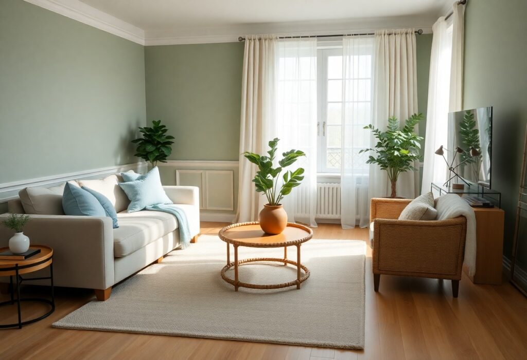
Most people underestimate how deeply color affects mood, but I’ve seen firsthand how the right palette can reduce anxiety and improve focus. I’ll show you which combinations work best for calming your space. You don’t need bold contrasts-soft blues paired with warm neutrals, for example, create a profound sense of peace. Your walls can either add stress or relieve it; I help you choose wisely.
Key Takeaways:
- Soft blues and greens are most effective for reducing stress because they mimic natural environments and promote feelings of calm and relaxation.
- Neutral tones like warm grays, beige, and soft whites create a soothing backdrop that enhances openness and mental clarity without overwhelming the senses.
- Pairing muted colors with natural light and organic materials such as wood or stone strengthens the sense of tranquility in a space.
The Palette of the Forest
I find that nature’s most calming color stories emerge from the forest floor, where muted greens and earthy neutrals blend effortlessly. These tones don’t shout-they settle into your space, lowering your pulse without you even noticing. I’ve seen how this palette transforms chaotic rooms into quiet retreats.
Sage and Soft Stone
Sage wraps you in gentle calm, while soft stone grounds the space with quiet strength. I use this pairing in bedrooms where peaceful sleep matters most. Together, they create a breathable balance-cool enough to relax, warm enough to comfort.
Moss and Bark
Moss brings a rich, damp green that feels alive, while bark adds warm, weathered depth. I rely on this duo when you need emotional stability in your environment. Their natural contrast mimics the forest after rain-familiar, safe, deeply soothing.
When I design with moss and bark, I focus on texture as much as tone. A moss-colored linen curtain paired with a bark-toned wooden headboard doesn’t just look cohesive-it invites touch and slows your breath. This combination works especially well in spaces where you unwind, because it mirrors the sheltering feel of tree cover. I never over-lighten moss-it loses its grounding power-instead, I let it stay deep, but not dark, so it holds warmth without heaviness.
Celestial Harmony
I find that colors inspired by the sky and atmosphere bring a quiet depth to interior spaces. These combinations don’t shout for attention-they settle into the background like a soft breath, helping your mind unwind. When chosen with care, they create a sense of openness and calm that feels both natural and deeply soothing.
Twilight Blue and Silver
You’ll notice how Twilight Blue and Silver mimic the hush between day and night. This pairing introduces a cool, reflective balance-blue grounds the space with serenity, while silver adds a subtle shimmer that never feels harsh. I use this duo in bedrooms to support relaxation without dulling the room’s energy.
Cloud White and Morning Mist
Cloud White and Morning Mist blend so gently that walls seem to dissolve into light. I rely on this combination when you need a space to feel weightless and clear. It’s ideal for small rooms or north-facing spaces where natural brightness is limited, offering a soft lift without starkness.
What makes Cloud White and Morning Mist truly effective is their ability to reflect light evenly, reducing visual strain and creating a sense of spaciousness. I’ve seen this pairing transform cluttered rooms into peaceful retreats simply by softening contrasts. The near-neutral tones allow furniture and textures to stand out, giving you flexibility in design while maintaining a consistently calming atmosphere. This is one of the safest choices for sensitive environments like nurseries or recovery spaces.
Earthly Foundations
I rely on natural pigments to ground a space in calm. Earth tones pull from nature’s palette-soil, stone, and sunbaked clay-and they reduce visual noise that can heighten stress. These colors don’t shout; they settle. You’ll feel their quiet strength in rooms where balance matters most.
Terracotta and Warm Sand
Pairing terracotta with warm sand creates a gentle rhythm, like sunlight moving across a desert floor. I find this combination soothes the nervous system without dulling energy. It’s warm enough to comfort, neutral enough to breathe-perfect for living rooms where you want connection without chaos.
Ochre and Clay
Ochre layered with clay brings depth without heaviness. I use this pairing when you need warmth with restraint. The yellow in ochre lifts mood subtly, while clay keeps it grounded. Together, they create a serene yet inviting atmosphere ideal for spaces meant to restore.
When I work with ochre and clay, I focus on texture as much as tone. A clay-colored wall with a matte finish absorbs light, while an ochre linen throw adds soft contrast. This blend works especially well in bedrooms or reading nooks where emotional warmth matters more than brightness. Avoid cool undertones-they disrupt the harmony. Stick to pigments with a red or brown base, and you’ll maintain the calming effect you’re after.
The Minimalist Sanctuary
I find that simplicity speaks volumes when crafting a stress-free space. Neutral tones paired with clean lines invite calm into your home. For inspiration on how color shapes serenity, I recommend checking out this 7 Soothing Spaces: How to Use Color to Create Calm at … article, which beautifully illustrates the power of restraint in design.
Pure Linen and Dove Grey
You’ll notice how linen’s soft texture blends effortlessly with dove grey’s quiet depth. This combination creates a soothing, breathable atmosphere perfect for bedrooms or reading nooks. I use these tones to soften edges and reduce visual clutter, letting your mind truly rest within your space.
Charcoal and Ivory
Charcoal adds quiet strength while ivory lifts the mood with gentle contrast. I rely on this pairing to ground a room without making it feel heavy. The balance between warmth and depth keeps your environment both inviting and composed.
When I work with charcoal and ivory, I focus on layering textures-think wool throws, matte ceramics, and brushed metals. The charcoal shouldn’t dominate; instead, it frames ivory accents to prevent the space from feeling cold. This contrast, when done right, delivers a profound sense of stability and peace, making it one of my go-to combinations for high-stress homes.
Aquatic Serenity
I find that water-inspired palettes naturally calm the mind, and I often recommend them for spaces meant for relaxation. The subtle movement of aquatic tones mimics gentle waves, helping lower heart rate and ease mental fatigue. You don’t need a view of the ocean to bring this tranquility indoors-just the right blend of cool, watery hues can transform your room into a peaceful retreat.
Deep Teal and Sea Salt
This pairing grounds a room with depth while keeping it light. I love how deep teal adds quiet sophistication, and you’ll notice how sea salt softens the contrast with its airy brightness. Together, they create a balanced tension-one that feels both secure and open, perfect for bedrooms or reading nooks where you want focus without heaviness.
Pale Aqua and Driftwood
I’ve seen this combination turn sterile spaces into warm sanctuaries. Pale aqua breathes freshness, while driftwood brings organic warmth underfoot or on walls. You’ll feel the difference immediately-this duo supports mental clarity and emotional calm without leaning too cold or too dark.
When I design with pale aqua and driftwood, I focus on texture as much as color. The soft sheen of matte aqua walls paired with the grain of light brown driftwood flooring or furniture adds dimension without stimulation. You can enhance the effect with linen textiles and woven accents, making the space feel grounded and breathable. This is one of the few palettes that remains soothing even in low light, making it ideal for any room where you seek long-lasting serenity.
Botanical Whispers
I find that soft, nature-inspired palettes invite quiet moments into your space. For deeper insight, I recommend checking out this discussion on What paint colors can create a calm vibe in a living room?-real homeowners share their soothing choices. These combinations don’t just look peaceful; they help your mind unwind.
Lavender and Fern
Lavender brings a gentle hush to your walls, while fern green grounds the space with earthy depth. I’ve seen this pairing slow the pulse of busy living rooms. The soft purple and muted green harmony mimics early morning gardens, making your room feel like a quiet retreat.
Mint and Honey
Mint adds a breath of fresh air, and honey warms it with golden serenity. I use this blend when you want brightness without stimulation. The cool mint balances the rich honey tone, creating a space where your thoughts can settle and breathe.
When I design with mint and honey, I focus on balance-too much mint can feel clinical, but honey softens it beautifully. I apply mint on upper walls or accents to lift the eye, while honey appears in baseboards or upholstery to anchor the room. The combination supports mental clarity and emotional warmth, making it ideal for living areas where you gather and decompress.
Final Words
Considering all points, I’ve found that soft blues, warm greens, and neutral earth tones work best in your space to reduce stress. I recommend using these colors in your walls, furniture, or decor to create calm. You don’t need bold contrasts-subtle, harmonious combinations support relaxation naturally. I trust you’ll feel the difference.