
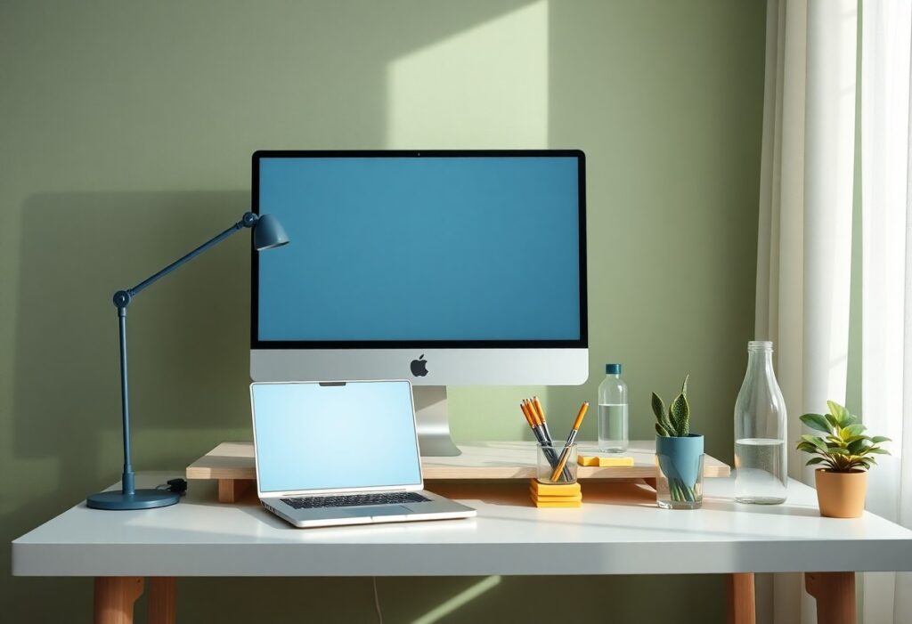
Focus begins with what you see. I’ve found that specific color choices directly impact your concentration and mental clarity. You don’t need bright, stimulating hues to stay alert-cool tones like soft blue or muted green often enhance focus more effectively. I use these insights daily to design environments that support sustained attention and reduce mental fatigue.
Key Takeaways:
- Blue tones, especially soft or muted shades, are linked to improved concentration and mental calm, making them effective choices for workspaces and study environments.
- Overly bright or saturated colors like intense reds and oranges can increase alertness but may also trigger distraction or mental fatigue over time, reducing clarity.
- Neutral backgrounds with strategic pops of color-such as green or earth tones-support sustained focus by balancing visual stimulation without overwhelming the mind.
The Neurological Canvas
How Your Brain Responds to Hue
I’ve watched clients transform their workspaces with just a single paint choice. Blue walls consistently boost concentration, calming the nervous system without dulling alertness. You don’t need bold accents to feel the effect-subtle tones can shape your mental state just as powerfully. When you surround yourself with the right color, mental clarity becomes effortless, almost automatic.
The Blue Spectrum of Concentration
I’ve found that cooler shades of blue-especially those leaning toward the 470-490 nanometer range-can sharpen focus and reduce mental fatigue. You don’t need bright or saturated tones; soft, muted blues in your workspace create a calm yet alert state. I use a pale sky-blue lamp in my study, and you may notice how it keeps distractions at bay without dulling energy. This subtle shift in your environment can quiet mental noise and support sustained attention.
Verdant Environments for Mental Restoration
I’ve found that surrounding yourself with green-especially in natural settings-can dramatically reset your mental clarity. This hue, abundant in forests and gardens, eases cognitive fatigue and supports quiet focus. I often recommend stepping into a park or adding indoor plants to your workspace. For deeper insight, I explore how color shapes well-being in Color Psychology & Wellness: The Healing Power of Color, where green’s restorative rhythm takes center stage.
High-Alert Palettes for Precision
I rely on sharp, high-alert color combinations when precision matters most. Bright reds paired with crisp whites trigger mental alertness and reduce errors in detail-heavy tasks. You’ll find these palettes effective for short bursts of intense focus. Learn how to apply these insights with practical examples at How to Use Color Psychology to Improve Focus and ….
The Minimalism of Neutrality
I’ve found that neutral tones like beige, soft gray, or warm white create a quiet backdrop for your mind. These colors don’t demand attention, allowing mental clarity to emerge naturally. You’re less likely to feel overwhelmed when your environment avoids visual noise. I use neutrality not as emptiness, but as a form of visual rest-giving your focus space to settle and deepen without distraction.
Practical Application in Personal Spaces
I choose soft blues and muted greens for my home office because they create a calm atmosphere that supports sustained attention. You’ll find your focus sharpens when surrounding yourself with colors that reduce visual stress. I avoid bright reds and neon tones in reading nooks-they may boost energy, but they also increase mental fatigue over time. When you design with intention, even small changes like repainting a wall can make a measurable difference in clarity and concentration.
Summing up
Summing up, I’ve found that your color choices directly influence your focus and mental clarity. I use soft blues and greens in my workspace because they calm the mind without dulling alertness. You don’t need bright or bold hues to stay sharp-subtle, cool tones often work better. I adjust lighting alongside color to reduce glare and eye strain, helping you maintain concentration longer.