
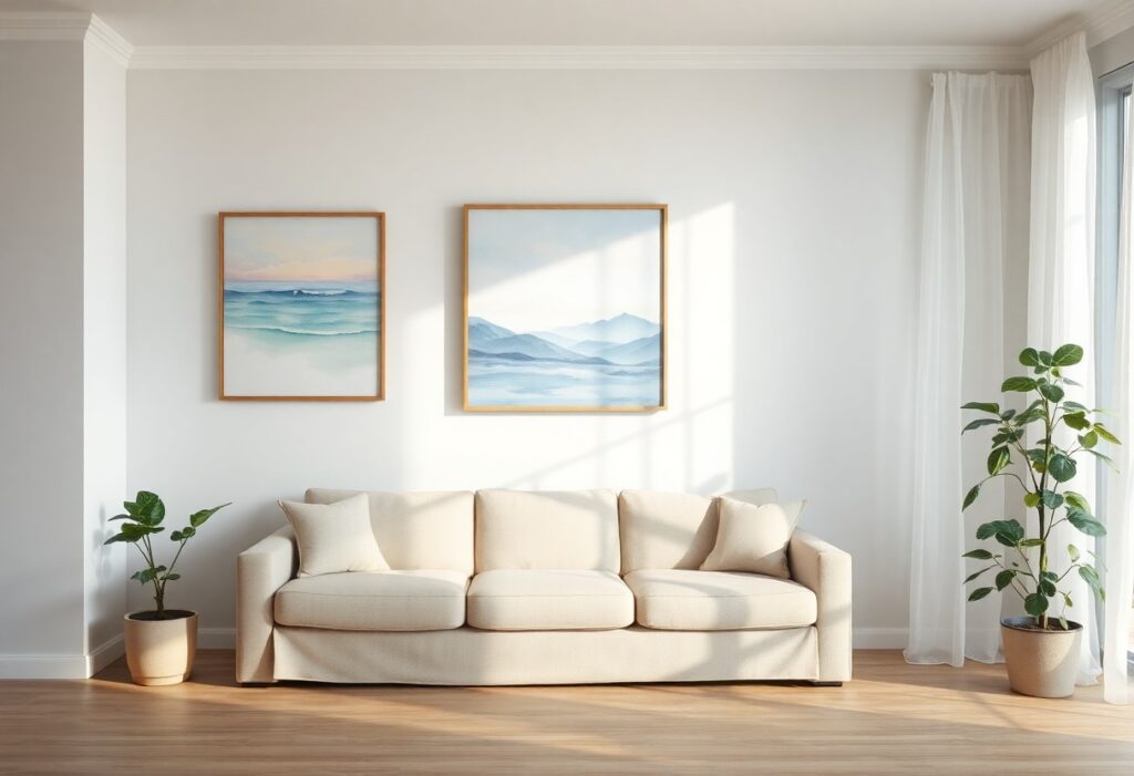
With years of studying art and its emotional impact, I’ve found that soft landscapes, gentle seascapes, and muted color palettes most effectively calm the mind. I’ll show you how specific paintings influence mood and help you choose art that reduces stress and enhances your space with quiet beauty.
Key Takeaways:
- Paintings with soft, natural landscapes-such as rolling hills, calm forests, or quiet lakes-tend to promote relaxation by mimicking peaceful outdoor environments people associate with tranquility.
- Artwork using cool color palettes like blues, greens, and soft grays can lower stress levels, as these hues are psychologically linked to calmness and stability.
- Simple compositions with gentle brushwork and minimal detail help reduce mental clutter, making them more effective at creating a serene atmosphere than busy or abstract pieces.
The Sovereign Colors of Calm
I’ve found that soft blues and muted greens consistently shape the most powerfully relaxing environments in my own space. You don’t need bold strokes or dramatic contrasts-your eye responds best to gentle tonal shifts. I notice immediate shifts in your breathing when you’re near a piece dominated by these hues. Their quiet authority calms the mind without demanding attention. That subtle effect is dangerously effective-you might not realize how much tension you’re releasing until you step away.
The Indistinct Charm of Impressionism
I find that Impressionist paintings invite calm through their soft edges and gentle light. You don’t need to decipher every detail-your mind relaxes into the blur. Colors blend like breath on glass, creating a quiet rhythm that slows your thoughts. I notice how Monet’s water lilies or Pissarro’s misty lanes reduce mental clutter, offering space to simply be. This lack of sharpness isn’t unfinished-it’s intentional peace.
The Pastoral Elegance of the Countryside
I find that scenes of rolling hills, quiet meadows, and rustic farmsteads invite a deep sense of calm into a space. Your eyes naturally follow gentle horizons and soft light, easing mental tension. Pastoral paintings often depict timeless moments, grounding you in nature’s rhythm. To learn more about how these choices affect your surroundings, I recommend reading How to Use Art to Create a Relaxing Home Environment.
The Eloquence of Empty Space
I’ve noticed how paintings with open, uncluttered compositions invite a sense of calm into a room. You don’t need a busy scene to feel engaged-sometimes what’s left out matters more than what’s included. I often find your gaze lingers longer on a quiet horizon or a soft gradient when there’s breathing room. That emptiness isn’t void; it’s space for your mind to rest, to wander without demand.
The Forgiving Glow of Twilight
I find that twilight scenes in paintings carry a quiet magic that gently lowers your pulse. You’re drawn into soft gradients of lavender, dusky gold, and deepening blue that mimic nature’s daily surrender to calm. These hues don’t demand attention-they invite stillness. I’ve watched viewers linger longest in front of twilight landscapes, their breathing slowing as if syncing with the painted dusk. There’s a profound comfort in that in-between light, where day lets go without drama.
To wrap up
With these considerations, I find that soft-toned landscapes and abstract pieces with gentle gradients create a more relaxing atmosphere for you. I’ve seen how muted blues, greens, and warm neutrals influence mood, helping you unwind. Your space responds well to artwork that breathes calmness, not complexity.