
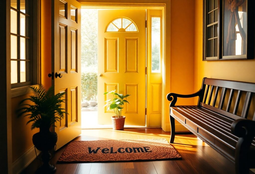
Many homeowners overlook how color directly shapes a guest’s first impression. I’ve studied color psychology in interior spaces for years, and I can tell you that warm neutrals like beige and soft terracotta consistently make people feel most at ease. You don’t need bold hues to create warmth-your walls can welcome quietly, yet powerfully.
Key Takeaways:
- Warm neutrals like beige, cream, and soft gray create a calm and inviting atmosphere, making guests feel immediately at ease upon entering a space.
- Accents of blue or green can enhance a sense of hospitality, as these colors are linked to tranquility and nature, promoting relaxation and comfort.
- Personal touches in color choices-such as a favorite hue used in throw pillows or artwork-add authenticity and warmth, helping guests feel welcomed on a human level.
The Sunny Impertinence of Yellow
I’ve always noticed how yellow dares to be cheerful without permission. It doesn’t whisper warmth-it announces it, boldly. In guest spaces, this brightness can feel like an instant smile, though too much risks overwhelming. I’ve learned balance is key: just enough yellow to uplift, never dominate.
Golden Greetings
Gold-tinged yellows invite guests with a quiet luxury. I use them near entryways because they catch the light like a silent welcome. You don’t need bold strokes-just a hint on a vase or trim can make someone feel instantly honored in your space.
Buttercream Hospitality
Soft and subtly warm, buttercream yellow wraps your guest in calm. I find it works beautifully on walls where natural light shifts throughout the day. It’s not loud, but its presence is consistently comforting, like a well-timed cup of tea.
Buttercream Hospitality goes beyond paint. I’ve layered it through linen cushions, ceramic trays, and even framed art with warm undertones. What makes it special is how it pairs with wood tones and soft whites, creating a space that feels both inviting and grounded. You’re not just decorating-you’re offering a mood, one that says, “Stay awhile.”
The Earthy Sincerity of Terracotta
I see terracotta as a quiet invitation, a color that doesn’t shout but warmly whispers welcome. Its grounded warmth feels familiar, like sun-baked soil or an old friend’s kitchen. You don’t need to explain why it feels right-your body senses the comfort before your mind catches up.
Rustic Embraces
Texture defines this tone-rough plaster, hand-thrown pottery, unvarnished wood. I feel at ease in spaces where imperfection is celebrated, where walls breathe and floors creak with honesty. These raw surfaces don’t hide life; they invite it in, making every guest feel like part of the home’s story.
Clay and Comfort
Color drawn from actual earth carries a quiet integrity. I notice how clay-based pigments absorb light, softening harsh edges and diffusing tension. You’re not just seeing a shade-you’re sensing a material with history, one that grounds a room in authenticity and warmth.
When I use clay finishes on walls or floors, I’m not just choosing a hue-I’m introducing a tactile experience. Natural clay plasters regulate humidity and temperature, meaning your space feels physically more comfortable, not just visually pleasing. The subtle variations in tone, the faint mottling from hand application-these aren’t flaws, but signs of life. This material connects you to ancient building traditions, where homes were made from what the land provided, and every surface carried the imprint of human care. That kind of honesty makes people exhale, settle in, and feel, without knowing why, that they belong.
The Pastoral Fiction of Sage Green
I’ve found that sage green carries a quiet promise of calm, like an open window in a sunlit kitchen. It doesn’t shout for attention-instead, it invites you in with soft assurance, mimicking the hush of leaves in a breeze. This color feels lived-in, even when new, as if it already holds memories.
Botanical Welcomes
You’ll notice how sage mirrors the first shoots of spring, offering a sense of renewal. Its natural roots make guests feel immediately at ease, as though they’ve stepped into a garden rather than a room. I always recommend it near entryways or breakfast nooks.
Verdant Peace
I see verdant peace not just as a mood, but as a design outcome. Sage green walls absorb harsh light and soften edges, creating a space where tension dissolves without effort. It’s the shade that makes you exhale without realizing you were holding your breath.
Verdant Peace goes beyond mere aesthetics-it shapes how people experience your home. I’ve watched guests relax within seconds of entering a sage-painted living room, their shoulders dropping, voices lowering. The color’s gray undertones prevent it from feeling too bright or stimulating, while its hint of yellow-green echoes growth and quiet optimism. When paired with natural wood and linen, it becomes a backdrop for connection, not distraction. This is the power of choosing right: a color that doesn’t just look good, but acts as a silent host, making every arrival feel gentle and right.
The Aristocratic Silence of Navy
I find navy exudes a quiet confidence that welcomes guests without shouting for attention. It’s a sophisticated backdrop that feels both timeless and intimate. For more inspiration, explore these 5 Welcoming Color Schemes That Will Energize Your Home, where deep tones are balanced with warmth to create truly inviting spaces.
Deep Sea Entrances
Color can shape first impressions, and I’ve seen navy transform entryways into stately yet warm gateways. When paired with brass or warm wood tones, it creates a striking first impression that feels secure and elegant. You don’t need bright hues to signal welcome-depth and contrast can do it more memorably.
Midnight Calm
There’s something grounding about using navy in living rooms or bedrooms, where I aim for serenity. This shade absorbs light in a way that promotes relaxation, making your space feel like a private retreat. The emotional comfort it offers is unmatched by bolder or lighter alternatives.
I’ve come to appreciate how Midnight Calm works beyond aesthetics-it influences mood and behavior. Navy lowers visual noise, helping you unwind faster after a long day. When I use it on accent walls or in textiles, the room feels more contained and secure. The psychological depth of this hue makes it not just stylish, but functionally soothing for everyday living.
The Virtuous Boredom of White
I see white not as empty, but as a quiet promise-offering your guests a blank slate where they can breathe and belong. It’s deceptively powerful, this calm neutrality, making even the smallest room feel open and intentional. For more ideas on creating warmth within simplicity, check out this guide to Inviting Paint Colors for Your Guest Room – Mobile.
Pristine Arrivals
White greets you like a fresh sheet of paper-clean, unhurried, and full of potential. I find that this shade sets a tone of immediate comfort, signaling to your guest that this space was prepared with care and clarity.
Alabaster Simplicity
Alabaster reflects light in a way that feels soft, not sterile. I use it when I want warmth without distraction, giving your guest room a serene foundation that welcomes rest and ease.
Alabaster isn’t just a color-it’s a mood. I’ve watched how its subtle warmth transforms a room, making walls feel like they’re gently embracing the space. Unlike stark whites, alabaster carries a whisper of cream that prevents coldness, ensuring your guest feels instantly at home without even knowing why.
The Charity of Soft Lighting
I’ve learned that soft lighting gives a room its soul. You don’t need bright beams to make people feel at home-gentle glows do more. Warm-toned bulbs cast a quiet kindness, wrapping guests in comfort the moment they step inside.
Illumination Secrets
Lighting should never announce itself. I place lamps where they blend into the background, offering just enough glow to guide your eyes without strain. The best illumination feels accidental, like sunlight caught in a corner long after dusk.
Shadow Play
Shadows aren’t flaws-they’re part of the mood. I let them gather softly behind furniture or along walls, creating depth that feels intentional yet effortless. These quiet darks make a space feel lived-in and safe, not staged.
When I design a room, I treat shadows like silent companions. They add texture and intimacy, drawing your gaze downward to a book on the side table or the curve of a ceramic vase. Too much light erases personality; I prefer the subtle drama of dimness, where you’re invited to lean in, relax, and stay a while.
Final Words
Considering all points, I find warm neutrals like beige and soft gray most welcoming for your guests. I see them as subtle backdrops that make people feel at ease without overwhelming your space. You don’t need bold statements to create warmth-sometimes, the quietest tones speak the loudest.