
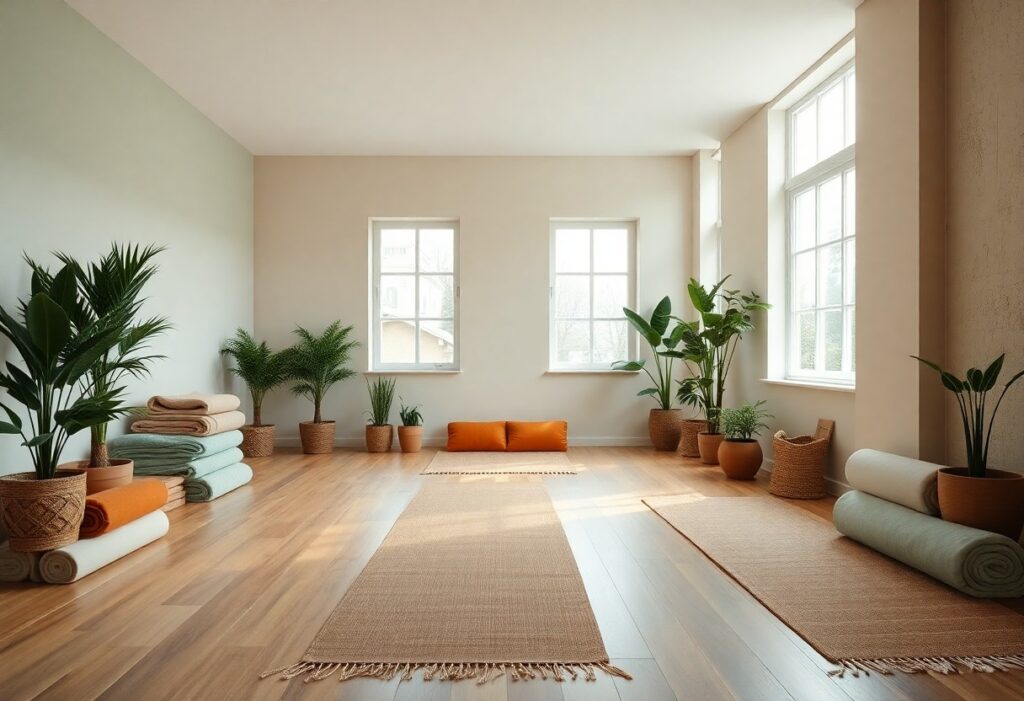
Most people don’t realize how deeply color influences mood and breath, yet I’ve seen how a single shade can shift the energy of a room from restless to profoundly calming. When you step into a wellness space, your nervous system responds before your mind does, making your color choices more than aesthetic-they’re physiological. I’ve watched clients linger longer, breathe deeper, and return more often when the palette supports stillness. This is not about trends, but about creating environments where healing feels natural.
Key Takeaways:
- Soft, neutral tones like warm beige, pale gray, and muted ivory create a grounding backdrop that supports mental clarity and physical relaxation, making them ideal for walls and large surfaces in yoga studios.
- Earthy greens and soft blues-inspired by forest canopies and still water-have been observed to reduce perceived stress levels, with one wellness center in Portland reporting increased client retention after repainting in sage and misty aqua tones.
- Natural materials such as unvarnished wood, stone, and linen contribute as much to the sensory experience as color itself, where the grain of a wooden floor or the texture of a plaster wall can deepen the sense of connection to the environment.
The Pale Canvas of Peace
I often recommend soft whites and muted greys as foundational tones because they create a sense of openness and mental clarity. These shades reflect light gently, making small studios feel larger and more inviting. You might notice how a space painted in warm ivory feels calmer than one with stark, cool white, which can appear sterile. A mid-sized SaaS firm redesigned its meditation lounge using a linen-white finish and reported increased employee usage, proving the subtle power of a well-chosen neutral. Your walls don’t need to speak loudly to hold presence.
Verdant Earth and Forest Deep
I find that deep greens rooted in forest and foliage bring a grounded stillness to wellness spaces, mimicking the natural world’s ability to restore balance. You don’t need live plants to achieve this effect-painting an accent wall in a shade like pine or moss can significantly deepen the sense of immersion. One studio I consulted for switched from neutral gray to a rich earth green and reported clients felt more relaxed and present during sessions. The color works best when paired with natural wood tones, enhancing its organic authenticity without overwhelming the room.
The Warmth of Sunlit Clay
I find that sunlit clay tones bring a grounded, nurturing presence to wellness spaces, mimicking the soft glow of earth warmed by early light. These hues, often leaning into terracotta, warm beige, and muted rose, promote comfort without overwhelming the senses. You don’t need bold accents when walls breathe like desert stone at dawn. For curated inspiration, I recommend exploring 7 Colors to Promote Health & Wellness by Well-Designed, a palette that thoughtfully includes clay-based shades ideal for yoga studios seeking warmth with restraint.
Ocean Shadows and River Stones
I find that deep slate blues and muted riverbed grays bring a grounded stillness to yoga spaces, mimicking the quiet beneath forest canopies or along shaded coastlines. These tones don’t just calm-they anchor, helping practitioners feel supported during restorative poses. When I pair them with organic textures like unpolished stone or weathered wood, the effect deepens, echoing the natural world’s quiet strength. For insight into how these choices shape experience, I recommend Design Meets Wellness: Yoga Studio Design, where color and intention align seamlessly.
The Influence of Natural Light
I’ve observed that natural light transforms how color behaves in a wellness space, shifting hues throughout the day in subtle but powerful ways. Morning light enhances cool tones like soft blues and greens, making them feel refreshing and awake, while afternoon sun warms earthy neutrals, deepening their grounding effect. You’ll want to test paint samples at different times, watching how your chosen palette responds when sunlight floods the room or retreats into shadow. A studio with large east-facing windows, for instance, may benefit from slightly cooler base tones to balance the golden morning glow.
Texture and the Raw Surface
I notice how often smooth, polished finishes dominate wellness spaces, but I’ve found that raw, tactile surfaces deepen the sensory experience in subtle yet powerful ways. Your hand brushing against unfinished plaster or reclaimed wood triggers a primal sense of grounding that color alone can’t achieve. I recommend pairing earth-toned palettes with materials like hand-troweled clay walls, linen drapes, or stone floors-surfaces that age with grace and carry the imperfections of natural origin. A mid-sized yoga studio in Portland replaced its synthetic flooring with troweled hempcrete and reported clients describing the space as “quieter,” even before class began. These textures don’t just look natural-they feel like time slowing down.
Conclusion
I choose soft, natural hues in yoga studios because they support the emotional and physical experience you’re trying to create. I’ve seen how pale sage, warm terracotta, and muted greys can quiet a room, allowing breath and movement to take focus. Your space doesn’t need bold statements-just quiet intention, reflected in every surface and shade.