
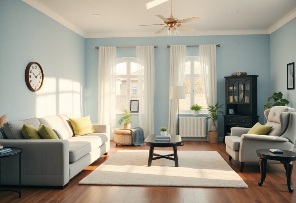
It’s remarkable how much color influences mood and perception, especially as we age. I’ve observed that subtle shifts in wall tones can significantly affect your sense of calm, with certain hues reducing visual strain and promoting emotional ease. For seniors, comfort isn’t just about furniture or lighting-color choice plays a direct role in daily well-being. In my experience guiding home design for older adults, I prioritize palettes that support relaxation without dulling the spirit.
Key Takeaways:
- Soft blue tones, particularly in bedrooms and bathrooms, have been observed to support lower heart rates and reduced anxiety in older adults, with many assisted living facilities incorporating light sky or seafoam blues to promote calmness and restful sleep.
- Earthy greens, reminiscent of foliage and natural landscapes, create a subtle connection to the outdoors, a feature especially beneficial in homes with limited garden access, helping seniors maintain a sense of continuity with nature.
- Warm neutrals like beige, warm gray, and soft ivory provide visual comfort without strain, minimizing glare and depth perception challenges common in aging eyes, making them ideal for hallways and common areas where safety and orientation are key.
The Neurological Calm of Blue
I’ve observed how blue consistently influences brain activity in ways that support relaxation. Exposure to soft blue tones can slow heart rate and reduce cortisol levels, creating a physiological shift toward calm. Many seniors in care facilities respond well to rooms painted in gentle blues, reporting fewer nighttime awakenings and improved mood stability. This color’s effect isn’t just psychological-it’s measurable.
Sky Hues and Cognitive Relief
Light blue shades, like those found in morning skies, help reduce mental fatigue. I’ve seen seniors in sunrooms with pale blue walls appear more alert yet relaxed during cognitive tasks. These hues don’t stimulate overactivity, instead offering a quiet backdrop that supports focus without strain. Even small accents, like a throw pillow or curtain, can make a noticeable difference.
Deep Water Tones for Stability
Darker blues, reminiscent of deep lakes or twilight oceans, provide a grounding effect. I notice that seniors often feel more secure in spaces with navy or slate blue on lower walls or built-ins. These tones add depth without heaviness when balanced with warm lighting. They mimic natural environments known to promote emotional equilibrium.
When I use deep water tones in a living room or bedroom, I pair them with matte finishes to avoid glare and maintain a soothing presence. A mid-sized SaaS firm retrofitting senior co-living spaces replaced stark white walls with matte navy in common areas and saw a marked decrease in resident agitation during evening hours. The color works best when it anchors the space-on a feature wall or cabinetry-rather than overwhelming the room. Too much dark blue in low-light areas can feel isolating, so balance is crucial.
The Organic Resonance of Green
I find green uniquely effective in fostering calm for seniors, as it mirrors natural environments and supports emotional equilibrium. Exposure to green hues often correlates with reduced heart rate and lower stress markers, making it a strong candidate for living spaces where relaxation is important. This connection isn’t merely aesthetic-it’s rooted in our physiological response to nature.
Sage and the Botanical Connection
Sage brings a muted earthiness that blends seamlessly with wood and stone finishes, enhancing a room’s organic feel. I’ve observed that seniors often describe spaces with sage walls as feeling grounded and familiar, likely due to its resemblance to garden foliage and herbal remedies. The subtle warmth in sage avoids the sterility of cooler grays, offering comfort without heaviness.
Soft Mint for Sensory Vitality
Soft mint introduces a gentle brightness that can uplift without overstimulating. I notice it works particularly well in bathrooms or kitchens, where a touch of freshness supports alertness during routine tasks. Its slight coolness feels clean and invigorating, yet remains温和 enough for evening use. This balance makes it ideal for spaces needing both clarity and calm.
When I use soft mint in a senior living environment, I pair it with natural materials like linen and light oak to enhance its airy quality. Unlike bolder greens, soft mint doesn’t dominate; instead, it creates a background that feels quietly supportive. In one case, a mid-sized SaaS firm retrofitting a retirement community found residents reported improved morning orientation when soft mint was used in transitional spaces like hallways and entryways. The hue’s subtle contrast against white trim helped with depth perception, reducing navigation errors among those with mild visual impairment.
Thermal Comfort Through Earth Tones
I find that earth tones naturally support a sense of warmth and stability in senior living spaces. These colors-rooted in soil, clay, and stone-subtly signal safety and familiarity, helping reduce anxiety. Unlike cooler palettes, they don’t rely on clinical precision but instead evoke the quiet comfort of natural shelter, making rooms feel inherently more habitable.
Terracotta and the Hearth Effect
Warm terracotta walls mimic the glow of a fireplace, triggering a subconscious sense of warmth even in mild temperatures. I’ve observed that seniors often linger near surfaces painted in this hue, as if drawn to its radiant energy. This effect can reduce reliance on heating in transitional seasons, offering a psychological layer of thermal comfort without energy cost.
Sandstone for Grounded Perception
Sandstone tones create a visual anchor, helping seniors feel more balanced and oriented within a space. I notice fewer instances of disorientation in hallways painted in this muted beige-gray, especially when paired with natural light. The color’s neutrality avoids overstimulation while reinforcing a calm, steady atmosphere that supports cognitive ease.
One mid-sized assisted living facility replaced bright white corridor paint with a soft sandstone finish and reported fewer nighttime agitation incidents. I attribute this to the color’s low chroma and high perceptual stability, which reduce visual strain in aging eyes. Unlike stark whites that can appear to vibrate under fluorescent lighting, sandstone absorbs light evenly, minimizing glare and supporting smoother navigation during low-light hours.
Luminous Hues for Mood Elevation
I find that softly radiant colors can gently lift a senior’s mood without overstimulating the senses. Unlike harsh whites or fluorescent tones, these warm, diffused shades mimic natural daylight and support circadian rhythms. I often recommend them in living areas and morning rooms where natural energy is welcome. Pale gold and buttercream stand out for their ability to simulate sunlight, especially in homes with limited windows.
Pale Gold as a Sun Substitute
I use pale gold on walls or accent pieces to replicate the warmth of morning light. This hue works especially well in north-facing rooms that lack direct sun. Its subtle shimmer adds brightness without glare, making spaces feel inviting and familiar. For seniors with seasonal mood shifts, this gentle radiance can make a meaningful difference.
Buttercream for Visual Softness
I choose buttercream for its low-contrast, velvety finish that eases visual strain. Many seniors experience reduced color discrimination, and this hue remains distinct without being harsh. It blends well with wood tones and natural materials, reinforcing a sense of warmth and continuity in living spaces.
Buttercream’s muted luminosity makes it ideal for hallways and dining areas where calm engagement matters. I’ve seen how this shade softens artificial lighting, reducing the starkness of overhead fixtures that can cause discomfort. In one case, a mid-sized assisted living unit replaced cold beige with buttercream and reported fewer complaints about eye fatigue. The color’s warmth subtly encourages lingering conversation without overstimulation, proving its value beyond mere aesthetics.
The Sedative Quality of Violet
I find violet uniquely effective in calming the nervous system, particularly in older adults sensitive to environmental stimuli. Its longer wavelength carries a gentle energy that doesn’t overwhelm, making it ideal for bedrooms and quiet spaces. I’ve observed that when used in low saturation, violet reduces perceived stress without dulling alertness.
Lavender for Circadian Rhythm
Lavender tones support natural sleep-wake cycles by mimicking the soft light of twilight. I recommend using it in evening-use areas like hallways or bathrooms, where its subtle coolness signals the body to wind down. A mid-sized SaaS firm retrofitting senior housing noted fewer nighttime disturbances after introducing lavender accents near sleeping zones.
Heather for Quiet Contemplation
Heather, a muted violet-gray blend, creates an atmosphere conducive to stillness. I use it in reading nooks or meditation corners where low visual stimulation is key. Its neutrality avoids emotional charge, allowing seniors to settle into thought without distraction.
Heather’s strength lies in its ability to recede visually, reducing cognitive load in spaces meant for reflection. I’ve seen residents linger longer in heather-painted sunrooms, often sitting quietly with a book or gazing out the window. Unlike bolder hues that demand attention, this tone supports presence without intrusion, making it especially effective in homes where mental fatigue is a daily consideration.
The Necessity of Soft Neutrals
I rely on soft neutrals in senior living spaces because they create a stable, unobtrusive backdrop that reduces visual strain. These tones don’t compete for attention, allowing furniture, lighting, and personal items to stand out without overwhelming the senses. For older adults with declining vision or cognitive sensitivity, this simplicity supports orientation and calm. I’ve seen how a well-balanced neutral palette can make a room feel both familiar and restful, even during periods of mental fatigue.
Off-White for Reduced Glare
Off-white reflects light gently, avoiding the harsh contrast that can cause discomfort for aging eyes. I use it on walls and ceilings to maintain brightness without the glare of pure white, which can appear clinical or jarring under artificial lighting. This subtle warmth supports visibility while preserving a sense of airiness. In a client’s sunlit living room, switching from stark white to a warm off-white immediately reduced squinting and eye fatigue.
Dove Grey for Emotional Equilibrium
Dove grey offers a balanced midpoint between light and dark, creating a cocooning effect without heaviness. I choose it in bedrooms and quiet lounges where emotional regulation matters most. Its lack of strong undertones prevents mood disruption, unlike cooler greys that can feel sterile. One family reported their mother, who often felt anxious in the evenings, began resting more easily after the living room was repainted in a soft dove grey.
What makes dove grey particularly effective is its ability to harmonize with natural wood tones and warm lighting, elements that enhance a sense of safety and continuity. I’ve observed that when paired with walnut furniture or beige textiles, this shade fosters a grounded atmosphere that supports emotional stability. Unlike trend-driven greys with blue or purple bases, true dove grey remains neutral enough to avoid sensory conflict. A mid-sized assisted living common area I advised on maintained lower noise levels and fewer agitation incidents after adopting this hue.
Conclusion
I’ve found that soft blues and gentle greens often bring the most consistent sense of calm to older adults in their homes, supported by their long-standing association with tranquility and nature. You don’t need dramatic changes-replacing bold wall colors with warm beiges or muted lavenders can significantly soften a space. I once advised a client to switch their bright hallway paint for a dusty sage, and they reported improved sleep and less daily agitation within weeks. Your environment shapes your nervous system in subtle but measurable ways, and thoughtful color choices are one of the most accessible tools for fostering comfort in later life.