
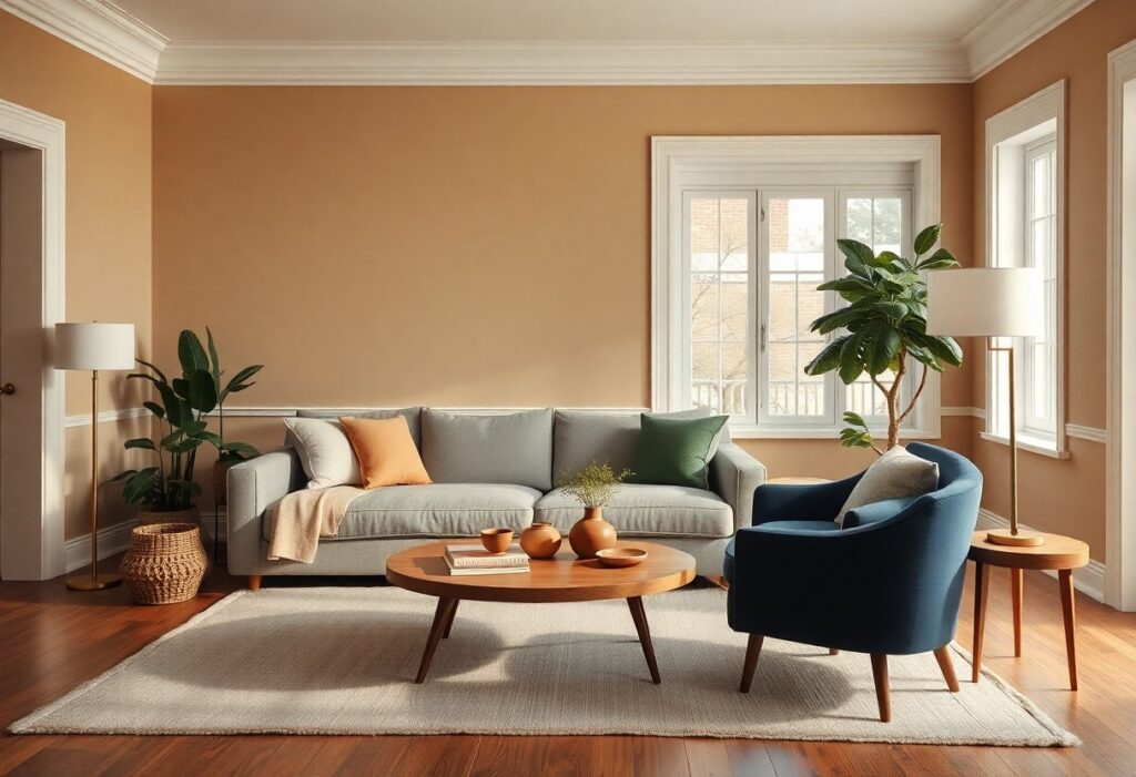
Most interiors that feel both beautiful and comfortable over time rely less on passing fads and more on a quiet confidence in color choice, and I’ve found that certain hues consistently deliver this balance. You don’t need to chase every seasonal trend to create a space that feels fresh-white, midnight blue, terracotta, sage green, charcoal grey, and soft beige form the backbone of enduring design. These colors adapt to changing textures, furniture styles, and natural light, making them the most reliable choices for your home’s long-term comfort and appeal.
Key Takeaways:
- White remains a foundational choice in interior design, not for its neutrality alone, but for its ability to amplify natural light and create a sense of spatial openness, particularly in compact urban apartments where every square foot counts.
- Midnight blue introduces a quiet sophistication when applied to cabinetry or accent walls, offering a deeper alternative to black that retains warmth and works well with both brass finishes and matte wood tones.
- Earthy tones like terracotta and sage green connect interiors to the natural environment, with terracotta lending warmth to stone floors and sage green providing a calming presence in bedrooms and reading nooks.
The Supremacy of White
I see white not as an absence of color but as a presence of possibility, a canvas that absorbs light and mood equally. Its enduring appeal lies in adaptability, allowing textures and forms to take center stage without competition. A white room feels open, uncluttered, and intentional, especially when layered with natural materials. This neutrality is not passive-it actively shapes how we experience space.
Pristine Gallery Walls
I often recommend white for gallery walls because it creates a museum-like clarity, letting artwork become the sole focus. The absence of competing hues ensures each frame, photograph, or painting reads with precision. Even in homes with bold furnishings, a white wall acts as a reset point for the eye.
Soft Linen Nuances
I notice how white bed linens in a bedroom suggest both luxury and ease, their brightness signaling freshness and care. The color promotes a sense of order, making the space feel instantly composed. Even slight variations in undertone-cool, warm, or creamy-add subtle depth without sacrificing calm.
When I choose linen in off-white shades, I prioritize tactile contrast: a nubby throw over a smooth duvet, or raw-edged pillowcases beside polished sheets. These variations in texture keep the palette from feeling sterile. Natural light reveals the fabric’s weave, adding warmth that pure bright white sometimes lacks. A bedroom dressed in these tones feels both curated and lived-in, never clinical.
The Depth of Midnight Blue
I find midnight blue brings a profound sense of calm and sophistication to interiors, working seamlessly across styles from coastal cottages to urban lofts. This is everything you need to know about choosing timeless paint colors that balance drama with comfort, and midnight blue consistently delivers.
Velvet Night Skies
Color choices like deep navy mimic the soft richness of a twilight sky, adding dimension without overwhelming smaller rooms. I’ve seen this hue transform bedrooms into restful sanctuaries, especially when paired with warm wood tones and linen textures that soften its intensity.
Naval Authority in Decor
Naval-inspired spaces often use midnight blue to convey structured elegance and quiet confidence. I notice it frequently in studies and entryways, where its grounding effect creates a sense of arrival and order without feeling cold or impersonal.
One project involved a heritage townhouse where I applied a matte midnight blue to built-in bookshelves and trim. The color absorbed ambient light beautifully, reducing glare while enhancing the warmth of aged paper and leather bindings. Unlike trend-driven shades, this tone aged gracefully, maintaining its timeless resonance even as furnishings evolved over years.
Earthy Terracotta Foundations
I anchor many of my designs with terracotta because its warmth feels both ancient and current, a hue that ages gracefully across decades. This grounded tone pairs effortlessly with natural materials and complements Interior Color Trends That Stand the Test of Time, proving that authenticity in pigment often outlasts fleeting fads.
Clay and Hearth
Clay and hearth tones bring tactile depth to a room, evoking the raw finish of sun-baked pottery. I use these matte, mineral-rich shades near fireplaces or kitchen nooks where human warmth and material honesty should feel most present, reinforcing a home’s emotional core.
Mediterranean Warmth
Mediterranean warmth emerges in walls washed with sun-bleached terracotta, a choice I’ve seen transform cold spaces into inviting sanctuaries. These hues thrive in homes flooded with natural light, where the interplay of shadow and pigment deepens the sense of place.
On a recent project in a coastal hillside home, I specified a hand-troweled terracotta plaster that shifted in tone from dawn to dusk, mimicking the region’s native soil. Unlike synthetic paints, these natural finishes develop a subtle patina over time, with slight variations in texture and color that celebrate age rather than conceal it. I find this quality especially powerful in living areas, where daily life imprints meaning onto surfaces.
Sage Green Serenity
I find sage green consistently reemerges in homes not because it’s trendy, but because it calms the eye without dulling a space. Its gray-green balance allows it to pair effortlessly with natural wood, cream textiles, or black metal finishes. On Reddit, users in the thread Most timeless style in your opinion? : r/InteriorDesign often cite sage as a go-to for enduring, livable elegance.
Botanical Whispers
Soft sage accents in botanical prints bring the outside in without overwhelming a room. I notice that even a single linen curtain or vintage-inspired wallpaper with leafy patterns adds depth and a quiet sense of renewal, especially when paired with ceramic pottery or rattan baskets.
Quiet Mossy Corners
I often designate a reading nook or window seat in quiet mossy green to create a retreat that feels grounded and intimate. The hue works best when layered with raw linen, unfinished oak, and a hint of brass for subtle warmth.
That mossy corner gains dimension when I introduce varying textures-think a nubby wool throw, a hand-thrown stoneware lamp, or a slightly weathered wood stool. The color doesn’t dominate; instead, it recedes gently, allowing objects and light to shape the mood. A mid-sized SaaS firm recently transformed their break room this way, and employees now cite it as the most used relaxation zone.
The Elegance of Charcoal Grey
I find charcoal grey strikes a rare balance between warmth and restraint, making it a go-to for interiors that feel both grounded and refined. Unlike cooler greys that can read as sterile, this deeper tone carries subtle undertones-often blue, brown, or even green-that add complexity without overwhelming. It works equally well in a minimalist studio or a traditional living room, proving its adaptability across styles and eras.
Urban Sophistication
Charcoal grey mirrors the polished tone of city architecture, bringing a sense of calm authority to modern homes. I’ve seen it used to great effect in high-rise apartments where floor-to-ceiling windows frame steel and glass skylines. Paired with matte black fixtures and natural wood, it creates a composed, tailored aesthetic that never feels cold or impersonal.
Dramatic Contrast Points
When I layer charcoal grey walls against crisp white trim or glossy black tiles, the result is an instant focal point. These sharp divides draw the eye and define spaces without structural changes. A single accent wall in charcoal behind a light-colored sofa, for example, adds depth and intentionality to an open-plan room.
Contrast becomes especially powerful in lighting scenarios. I’ve observed how recessed warm-white LEDs against a charcoal surface amplify texture and shadow, turning a plain wall into a dynamic element. Matte finishes absorb light to create intimacy, while satin or semi-gloss sheens reflect it, enhancing the spatial drama in hallways or dining nooks. Even cabinetry benefits-white interiors within charcoal cabinets surprise and delight upon opening, revealing a deliberate duality.
Soft Sand and Beige
I find soft sand and beige tones bring an enduring warmth to interiors, quietly enhancing natural light while creating spaces that feel open and grounded. These hues work seamlessly across styles, from coastal cottages to minimalist lofts, because they mimic the subtle gradients found in nature. Their neutrality is deceptively powerful, allowing textures and forms to take center stage without overwhelming the senses.
Desert Calmness
Desert calmness emerges when you layer pale taupes with warm whites, echoing sunbaked dunes and dry riverbeds. I’ve seen this palette soften even the most angular modern spaces, lending them a quiet, organic rhythm. The effect is immediately soothing, reducing visual noise and inviting relaxed movement through a room.
Neutral Textures
Neutral textures transform flat color into lived-in depth, using materials like linen, raw silk, and unfinished wood to catch light and shadow. I notice that when you combine these with soft sand and beige walls, the result feels tactile and intentional. A nubby throw or a woven jute rug adds quiet contrast without disrupting harmony.
Wool-blend curtains in a beige hue filter afternoon light differently than cotton or synthetic fabrics, revealing subtle shifts in tone as the day progresses. I pay attention to how these variations create micro-moments of interest-a linen pillow creasing naturally, a wooden stool developing a patina. These are not decorative details but evidence of use and time, which deepen a space’s authenticity far beyond color alone.
Conclusion
I find that timeless color choices anchor a room not through trendiness but through emotional resonance and natural harmony. You don’t need to chase what’s new to create interiors that feel beautiful and comfortable. I’ve seen how white, midnight blue, terracotta, sage green, charcoal grey, and soft beige consistently bring balance, regardless of style or era. Your space becomes enduring when it reflects quiet confidence, not fleeting fashion.