
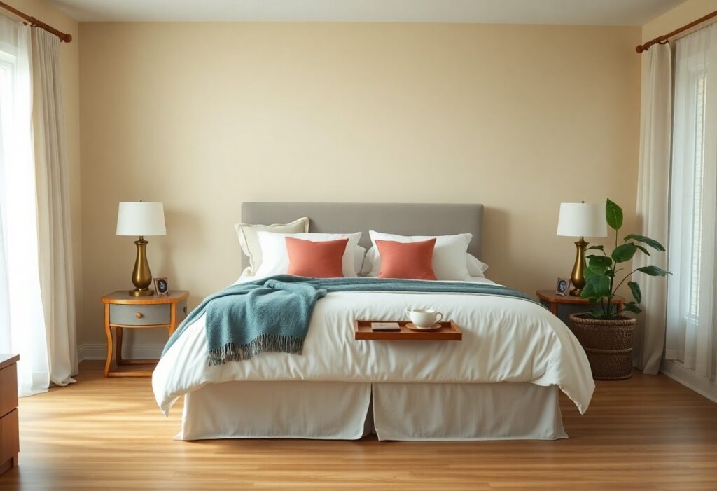
Many guests form their first impression of your home from the guest room, and I’ve found that color plays a powerful role in shaping that experience. You don’t need bold statements or trendy palettes to make someone feel at ease. Instead, your choice of hue can quietly signal warmth, comfort, and thoughtfulness. I’ll show you which colors genuinely invite relaxation and belonging.
Key Takeaways:
- Soft neutrals like warm beige, greige, or creamy white create a calming foundation, allowing guests to project their own comfort onto the space without sensory overload.
- Shades of blue, particularly muted sky or soft aqua, are linked to lowered heart rates and can support deeper sleep, making them ideal for overnight comfort.
- Introducing subtle accents in warm pastels or natural wood tones adds personality and warmth, preventing the room from feeling sterile while maintaining a restful atmosphere.
The Virtue of Soft Neutrals
I find soft neutrals create an immediate sense of calm the moment a guest enters the room. I often choose warm beiges, gentle taupes, or creamy whites because they reflect light beautifully and make small spaces feel more open. These tones don’t compete with furnishings, allowing art and textiles to stand out. I’ve seen how a well-painted beige wall in a guest room can make a visitor feel settled within minutes, unlike stark whites that sometimes read as cold or impersonal. A mid-sized SaaS firm redesigned their executive guest suite with a warm greige, and the feedback highlighted how it felt both modern and comforting. I avoid anything too cool or grayish, as those can suppress warmth. Instead, I lean into undertones that mimic natural materials-think linen, sandstone, or unbleached cotton. This subtle warmth invites relaxation without demanding attention, making it one of the most effective backdrops for hospitality.
Serene Blues for Restful Nights
I’ve found that painting a guest room in soft blue tones often leads to better sleep and a calmer mood. You don’t need deep navy to achieve this effect-lighter shades like powder or mist blue create a soothing backdrop without feeling cold. In one home I advised on, a coastal-inspired guest room in pale aqua helped visitors unwind within minutes of arrival. When paired with white linens and natural wood furniture, these hues deliver a quiet elegance that feels both intentional and inviting.
Earthy Greens for a Natural Retreat
I find that earthy greens quietly transform a guest room into a grounded, calming retreat, mimicking the restorative feel of a forest floor or moss-covered stone. You don’t need to paint every wall a deep sage to achieve this effect-soft celadon or muted olive on one accent wall can be just as effective. I’ve seen a mid-sized SaaS firm repaint their guest suite in a warm khaki-green, and their visiting clients consistently remarked how “restful” and “settled” the space felt. For deeper insight into curated tones like these, 9 Guest Room Paint Colors Designers Swear By offers practical examples that align with this organic approach. The right green doesn’t shout for attention-it simply makes you breathe deeper.
Warm Pastels for a Sunny Disposition
I find that warm pastels-like buttery yellow, blush pink, or soft peach-infuse a guest room with quiet optimism. These tones mimic natural daylight, making the space feel open and cheerful without overwhelming the senses. You’re likely to notice guests linger longer in a room painted in these hues, as they subtly elevate mood and energy. For inspiration, I often refer to this curated selection of the 10 Best Paint Colors for Guest Bedroom, where warm pastels are paired thoughtfully with natural textures. A mid-sized SaaS firm redesigned their executive guest suite using a peachy undertone, and reported noticeably more positive feedback from visiting clients.
The Art of Welcoming Hues
I’ve found that warm beiges and soft taupes often make guests feel immediately at ease, creating a quiet backdrop that suggests comfort without overwhelming. These tones, unlike stark whites, carry a subtle warmth that reads as intentional and genuinely inviting. You don’t need bold statements to convey hospitality-sometimes the most welcoming spaces are the ones that whisper rather than shout. A guest room painted in one of these quietly confident hues tells your visitor they’re seen, respected, and cared for.
Accents That Complete the Portrait
I choose a single piece of artwork in rich terracotta or deep indigo to anchor the space, because even subtle contrasts can transform a bland room into a thoughtfully composed retreat. You might add a handwoven throw at the foot of the bed or a ceramic lamp with a warm glaze, details that invite touch and signal care. Your guest will notice these layers, not as decoration, but as quiet signs of intention. A small vase with dried lavender or a stack of well-chosen books completes the sense of welcome-simple, personal, and never overstated.
Summing up
I choose soft, inviting colors in my own guest rooms because they make the space feel immediately comfortable. You don’t need bold statements to make visitors feel at home-quiet tones like warm beige, gentle sage, or muted sky blue often have a more lasting effect. Your guests will remember how the room made them feel, not the paint brand you used. A well-painted wall in a thoughtful hue does more than decorate-it welcomes.